A Three-in-One Identity
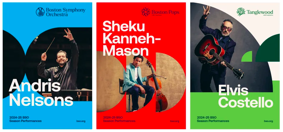
Ad agency Colossus has created a new identity for the historic Boston Symphony Orchestra that elegantly houses the Orchestras three associated and also famous brands: The Boston Pops, Symphony Hall, and Tanglewood. Read More
Ad agency Colossus has created a new identity for the historic Boston Symphony Orchestra that elegantly houses the Orchestras three associated and also famous brands: The Boston Pops, Symphony Hall, and Tanglewood. Read More
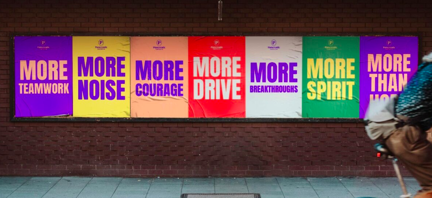
GOOD agency recently rebranded Pancreatic Cancer UK, an agency that surprisingly receives just 3 percent of the UKs cancer research budget. Read More

Cyber-security platform Rotate has a new identity, created by A LINE, that focuses on the ability to Work Assured, as opposed to working in dread and fear of cyber-attack. Read More
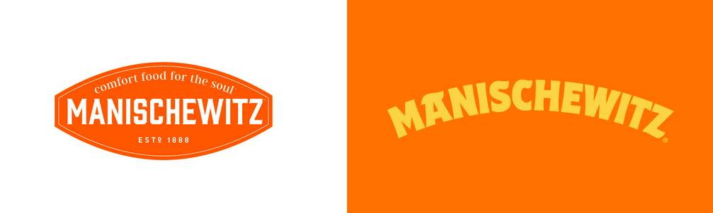
Jones Knowles Ritchie recently gave Manischewitz a rebrand, completing a plan that was launched in 2019: to attract new customers who may never have considered kosher foods. Read More

Sports drink Lucozade has a new logo and identity, created by Pearlfisher. Read More

. Jones Knowles Ritchie recently created a much more emotional and inclusive identity that also easily rings back to the original design. Read More
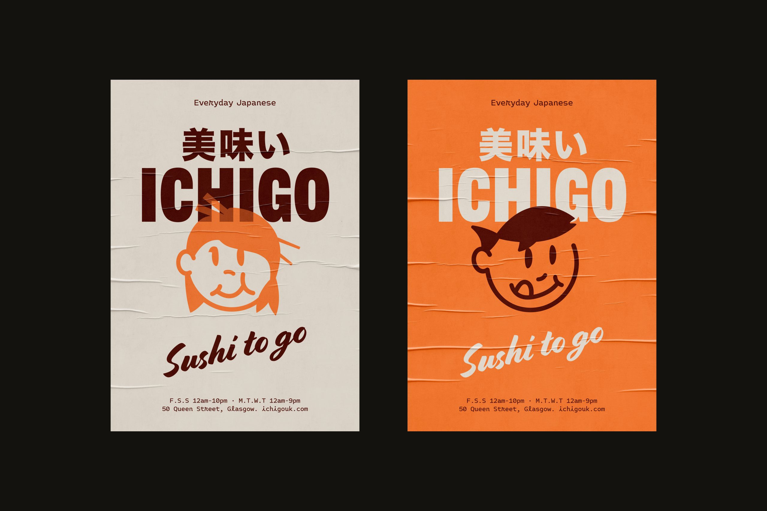
ICHIGO is a Japanese sushi restaurant that has a mid-century modern American sensibility and which is located in Glasgow, Scotland. Design firm Everything Will Be Fine melded all of these elements to create the new establishments identity. Read More
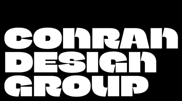
Conran Design Group has a new logo that centers on a chunky bespoke typeface Read More
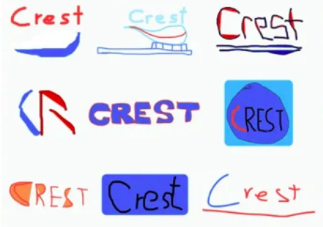
A recent study of health product consumers showed that their ability to reproduce the logos of these products is woefully poor. Read More
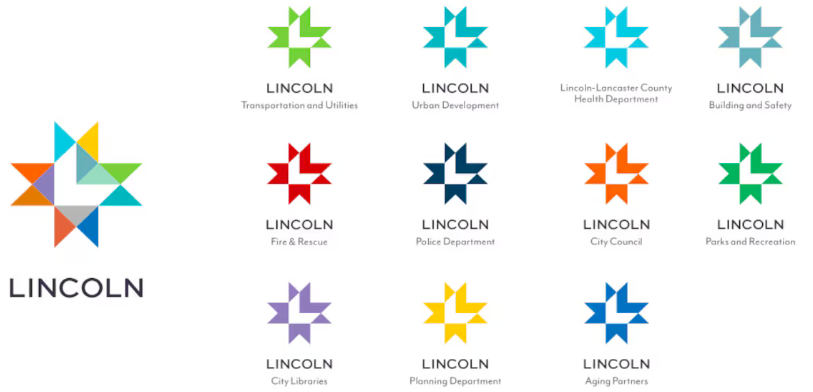
The city of Lincoln, Nebraska, has a new logo, created by Lincoln-based design firm Agency. Read More
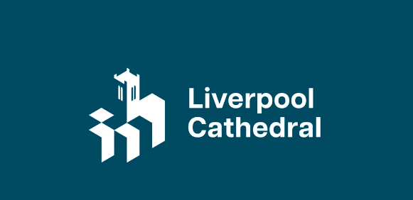
Poke Marketing has created a new identity for the cathedral that takes all this into account, plus reaches out to new audiences, encouraging all comers to Look up. Read More
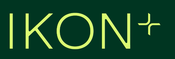
Ikon is a London-based workspace design company that creates truly unique environments. Read More
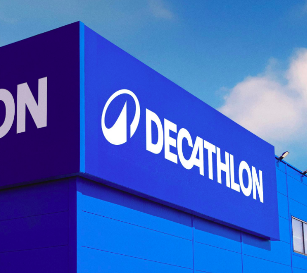
Wolff Olins recently created a logo for Decathlon, nicknamed LOrbit. Its canted, circular shape, meant to suggest motion, surrounds a peak, a symbol commonly associated with achievement and emotion. Read More
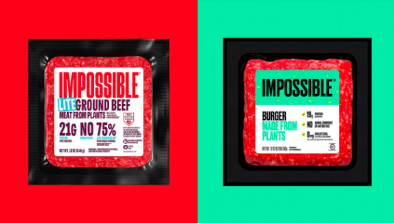
Jones Knowles Ritchie has created a new identity for Impossible Foods. The design is bold, its red, and its meant to combat an almost 15% downturn in plant meat sales. Read More
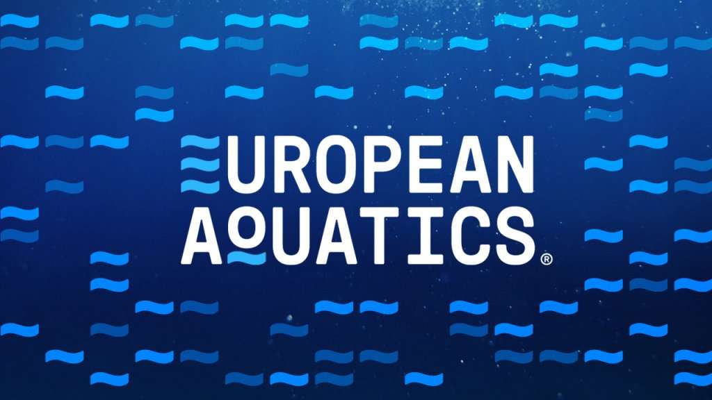
European Aquatics has released its new identity to coincide with World Water Day. Read More