GOOD agency recently rebranded Pancreatic Cancer UK, an agency that surprisingly receives just 3 percent of the UK’s cancer research budget. As a result, diagnosis, treatment, and survivor rates for the sufferers are low.
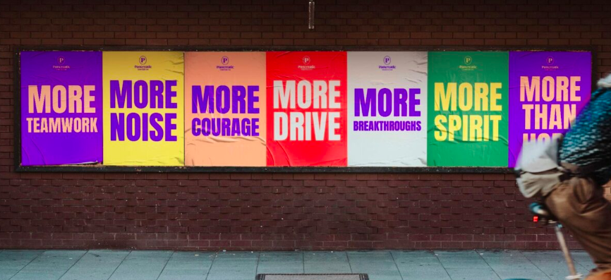
These cold realities led to a new brand idea: people affected by with pancreatic cancer need “More Than Hope.” To demand immediate action and attention, the brand has an editorial-like feel, meant to strongly communicate news and facts. Large, headline-like messages grab notice. The logo itself, a simple P centered in an oval, puts pancreatic cancer patients at the center of the program.