Preparing for this year’s LogoLounge Logo Trend Report, I couldn’t help but land on the word drama. No, not the flippant kind that plays out as passive aggressive jabs between partners, but more like the ancient Greek kind: comedies, tragedies and satire that help us fully connect with the human experience.
Design firms either did very well or very poorly. Either their phone was ringing off the hook or quit ringing entirely. Distance working has enabled distant client relationships and more connectivity between virtual offices opened opportunities for those willing to embrace it.
Go-to freelancers often saw even more work because agencies are more amenable to remote contractors. It’s just as easy to connect with an in-house designer on Zoom as it is with someone halfway across the country. New players emerged and old ones shifted into new spaces.
Small businesses had space to flourish, as side gigs became full-time hustles. And until many of these scale up, they depended on small-batch artisan brands to avoid being so pretentious as to be beyond belief—authenticity matters.
Our trip to a virtual business model hyper jumped in time by necessity. The burgeoning business that is on digital is trying to find the blendo between slick and personal.
Products related to pets, plants, and cleaning caught our at-home attention, delivery reigned, and new skills were served up through online courses: cooking, writing, art, crocheting, juggling, you name it. Connectivity was our driving factor, and cyber interactions were the hygienic choice.
What we do know from graphic trends is that they swing on a pendulum. When anything reaches saturation we will rush back to the other side to fill the void.
All of this is exceptional news for designers and especially for branding. This infusion of new products, services and enthusiasts have stories to be told and we are the people to do that.
People in branding are hired to tell stories and create meaning. Make the drama matter.”
Consumers are looking for guidance in alien territory and we are the scouts and the guides. Brands have to be where the customers are and this year they weren’t in brick and mortar locales, they were online. All the more reasons brands need to be designed to live in the RGB world.
Conversely, we felt a deep need to disconnect from technology this year, and connect with nature. Ecology and the environment were huge themes this year, with a slight twist in every genre toward sustainability.
Unsurprisingly, many of the trends are geared to showing a shift in our culture or in a brand. Off Jogs visually jump from level A to level B in an abrupt message of change, while Swingers and Spliced CBC both show transitions in space.
Electric Tape and Dog Tags speak to the immediacy of the message without following past conventions to finesse and pamper the message—intentional and strategic imperfection that speaks to the aesthetic.
Responsive identity design shifted from variable fonts to variable typefaces that shifted from display serif to stark sans serif just to prove it could be done and demonstrate extraordinary metamorphoses.
Old school etched logos came back with a vengeance but were retooled to reproduce digitally.
Snakes on Swords and Sushi on Chopsticks as well as every iteration of the revolutionary fist thrust into the air abound. Avocados, droplets, palm trees and pine trees and a few too many cute critters chopped in half to expose their innards are not as we assumed.
This is a trend report and NOT a trendy report.”
It is an observation of the trajectory and evolution of key design directions. Yours is not to imitate but to use these to inform you where our industry is going and if you are able to stand on the shoulders of these designs and push them to the next great iteration or a completely new level. If so, you may be the creator of what we’ll be admiring with envy a year from now. You may well have crafted the beginnings of the next exceptional trend.
01 | Logo Trend
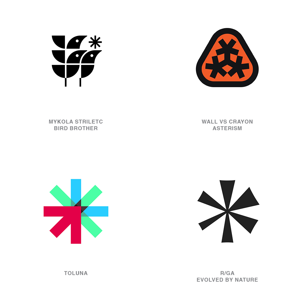
Asterisk
It’s no surprise that following a year with the rampant use of lightning bolts and twinkling four-pointed stars, designers lead a scavenger hunt in search of their next little star.
And this is exactly where they’ve netted out with the asterisk, which literally translates from Latin as “little star.” Whether parading in the five, six or eight-pointed variety, this punctuation icon is now firmly rooted in the designer’s graphic vernacular. Incorporated as a bit player in a more involved logo or cast in the solo starring role, this mark tops our list with the most annual credits and will likely be found for a few years to come in brands currently in pre-production.
Though Walmart and FedEx Office have been sporting asterisk derivative marks for better than a decade, the resurgent popularity generally focuses in on the sans serif iteration. This clean aesthetic scales well and reads universally as a sun, a star, a flower, a spark or an idea and of course as a signal of possible omission or to take note. Oddly an alternate iteration is also gaining traction where the symbol is being modified by visually dropping the convergence point to create an off center representative of cannabis. Shall we refer to this as a poterisk?
The asterisk is proving to be much more flexible than as a character place-holder for passwords. Visually, this symbol can be broadly interpreted and embellished without losing its imbued linguistic meaning. The only down side seen here is the vigilant consumer, head tipped downward scanning for the qualifying footnote.
02 | Logo Trend
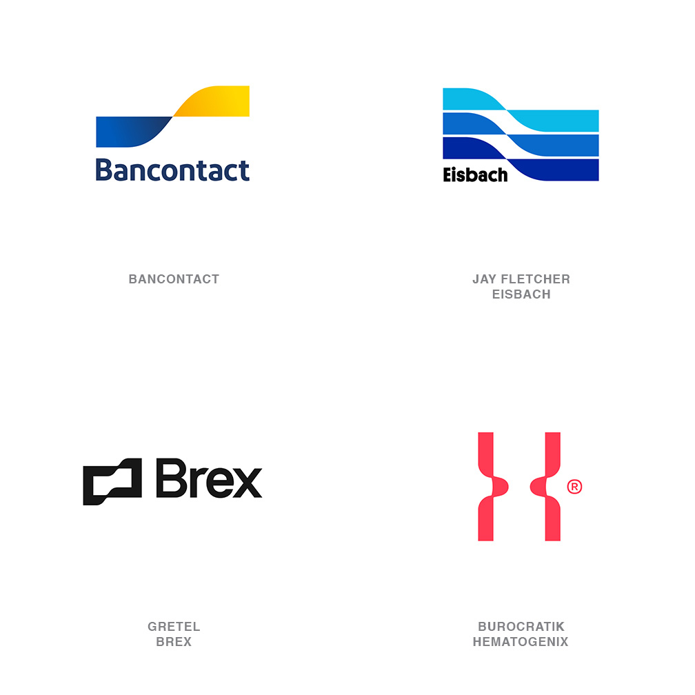
Off Jog
This is perhaps one of the most intriguing trends of the year, easily spotted once pointed out but elusive in definition.
Imagine any band or ribbon that alters and resumes course. It is that point of alteration that is of interest, not what happens before or after. That occurrence along the path could be a shifting up in gears, or an adoption of a new process, or entering a new generation. It may be a transition of space, materials, ownership or product, but regardless the path once altered continues forward true to course.
Following left to right the Bancontact logo reads as a ribbon twisting a half turn exposing it’s golden side and proceeding forward with new elevation. Eisbach uses a nearly identical alteration, but the trio of bands reflect the point break in the water for surfing. What unites all of these marks in the jog creates a tenuous junction between before and after that barely allows a bridging of the gap. A bit like glorifying the moment. There is no doubt it occurred but scant evidence remains. From a designer’s perspective this creates a narrative of continuity married to a moment of significant change. There was a hiccup, good or bad, but we’re on course, just like we planned.
03 | Logo Trend
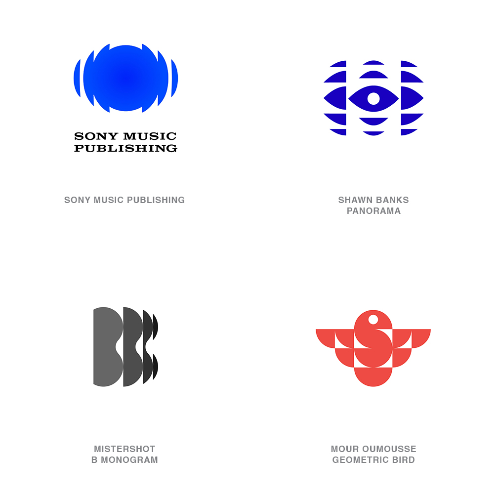
Spliced CBC
It was 1974 when Burton Kramer crafted the seminal Canadian Broadcast Corporation’s kaleidoscopic logo, less reverently referred to as the exploding pizza.
Though updated and iterated over the years, the husk of the original design remains with a red circle radiating in a faceted geometry, as might be seen through a dragonfly’s eye. And though the CBC logo was not the first nor the last to adopt this elegant burst effect it certainly is to this day the most visible, and is now impacting a generation of designers absent at its birth.
An array of diminishing fragments projecting out of a core element is the signature of this motif. Each splice expanding out yet visibly dissipating like ripples from a pebble tossed in a pond. Proliferation, multiplication and reach all come to mind with this concept that looks like mitosis incarnate. Sony Music Publishing riffs on this look perfectly to represent dissemination of sound and the delivery of a digital product. Several in this new generation recognize the projectiles don’t all have to physically be disconnected from the host to demonstrate the idea. Despite the original CBC mark displaying a sunny sequential palette of colors, the majority of these trending marks have embraced a single tone, understanding the graphics convey change enough and that stepped colors may be a step too far.
04 | Logo Trend
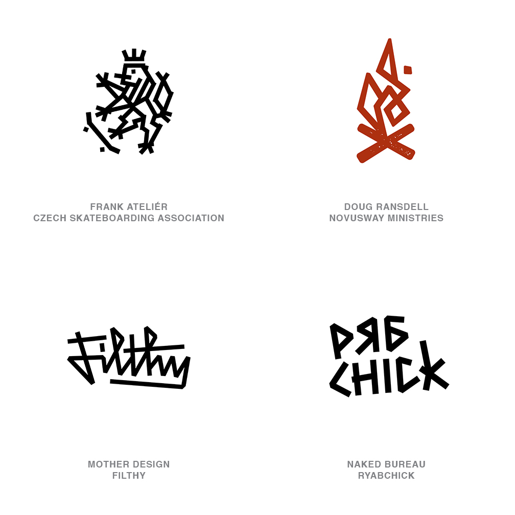
Electric Tape
Not sure if this is a step forward or backwards when a designer’s media of choice is a roll of electrical tape.
Landing somewhere in the realm between a brutal application of graffiti and a finely finessed monoline design, these logos have embraced a miscreant’s attitude. The kind of art you might expect to see on the side of a service truck whose owner couldn’t afford a vinyl placard. This DIY styling is typically crafted out of common width, straight strips, that fail to negotiate a corner without a hard cut, and cobbled together with little concern for cleaning up junctures.
How completely appropriate for the witty Czech Skateboard Association, mashing up the Republic’s two tailed rampant lion with a marauder on a longboard. Mis-registered corners and unbending structure give a mischievous feel to this group of marks that make them completely approachable and remove any doubt that anyone is taking themselves too seriously. Flexibility of this style allows it to morph from image to typography but it becomes most evident in the absence of curves. This naive quality is going to have a pretty finite market but when there’s a need to completely remove any pretentious mantel, guaranteed, this is the express.
05 | Logo Trend
Trans Flip
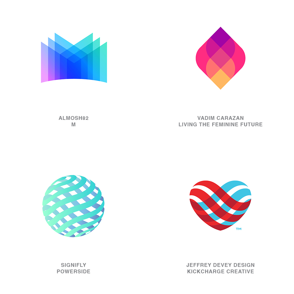
Hypnotic, mesmerizing, and spellbinding all come to mind gazing into these faceted bauble logos.
Something about the rhythmic symmetry and inner light lets you lose yourself in their depth. Imagine anyone of these before being flipped and embedded on itself, and you can see how that layered transparency is a force multiplier. For practical reasons, the more layers you have, the deeper the color becomes as they begin to overlap. Even when utilizing opaque layers or a modest gradient, the illusion of depth can be equally spellbinding. Certainly this is not the first of these that we’ve seen but this is the year they’ve really seemed to proliferate.
Where layered transparency is a factor, too many subtle steps of hue can become a challenge to manage even in an RGB environment. From necessity this can also create enough sequential color cells that the integrity of a logo is lost as it scales down. With the popularity of gradient fields of color, this tonal stepping technique gives designers an option to create a non-gradient color trance that’s just as engaging. Even though the examples shown here display mirror symmetry this same technique is being utilized with equal success in some asymmetrical applications. The upside for a client adopting this direction is an engaging vision that represents the prospect of an orderly, transparent relationship.
06 | Logo Trend
Stacked
There can be a very gray area between logo design and icon design at times.
Or in this trend a white area is more apropos. Consumers have become comfortable with the avalanche of symbols, pictograms and emojis that populate even the most obscure interface. Not just the international language on your mobile device but there to guide tire inflation, iron settings, recycling, heart rate, ovulation and every other noun or function you can fathom. These icons reward designers with what is ultimately a universal visual utopia to draw upon. A virtual cornucopia of graphic building blocks and that is exactly how they are being stacked.
Give me a mark for an exceptional resort. Well let’s see, waves, a home and the Sun for some really good rays and a swarthy tan. Stack them up and we’re done. Frankly, that is a nicely crafted mark and the idea of bringing visuals associated with a locale is nothing new. What probably is new-ish is our ability to visually knock down the film industry or photography to a ring in a square and a series of floating hash marks for a clapper board. Six wedges sliced off a circle and a square transport us to a tropical paradise.
These marks are to the point and spatially pleasing with their blend of positive and negative space. Though they can appear somewhat generic that can also signal the ownership and authority of the symbolic genre their logo represents.
07 | Logo Trend
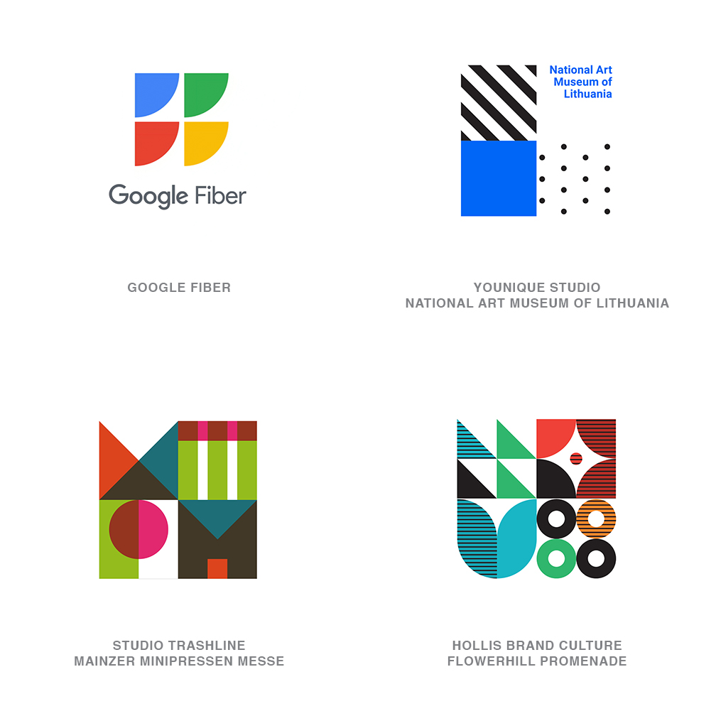
Quads
Just because it’s the way things are, the really important things in life tend to come in fours, like seasons, cardinal directions, the suits in a deck of cards, the fantastic four, the fab four, and CMYK.
I may have missed a few here but this year designers didn’t. Foursomes were on their mind and in particular there was a true obsession with the tidy practice of quartering a square. We have to admit that a square is a fundamental go-to logo design element and wait for it...the shape has FOUR sides! Whether actually being used to neatly pack up four initials or partners, or offerings, it was not a mandate for this trend as it could just as easily have been a way to signal diversity or abundance in a tidy container.
Branding is largely about building consistency and being able to demonstrate order in a logo can be fundamental to our craft. When applied to the appropriate client, all the better. Amongst others, it’s not surprising to see these marks representing architecture, museums, builders, and urban entities that are often called on to create spatial organization. Because dividing a square into quads creates four more squares, it assembles a cluster of elements each still large enough to scale well as part of a single logo. These can become really over worked in detail and a Spartan design aesthetic can be a plus, thus what appears to be basic geometry inside of basic geometry or letterforms.
What is LogoLounge?
LogoLounge is a global community of thousands of designers that share inspiration, network, and compete to earn awards.
08 | Logo Trend
Chains
I was always taught that the quickest way from point A to point B is a straight line.
Then it pretty much stands that the serpentine line is for someone with either too much time on their hands or it’s more about the aesthetics of the journey than the destination. These thoughts come to mind with this set of marks that all use a composition of half circles alternately flipped and gathered together in a chain like fashion and connected at their tips. Any of these probably could have been served by utilizing a serpentine line but without nearly the effect or the visual weight created here. Steam, smoke, waves or any other good reason to use the symbolic wavy line seems to have been a candidate for this technique that sees a rise in logo design over the last year.
Used in a supporting role like the steam rising from the bowl or to create a simple geometric pattern, this technique adds a rhythmic field to a mark using minimal visual exertion. The method becomes more challenging when the central focus of the mark as sprinting forward with too many links either vertically or horizontally limits scale. It’s perfect if you’re carving out a letter s but not too much more. It will be interesting to see where this evolves as it is one step away from describing the three-dimensional space of a spiral with a line run through its core.
09 | Logo Trend
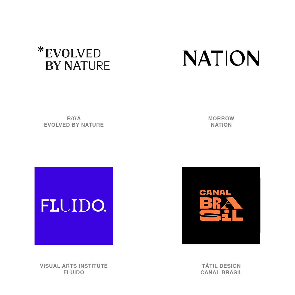
Janus
Variable fonts have made as much of a contribution to shifting the design landscape over the last few years as have any tools we’ve seen introduced.
So much of the fascination with a typeface that can easily be manipulated into various approved weights and widths has been in the visual demonstrations of the transformation occurring. Only less captivating is the static result of whatever characteristics the user lands on. Give credit where it is due, but we should only be modestly surprised at this next step in the evolution. A crafty designer posed the question, what happens if we create a variable font that transitions from a serif font for example to a very different sans serif option.
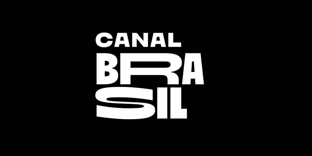
Exploiting the premise, designers did their damnedest to display an analog demonstration of variable fonts by creating word marks where each letter sequentially shifted weight or another attribute. Evolved By Nature visually nails the process of evolution in their wordmark, but it becomes all the more evident as each letter, from left to right, starts to molt serifs until the final svelte transfiguration is evident. Even the asterisk logo for Evolved goes through a similar transition but in much tighter confines. This is a technique that shines when it comes to demonstrating diversity and change. Canal Brasil takes an even more brazen and entertaining path to this trend with a looped animation of letter-forms, each in full transformation as if caught squandering polyjuice potion.
10 | Logo Trend
Merger
Each of us has at some point stared at a windowpane covered with raindrops from a shower.
A droplet with just the right gravity starts to trickle across the glass merging with the next, then the next, until it creates a rivulet of water that races down gobbling every drop in its path. There is a random nature about this but also an inevitability that every drop adds to the power of the whole. Magnetism draws elements together, and what was once a chain of two or three drops might become a torrent. These logos demonstrate the multiplied strength of those that have joined in the effort as well as the individual beads prepared to join in the movement.
A building drop used in this scenario stands resolute on its own in a perfect dome. It’s completely self-sufficient but at a tense proximity only a fraction away from becoming a part of something larger. These logos represent strength in numbers or a magnification of capability. They demonstrate an ease of blending and a mercurial ability to react. Most of these logos demonstrate this process with a chain of unions, captured at the second in time when the merger occurs. Snapshots taken at the perfect moment to best engage the consumer’s imagination.
11 | Logo Trend
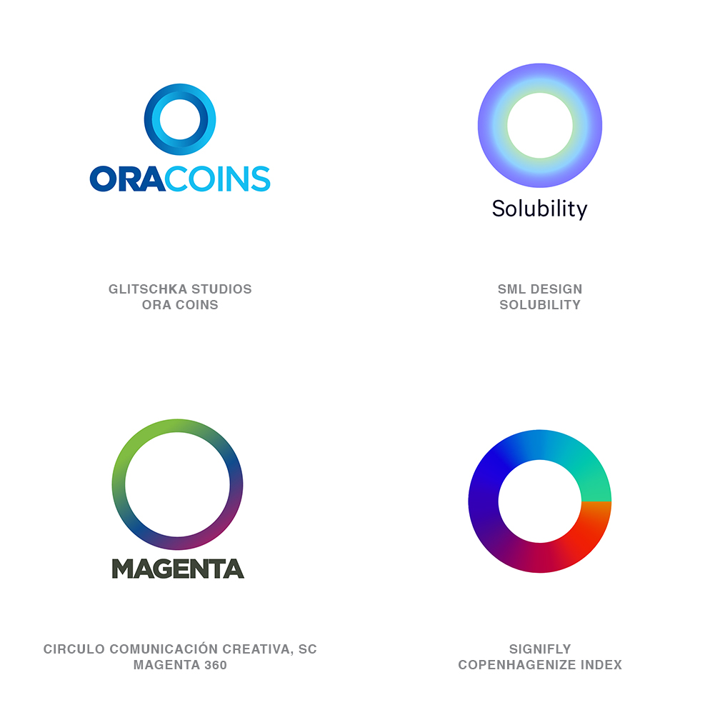
O’Really
There is probably no more foundational shape for a designer than the circle.
It harkens to a level of perfection that is terribly unforgiving and blessed are we as designers that design software can whack them out perfectly time after time. And another circle knocked out of the first but a little smaller and exactly centered, and there’s your ring. Or a letter O if you’re working with Avante Garde. And it may seem that in producing the ring, that the only real decision to be made is regarding the thickness, light, medium, bold, or black? But as this series of beautiful logos attest, there is so much more. And the much more part is why this group of logos can even be considered a trend since we’ve been busting out rings and calling them logos for generations.
It’s the use of gradients or a halftone effect that’s really caused this shape to leap to the top of the popularity heap. Yes, a ring still conveys eternity, unity, perfection or a cycle. It signals completion and is unbroken and the hole in the middle can convey passage or a window or portal. All of those connotations stand true, but with the treatment of the surface to a wash of tone and a new world of symbolism is exposed. It’s not just a cycle, but one from cool to hot, or night to day, or properly shaded the ring takes on dimension. Gradients can wander the ring’s perimeter or spread across the face or even diminish into an inner abyss. And though it’s swell if your name starts with an O, the imbued power of this shape far exceeds mere association as a monogram.
12 | Logo Trend
Swingers
Leave it to a designer to dispel Sir Isaac Newton’s law of motion that “an object at rest will stay at rest.”
He’d frankly not anticipated designers adding motion stripes or a visual vortex to speed up or whirl an object from its place of rest in the consumer’s mind. Designers are a pretty clever band and if a project calls for the static demonstration of movement, there’s no shortage of solutions in their kit of tricks. Spinning, leaping, flying, exploding, dashing and all the other ingings have been trotted out time and again but this year logo designers have taken to swinging.
Swingers as we’ve named them are those marks that want to demonstrate motion but are tethered to a principle or a core that signals stability. These marks may represent an entity that is pivoting from a previous position. Possibly this hinged effect reinforces the idea that stability and flexibility are not exclusive of each other. The marks using transparency to convey a series of frames in motion convey openness and clarity, and all of these logos define space through optical dimension. Whether these logos appear to be swinging, flapping or waving in the breeze, none of the entities they represent appear to be objects at rest.
13 | Logo Trend
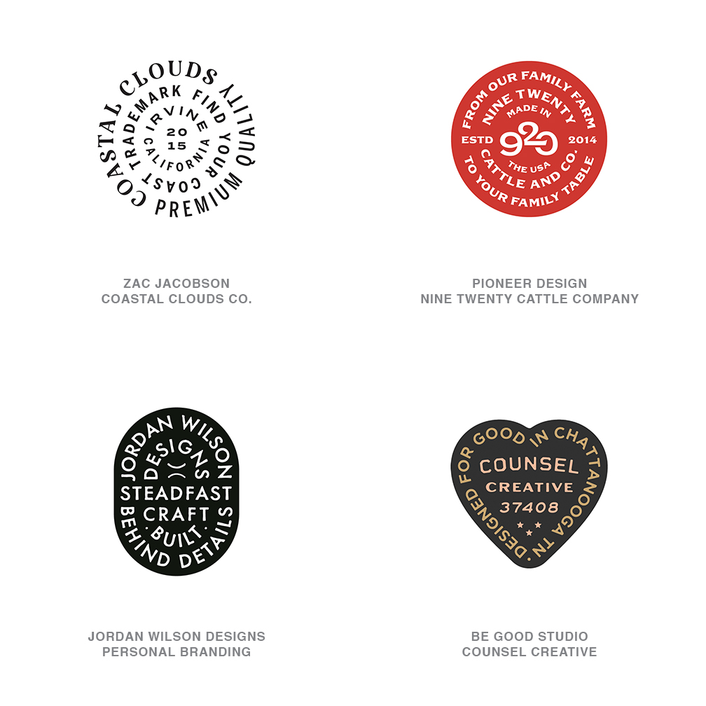
Dog Tags
There’s that certain charm, beauty, and finality that attaches itself to the idea of cramming all of your vital stats onto a small metal lozenge with a limit of 72 characters.
Decisions are made as information goes through the triage of suspect abbreviations, dropped details, and just determining what’s critical and what’s not. A cadence is evident when looking at these solutions that disregard kerning or letter modifications as words swing around the inside of curves and tend to consume every iota of space. Though this trend may allow an additional typeface to squeeze into the solution they are often crafted with an unremarkable font with a single weight and point size.
Constraints that we live by lead the creative to some exceptionally clever solutions and these marks reflect that. For the client these logos represent, they exhibit simplicity and functionality that is forthright and honest. The text itself becomes decoration or a pattern used to define or repeat the shape of the tag, exhibiting a level of resourcefulness. As a rule these logos avoid using graphic symbols in the letter mix, which means the external shape becomes the sole iconic signal. Finding the client with the right aesthetic to rep this mark is key. Like the right look, on the wrong person these logo’s unintentional nature is completely intentional.
14 | Logo Trend
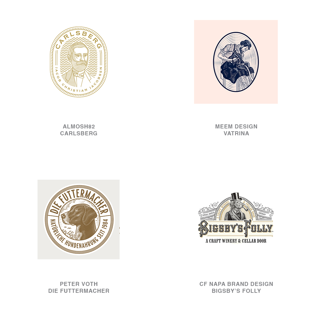
Etched
Mascots and logos as we came to know them often were extracted from engraved advertising art used even before the turn of the prior century.
The Smith Brothers or the Quaker Oats man or even Nipper the RCA Victor dog with the quizzical face were lifted from the art used to hock the wares. Those logos were etched and full of nostalgic charm from when the world was more innocent, but illustrated in this manner solely because that technique was essential for printing. Our continued infatuation with this style has nothing to do with reproduction and everything to do with reflecting on products imbued with qualities from a prior generation.
It’s a fair comment that finely engraved logos and badges have hung around or been newly crafted as an artifact of another era for eons. This recent season of marks has however been riddled with ever greater numbers of logos of exactly this ilk. A fair assumption is two things have converged for this to occur. Firstly there has been an entrepreneurial rush over the last several years to provide curated and/or small batch products and services that counter the behemoths. Secondly, there have been a number of capable illustrators and designers cutting their teeth on gin bottles and chocolate boxes with exactly this style. Now they are fueled up and ready to deliver. Quality levels and styles vary from naive to highly honed and sophisticated but all transport the consumer to an intangible place.
15 | Logo Trend
Rods
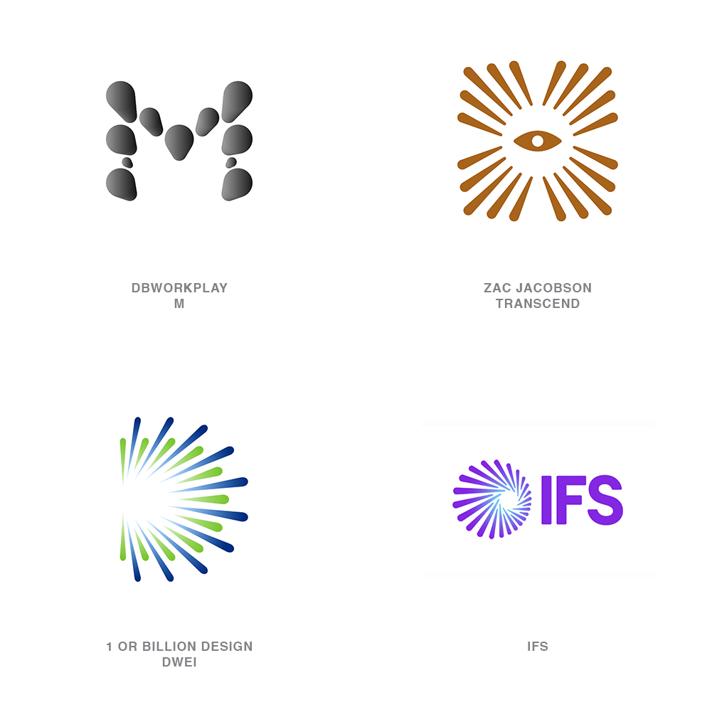
Perspective has everything to do with everything.
Possibly the difference between a dot and a dash is really the angle from which it’s being viewed. Staring down the barrel of a rod from just off center gives us a shaft that diminishes width, and rounds off at either end. Start to splay these in an orderly array and you have the makings of this trend set. Give the center a minor twist and the same logo evokes the rotation of a gradually winding vortex.
It’s easy to make the jump to this set being a derivative of the auras and halos so often employed over the last few years. These are more about the shafts themselves than about providing a nimbus to circumscribe a central feature. The rounding of the ends on these keep them friendly and approachable and truly is their distinguishing element. From this display you’ll note that the effect is equally impressive using a single tone or when gradients are used to define shape and distance. These marks nearly always project from a vacuous center torched clean by a burst of light and convey a sense of expansion, hope, and outreach. It’s all about the management of the action and less about what caused it.
Are you in design or marketing? Join LogoLounge to watch in realtime what’s happening in the world of logo design.
Follow the trends.
Logo design in your inbox. Subscribe to our monthly newsletter for the latest from LogoLounge.