The city of Lincoln, Nebraska, has a new logo, created by Lincoln-based design firm Agency. The core city logo is a multi-colored, eight-pointed star with an L reversed out of its geometric interior shapes. The eight-pointed star is a common symbol in many cultures, including American folk art and Native American art, which are both appropriate cultural references for the area.
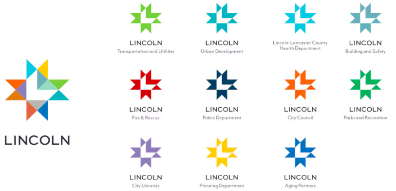
In this application, the many points of the star are also used to represent the multi-faceted nature of the city and its services it offers. The multi-color design used for the city represents diversity. Single color versions represent each of the city’s service departments.
https://www.1011now.com/2024/03/29/lincoln-mayor-announces-new-logo-city-departments/