Ikon is a London-based workspace design company that creates truly unique environments. But its name is far from unique: everything from fashion firms and boy bands to industrial supply companies and even other design firms share the name Ikon. So design office Campbell Hay had to create a new way to make its client stand out.
Their solution is a modern, elegant workmark locked-up with a modified and ownable plus sign. The icon is actually formed from two inward-facing arrow points. The point where they meet can represent collaboration, creativity, and/or unity. A plus sign, of course, has its own positive connotation. The plus icon can be used on its own, repeated in patterning, or used as a frame to house imagery or color.
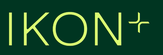
A dark green, selected to represent trustworthiness, stability, and strength, is combined with a warm beige and a vibrant neon yellow in the new system.