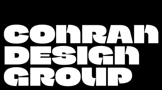
Conran Design Group has a new logo that centers on a chunky bespoke typeface. The core logo is the capital letter C—for Conran—with a D—for Design—formed by its counter/center. In fact, almost every letter in the new alphabet has a D hidden inside, an apt and subtle nod to the branding firm’s design goals.
https://www.itsnicethat.com/articles/conran-design-group-rebrand-graphic-design-project-030424