Liverpool Cathedral is both the longest cathedral and the eighth largest cathedral in the world. It’s an architectural landmark that attracts 800,000 visitors each year, in addition to serving as host to worship services, dinners, musical and arts performances, and conferences.
Poke Marketing has created a new identity for the cathedral that takes all this into account, plus reaches out to new audiences, encouraging all comers to “Look up.”
From the Poke Marketing website: “We created the brand theme ‘Look up,’” encouraging exploration. ‘Look up’ encourages people to not only explore the building, but themselves too. Audiences can look up to the building, to God, to life, to fun, to enjoyment, to pondering, to remembering, and to be wowed.”
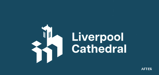
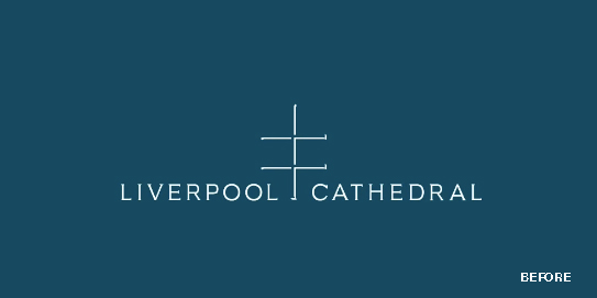
The new logo is formed from the shape of the cathedral. It clearly represents a religious building, but also subtly suggests a capital letter L. The design was inspired by a double cross, known as a Lorraine cross, which was used in the cathedral’s previous identity. You can view an animation that shows how the old identity was transformed into the new one at https://www.instagram.com/p/C1rQiFyM2N_/.