In the UK, the RSPCA’s octagonal logo is very familiar: after all, the Royal Society for the Prevention of Cruelty to Animals has been in service for 200 years. Navy and white and angular, the agency’s logo had an authoritarian feel—not entirely inappropriate, but not exactly suggesting the emotional bonds people and animals share. Jones Knowles Ritchie recently created a much more emotional and inclusive identity that also easily rings back to the original design.
Intensive farming, climate change, and urbanization have created significant threats for domestic and wild animals alike. So JKR built a new identity that visually included many animals. The designers used the octagonal shape from the original logo as a shelter of sorts that can house a wide range of animals. The animal octagon, locked-up with a new wordmark and a brighter, friendlier core blue, clearly communicates both the purpose and the caring behind the RSPCA.
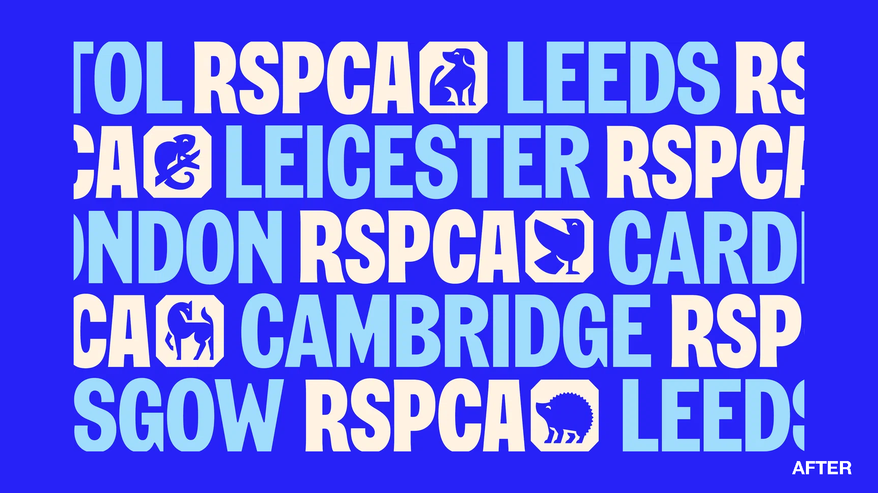
A broad palette of secondary brand colors makes the new identity even more flexible. For instance, RSPCA branches across the UK can select the colors and animal that best suits their locale.
https://www.itsnicethat.com/articles/jones-knowles-ritchie-rspca-graphic-design-project-110424