• Pentagram has created a new identity for the Monterey Bay Aquarium, which is celebrating its 40th anniversary. Rippling kelp fronds formed the original logo: Pentagram updated the symbol to make it more flexible.
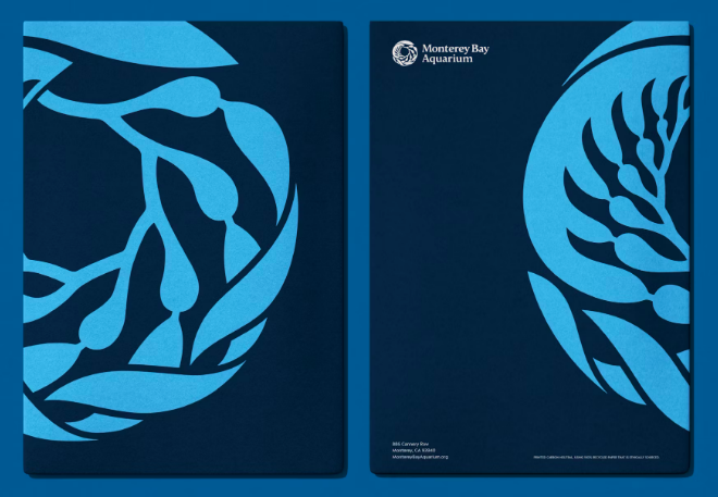
From the design firm’s website: “The new kelp drawing simplifies the fronds to streamline the mark slightly and make it more scalable. The symbol becomes the foundational element in a dynamic and contemporary visual language that provides clarity and consistency across brand expressions. The system leverages the icon in new and unexpected ways, utilizing it as a frame or filter for images, or in variations as a halftone or multi-line drawing. It has also been adapted into a pattern.”
https://www.pentagram.com/work/monterey-bay-aquarium/story
• European Aquatics has released its new identity to coincide with World Water Day. As the governing body for aquatic sports representing Europe, including artistic swimming, diving, competitive swimming, open water swimming, and water polo, the organization needed a new logo that comfortable housed both performance (competition) and a way of life (social responsibility).
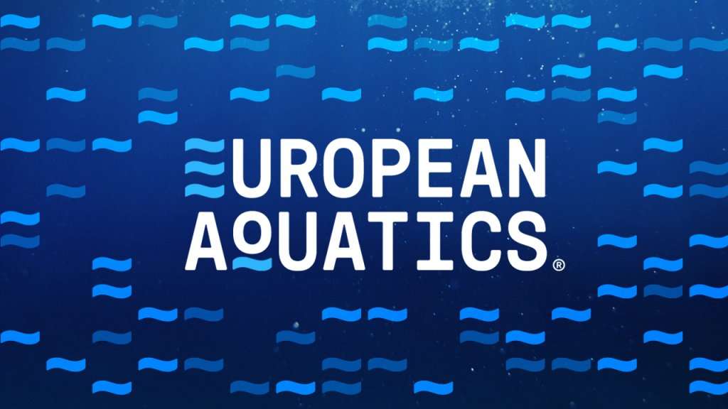
From the group’s press release: “The unique ambiance of blue water is central to the design, strategically intertwined with an emblematic wave pattern grid system. At the same time,?the brand colors symbolize our sport’s aquatic nature?with style. The incorporation of deep blue water aligns seamlessly with the brand’s tagline, ‘This is your element.’”??
https://www.len.eu/european-aquatics-reveals-new-logo-and-brand-on-world-water-day/