• Jones Knowles Ritchie has created a new identity for Impossible Foods. The design is bold, it’s red, and it’s meant to combat an almost 15% downturn in plant meat sales.
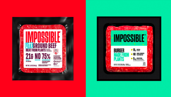
The new plan does not feel like it is addressing vegans and vegetarians anymore. The previous identity used a light green as its core identity color; the new identity employs a bold red that meat-eaters relate to meat products. The new lettering is even bolder than it was before, and the actual messaging has changed as well. What used to read, “Burger Made From Plants,” is now “Lite Ground Beef Made From Plants.”
• New York heritage cheese brand Murray’s is going national with the help of a new identity created by Base Design. By adding the words, “est. 1962,” Base emphasizes the brand’s built-in authenticity: underlining age feels very appropriate for a cheese brand.
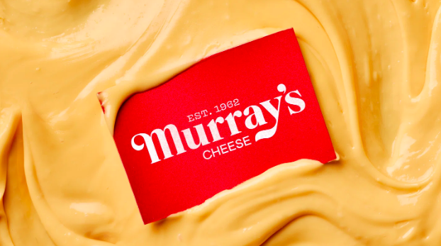
Brand colors are drawn from the products themselves: red for the waxy rinds found on some cheeses and soft yellow and cream shades of the cheeses themselves.
https://www.itsnicethat.com/articles/base-murrays-cheese-graphic-design-project-200324