Maybe it’s because I live in the Midwest, or maybe it’s because I put this report together every spring when the region’s nickname “tornado alley” suddenly makes sense, but I can’t help realizing how logo trends and weather have a lot in common.
Context.
As unique and fantastic and otherworldly as tornadoes are…they don’t appear out of thin air. They’re created by certain conditions. They’re not always predictable, but there’s a certain pattern that emerges before they appear, especially if you’re paying attention.
Logos don’t simply emerge from thin air either, no pre-existing conditions, no context.”
Context isn’t just particular cultural movements or moments, it’s also tools and technology. While the advancing cold front of AI has sent a chill down many a creator’s spine (we’re talking about Artificial Intelligence, not Adobe Illustrator), it’s important to understand how to work with it, instead of ignoring it or working against it. (Don’t spit into the wind.)
Instead of taking the tools at their face value, learn to use them as a sort of brainstorming tool. Much like lightning disrupts the sky and illuminates things in new and wild ways, AI can quickly churn out unique perspectives. Sometimes they’re awful (like when it hits a tree, sets it on fire, and it falls on the house nearby) and sometimes it’s incredible and releases nitrogen into the air, fertilizing the ground below and fostering new growth. In other words, AI isn’t going anywhere, so we might as well use this tool to enhance the creative thought process we already excel at.
Instead of taking AI tools at their face value, learn to use them as a sort of brainstorming.”
I recently came across this (unattributed) quote on LinkedIn, and loved it so much I want to share it with you:
”Don’t worry about AI stealing your job. To replace graphic designers with AI, clients will need to accurately describe what they want. We’re safe.”
Another tool we see coming in on the trend front, the tool du jour, so to speak, is inflation. No, not the economic kind that means you need to take out a second mortgage to pay for groceries. I’m talking about the kind that enables designers to “puff up and lift” items off a page, like Sam Smith strutting the red carpet in an inflatable black latex suit at the BRIT Awards. As a standalone piece, the (probably squeaky) balloon-esque ensemble might not make much sense, so it’s important to understand the context of the design trend. Anticipate designers over-using this 3D tool in a nascent way until it shifts gears to a more mature and thoughtful capability and not just a trick.
This trend report looks back to move us forward–providing invaluable insight developed by countless hours tracking the trajectory of design trends. I’m not here to tell you which of these trends is my favorite (though there are some stellar ones), but rather, I’m laying out ‘what is’ and sorting through the mayhem to help explain the ‘why.’
And remember, trendy and trends are not the same. Trends are directions–the way in which something will most likely go. Trendy is more ephemeral. Renowned designer Tom Geismar said it best when he shared with me, “Nothing dulls so quickly as the cutting edge.”
Last year we saw a crap ton of pink (that’s a real scientific measurement), and this year it’s green (any shade) and blue (a certain shade of blue), a newly discovered color that we can’t get enough of. Of course, at some point, every color that’s visible to the human eye has been cornered, and we must look beyond the palette proffer. So we see dichroic foils hitting the scene, shimmering with eye-catching possibilities.
Symbols (notably happy faces, castles, mushrooms, too many eyes and flags) are omnipresent, but we must keep in mind that symbols are only as strong as the context in which they were born. For example, a more eastern visual interpretation of clouds incorporates wind and they are moving westward, while the occidental variety is more static. Trends this year took us toward both the tangible and intangible. Wildflowers invite us to stop and smell the roses, Sonics make us stop and listen–while Fades alter our sense of reality and put our eyes to the test.
LogoLounge members gain access to better than 400,000 exceptional logos from which to find inspiration. They’re contextualized and searchable, making it easier to find a path that leads to your next design destination. You’ll have more than 20 years of trend reports to explore, and if the conditions are right, lightning just might strike.
What is LogoLounge?
LogoLounge is a global community of thousands of designers that share inspiration, network, and compete to earn awards.
01 | Logo Trend
Wildflowers
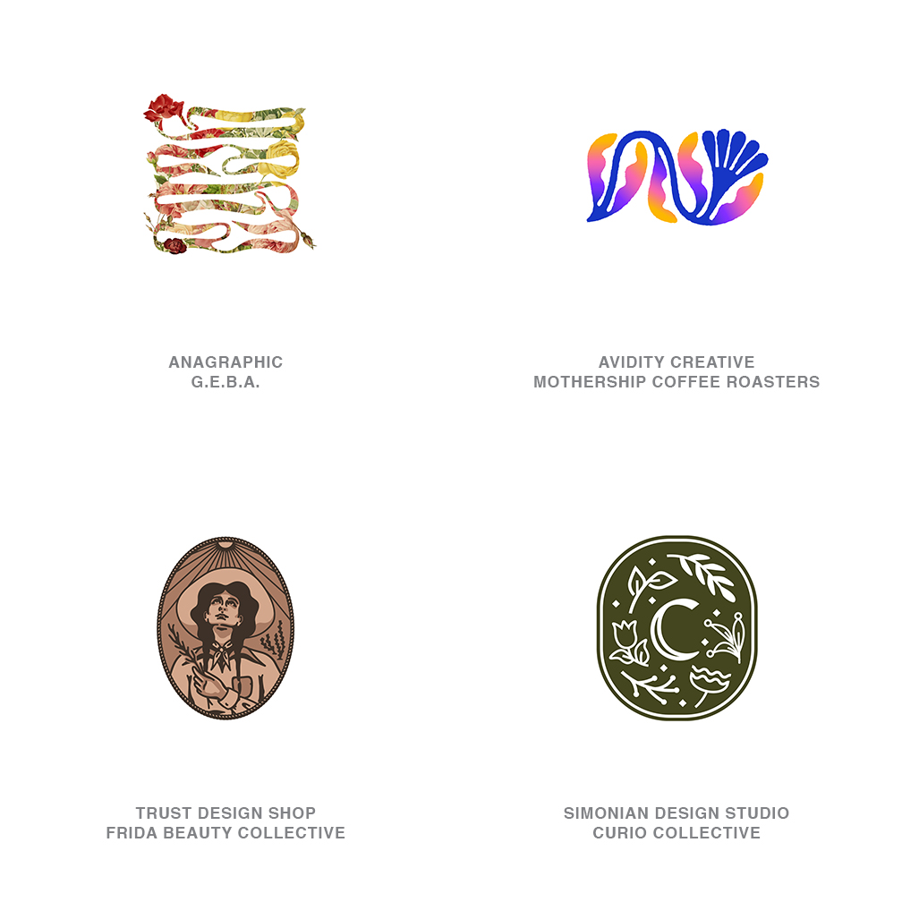
A perfect time for the scratch and sniff industry to make a resurgence would be with this abundant crop of blooms capturing the imagination and dollars of consumers.
This botanical association with all things natural, holistic, or healthful was once reserved for hibiscus tea and alpine cough drops. In 2022 the beverage industry calculates that better than half of the new market entries have listed floral ingredients among their flavor tones. Enthusiasm for other leaves, buds, petals and the resulting benefits in the health, beauty, spirits and recreational industries have heightened awareness in the design industry as well. Designers are embracing the challenge with a feverish zeal, crafting lavish visual brands ready to wake our olfactory senses through our eyes.
Interpretations of flowers range from highly identifiable to vague fantasy placeholders. Badges and crests that were once replete with moons, hearts, and stars to fill out their background, have now been populated with leaves, vines and sundry blooms of every kind. Whether these logos use floral elements as the feature or as a bit player there is an evident upping of the design aesthetic in this crop that’s looking beyond cliches. Papel picados, photo embellished ribbons, and hand drawn badges exemplify just how diverse this trend has become. I am left to wonder if we’ve so over saturated the infused gin market with flowers that we might run short. Not one of the above marks is for a florist. Interesting.
02 | Logo Trend
Bloblend
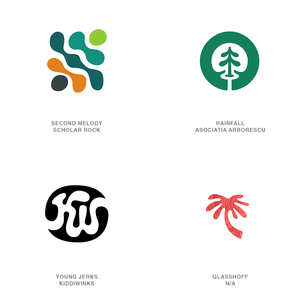
As the antithesis to those brethren of geometrically solid marks brimming with right angles, perfected radius, and precision symmetry, sometimes a client needs to let down their hair, and their guard.
Perfected logos speak to perfection, and frankly not every personal or branding relationship is founded on perfection. Enter a trend of highly relaxed and very approachable marks that look as loose and comfortable as the entity they represent. There is smart design here with good symbolism, proportions, and positive/negative spatial rapport, and despite the fluid nature all hold their own as a logo. You may know that you’ve been initiated in this trend if the majority of your mark appears to have been drawn with a honey bear squeeze bottle.
That unconstructed liquid appearance may well speak to the spontaneous nature of the brand experience you’ll come to expect, or the flexibility you can anticipate. It’s often attached to natural or leisure-oriented products that want to dial down the wall of formality. To counter a too-loose persona, the attending typography or other contextual graphics may offer a bit more structure to assure consumers the brand’s brain does have a left side. Numerous fonts have been released with letterforms that flow neatly into this trend. In particular there are a rash of script wordmarks this year that are all droop and no points. Am I too late to rename this trend Pointless?
03 | Logo Trend
Fades
In an international survey, participants were asked which of their senses they’d least like to lose.
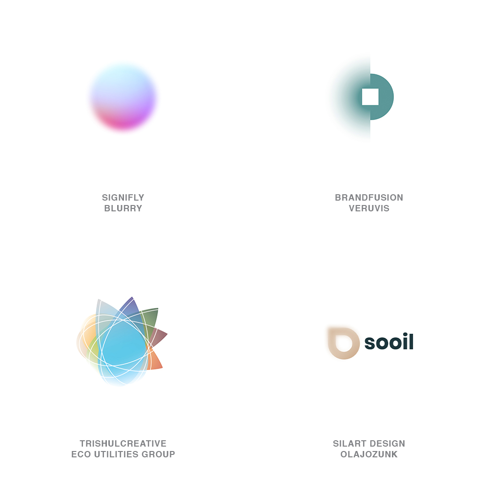
An astounding 70% responded sight with 8% least wanting to lose their hearing, with smell, touch, and taste trailing in the results–no surprise to a contingent of designers that would probably clock in at 100% in favor of keeping their sight. What does strike me is that most of the population either wears glasses or has some form of corrective vision. We forget that up until the last century a large piece of the population just lived with an inability to focus. That’s a circuitous set-up for this trend which is counterintuitive and puts a consumer’s strong vision to a test or at least challenges it.
This logo for Blurry is a beautiful thing to behold if I knew where to grab it. The completely unfocused orb speaks to the app of the same name which assists in linking musical artists through anonymity. Smart thinking. Most of the marks that are adopting some forms of this effect are blending focused and unfocused elements to help contrast one from the other or to show a gradual shift to demonstrate building clarity or possibly in the inverse if they want to obfuscate. There have been some exceptional uses of this in brand applications where animation allows focus to tell a story as it creates a transitional reveal in slow motion. Catch the way the Myers & Briggs Foundation utilizes this via personality testing to reveal an individual’s awareness of themselves.
04 | Logo Trend
Foreshort
Long before we could grab an asset on screen and tumble, spin, stretch, and diminish it into a semblance of three dimensionality, we couldn’t.
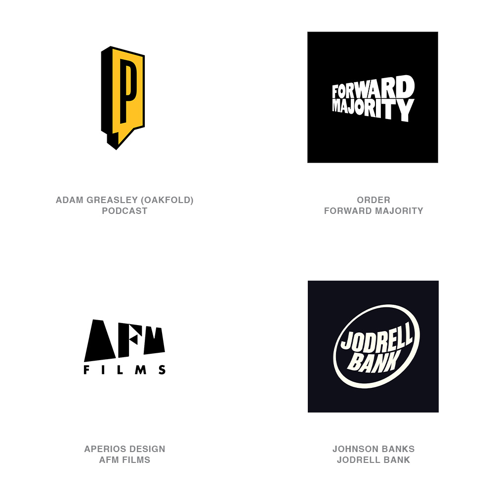
Hand drafting an image to conform to a one-, two-, or three-point perspective didn’t even exist until Brunelleschi. The genial genius of Italy fathomed the concept in the early 1400’s and the renaissance shifted from simmer to bonfire. I’m just trying to give a little credit and perspective to the whole concept of perspective! Designers are copiously utilizing the same principle that jarred humanity centuries before. It was considered wizardry at the time when a subject they were accustomed to seeing on a two-dimensional plane swung back into space and suddenly created a sense of place.
These logos create a feeling of cinematic drama and though we’re no longer left in astonishment they do slow us down long enough to beg consideration. They help demonstrate space and time or anything else that exists on a continuum. They also establish the vantage point for the viewer. Logos may be looming overhead or leaving you behind. Possibly racing toward you or in the case of the Jodrell Bank Observatory logo, giving a sense of shape and space as the concave dish is defined. Squeezing down text in this fashion also tends to turn an otherwise lengthy wordmark into a compact and manageable symbol. And though the group of marks assembled here are type in orientation, it was a propensity but not an imperative to belong to the trend.
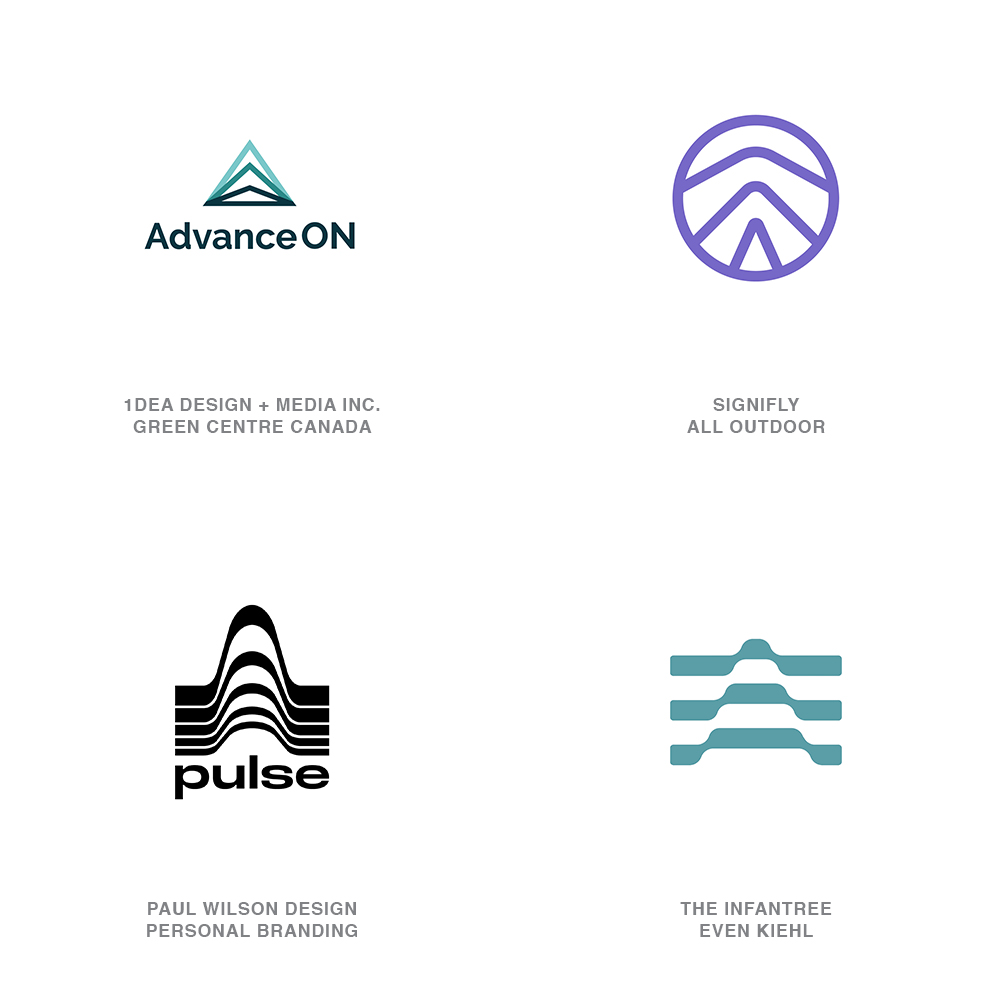
05 | Logo Trend
Thrust
For the greater part designers have very few clients that are downers.
The vast majority will tell you at the opening of conversations that their business is on the way up. Profits are up, clients are up, sales are up, the better part of their world is on the up and up. It’s usually once you move beyond the direction their future is headed that they’ll start to share the meaty part of their venture that will give you the most value in building a brand story. This said, there are those times when an uplifting mark is really what’s called for and this year things must have been looking up. Part of the challenge of dealing with rising fortunes is the cliché arrow has been utilized to excess. This year there seems to be a trend that embraces the lift but presents it in a refreshing format. Designers have taken the opportunity to not only indicate a direction but exhibit velocity of achievement at the same time.
The upward triangular arrows are built from linear segments that indicate a sequence of thrust as a primary message. Each line chronicles a stage in a process that may relate back to the core of your client’s procedures or steps they take in a patented process of improvement. Some of these marks show the acceleration of a juggernaut strapped to a rocket and others give the impression they’ve reached cruising speed and are holding steady. Note that another demonstration of the process is to colorize each step to indicate the intensity of each subsequent layer. Here’s hoping for a long life for this trend and an upward track for all.
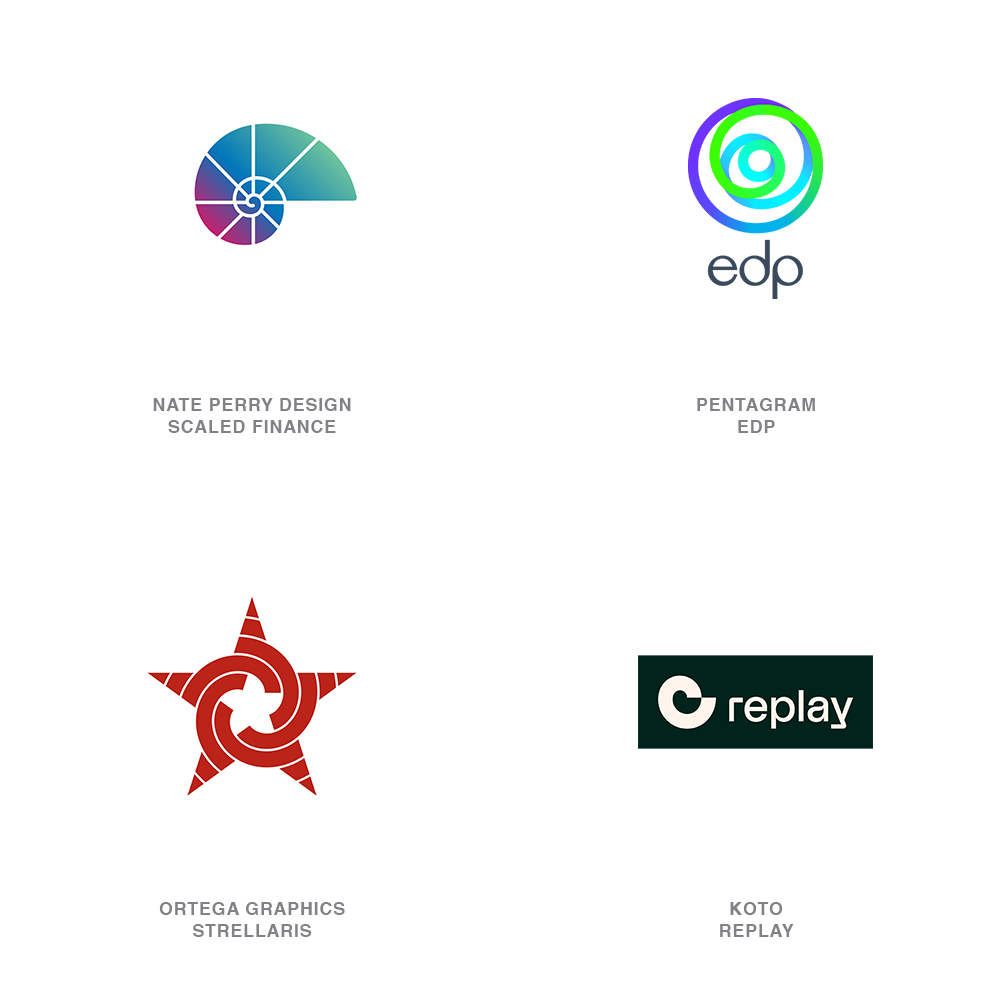
06 | Logo Trend
Spirals
The year’s 1170 and Leonardo, a young boy from Italy, visits Algeria and returns writing a treatise on Arabic math.
Europe embraces 1-2-3-4-5 instead of the Roman numeral system the continent had been laboring under. Way to go Leo. He also formulates a numeric sequence revealing why a nautilus shell spirals and explaining a few thousand other mysteries of nature. Much of Europe called him “the traveler from Pisa.” His family name was Bonacci, but a historian in the 1800s called him Filius Bonacci or the “son of Bonacci.” Leonardo never heard this name, nor did he realize it would get abbreviated to who we know now as Fibonacci. The master mathematician who gifted us with the Fibonacci sequence. Trends and a history lesson…check that off the list.
Where the designer in us picks this story up is in just how essential this little equation of adding each number to the prior to obtain a sequence of 1, 1, 2, 3, 5, 8, 13, 21 and so on… plays out in design. Considering it defines the golden ratio and helps us understand nature from the atom to celestial bodies–we’re in good stead leaning on it to build a logo or two. The resulting spiral is most associated with the cross section of a nautilus shell. The pure simplicity of this shape derived from such a divine formula of nature allows it to fairly represent depth with simple beauty. Concepts as complex as Replay’s genomic sequencing or representing infinite sources of energy such as wind, for EDP, are easily achieved. You’re sure to earn bonus points from a client now able to work Fibonacci into their elevator pitch.
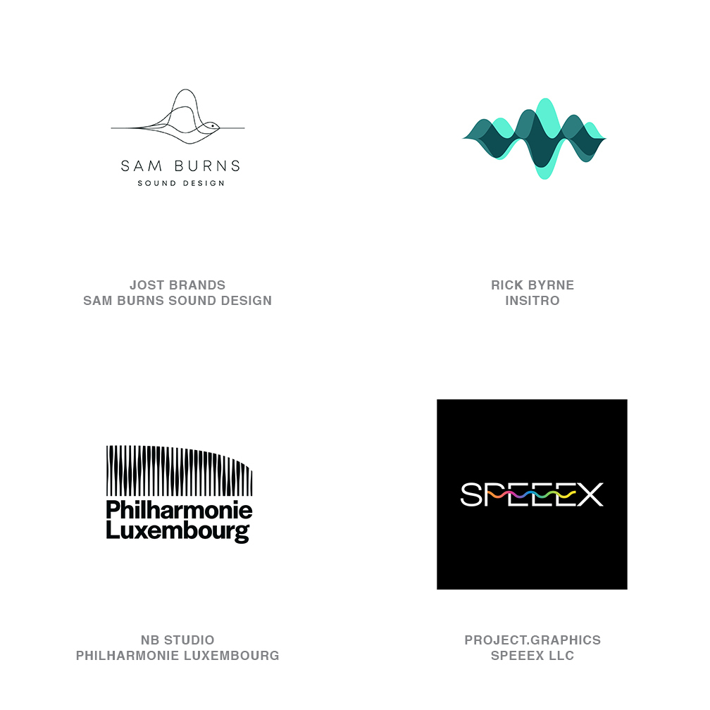
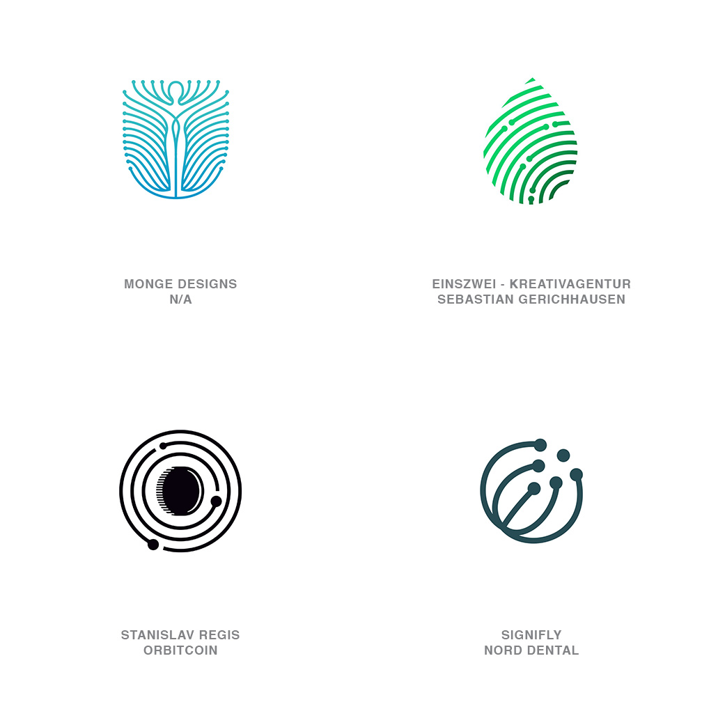
07 | Logo Trend
Sonics
Imagine standing there minding your own business and entirely without warning, something slams smack into you at Mach 1 speed.
That’s the speed of sound and you’re still able to survive. Sound hits us at 761 mph every moment of our lives yet those crucial sound waves are invisible to us until we give them that second thought. They can communicate, educate, fascinate, irritate, obliterate and just about all of those other -ates. But we can’t see them so when we try to demonstrate sound in a visible manner we tend to fall back on sine waves or the bars from an audio equalizer. These are all nice but still not what sound looks like. It’s merely a measurement of sound via a mathematical equation. (That tends to pull all the feel good out of a song.)
Leaning heavily toward these measuring devices appears to be the pathway for this trend. Considering the increasing role sound plays in marketing it’s no surprise designers are enlisting new ways of representation. Multiple whipping sine waves in fine line form are everywhere this year from logos to supporting fields of brand pattern. Scalability is still challenging but filling in the zone between wave lines is providing enough surface acreage for many of these to overcome that obstacle. Equalizer bars are rampant as well, and though not new they continue to manifest in new iterations. It’s reality that we cling to cliches because consumers can relate. Surely a fresh visual interpretation is only steps away but as they say, it’s tough to make the invisible visible!
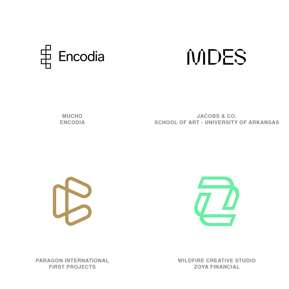
08 | Logo Trend
WireForms
I think the word misbehaving is a sorely misunderstood concept, and frankly it’s a badge many designers wear often and with great pride.
Possibly a better interpretation of misbehavior would be testing boundaries. Progress is often defined by pushing the known boundaries and that virtually is the definition of evolution. This trend is a manifestation of our digital tool kit and has designers grabbing and tugging bezel points on perfectly mundane solutions to stretch them into new dimensions. Or interpreted another way, redefining boundary lines. Encodia, a company involved in reimagining DNA processing, has taken the outline of an uppercase E and shifted its left face to the right two ticks. Presto! A reimagining of basic information.
These simple modifications of the outline of a starting point still leave behind a ghost of their former self to let the consumer see where they started in life. That tends to telegraph action or a process of metamorphosis to help illustrate a brand story. This trend was named WireForms as most of these marks are crafted in a monoline aesthetic allowing them to take on a dimensional quality as boundary lines are tugged across each other. That crossover is the signature of the trend and transforms a solid shape into a series of shapes tenuously tethered where the lines converge. Note the MDES mark also fits this family but is equally successful as a filled form. A fairly compelling solution for a client that fits the story and doesn’t mind testing the boundaries.
09 | Logo Trend
BallCaps
Over the last decade there’s probably been no more ubiquitous trend than the introduction and proliferation of monoline design and the variables spawned from this juggernaut.
The delight of the monoline aesthetic is its continued evolution as it reinvents itself with such speed that it’s turned from a one trick pony into a veritable stampede of diversity. For this trend you’ll notice each of these linear barbed lines have been capped with a ball tip. Obviously there to protect the overzealous consumer. Fortunately, these have evolved beyond the circuit board language often associated with the dot tipped line but it can be a cliché that’s hard to escape. There is an undeniable technical tone to these, but the ball is a destination or a starting point. It’s the objective that lets us signal finality. It’s the character we need to focus on, and the line is merely a pathway used to reach a conclusion.
Many of these use a dense field of repetitive linear elements such as the outstretched body and there’s little discrimination regarding whether a single or both ends of a line are capped. For those marks, the bulbous tips seem more of an intention to provide closure. Still another grouping uses more sparing linework and only caps a single end, giving the appearance of a contrail or tail following the dot to indicate direction and motion. Make note of the comparative scale, which tells us if we’re to focus on the dot as our subject or the line as our action.
10 | Logo Trend
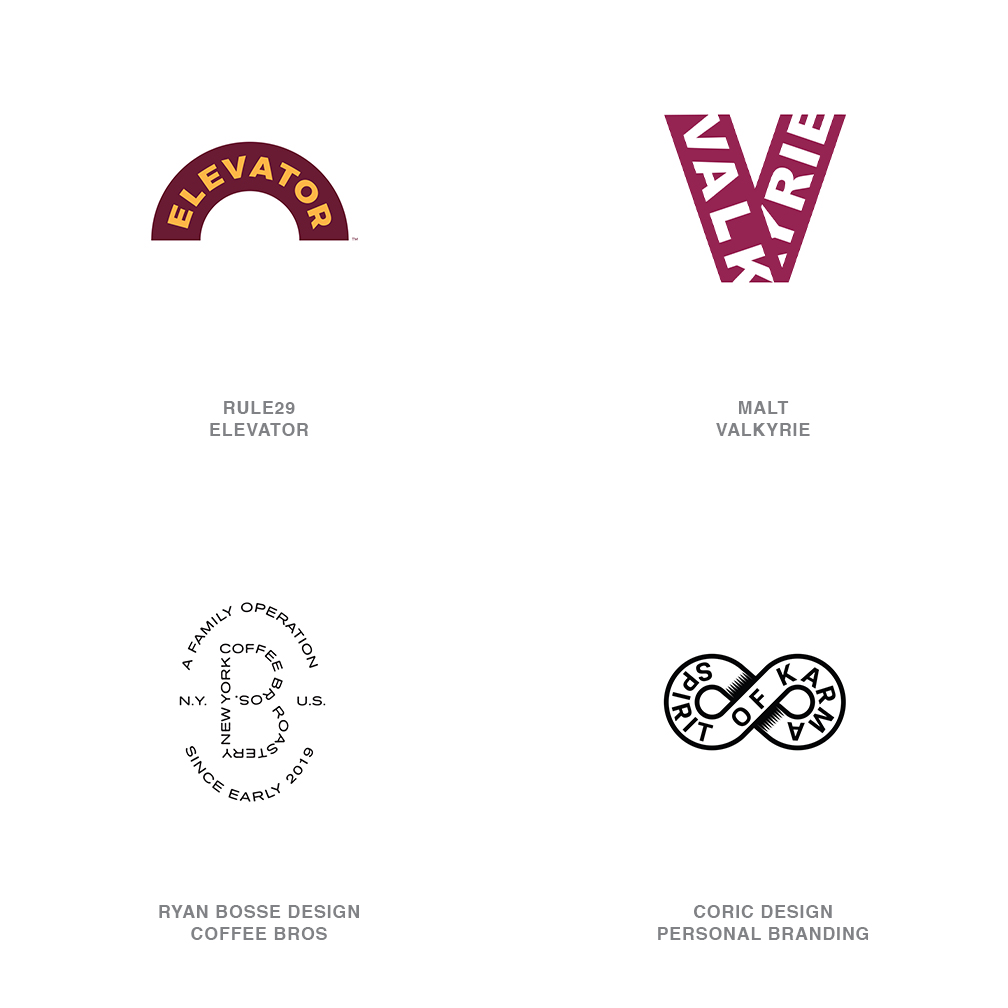
NameFills
This crop of trends throws a lifeline to designers of two minds.
The ones that love type but really want to crank out a symbol or maybe those with skills swinging just the opposite way. Why not do both? We register an abundance of words all crafting out shape and symbol but managed in a variety of iterations. Some like the Spirit of Karma embrace a simple illustration as the dish to serve up letters on. Neither the type nor the infinity symbol are strong on their own but the mash-up works great. By blending the symbol and name you avoid any need to consider a lockup as all the critical information is self-contained. A blessing for those that feel like the tag along with the wordmark is a nuisance to deal with or vice-versa.
Some of these have embraced elevated types and cleaned up their field of play. Latching onto the shape of an elevator floor indicator creates an ideal package to hold the same word. As well, Valkyrie neatly finds a home in the folded ribbon V. Both hold their own as a symbol or typographic mark. Then there’s always that spirit that sheds all inhibition and ventures out unencumbered. This mark for Coffee Brothers Roastery pulls off a badge with nothing but type and frankly I dig it. Then again, drop this on anything smaller than a venti cup and you’re asking a pre-caffeinated user to read some pretty fine print. Good range to roam within this trend of unadulterated yet well considered type, and simple shape messaging.
11 | Logo Trend
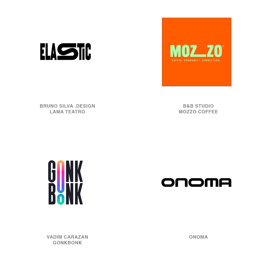
Stretchers
As much as I love a logo that’s a good solid little symbol that just tells a visual story and pops off the screen in a bold stroke or two and it pairs with a wordmark to support it… the tables are turning.
And when the focus is on a letterform to carry the message or brand story, it has to pick up the baggage the symbol might have carried for the team. Expression through symbolism in type has become more critical and designers are stretching themselves and the letterforms to prove it. It may be no more than extending a significant letter or the more unorthodox insertions of a stretched letter of a different mother. These efforts are ranging from demure tweaks, to HEY I’m over here and notice ME!
Onoma’s wordmark demonstrates another approach to this trend is taking a word with multiples of the same letter and modifying one of the pairs to avoid duplication. Note the letter O appears twice and they have varied widths. Letter modification within these marks are made with purpose and not just out for a stretch on a lark. They may represent a product or a process associated with the client and certainly anytime the cadence of standard text is broken our eyes are drawn to it like a train wreck. But in a good way. And on a closing thought, take comfort this stretching demonstration helps consumers recognize the difference between another word that strayed away from its headline and one that’s a fully pedigreed logo.
12 | Logo Trend
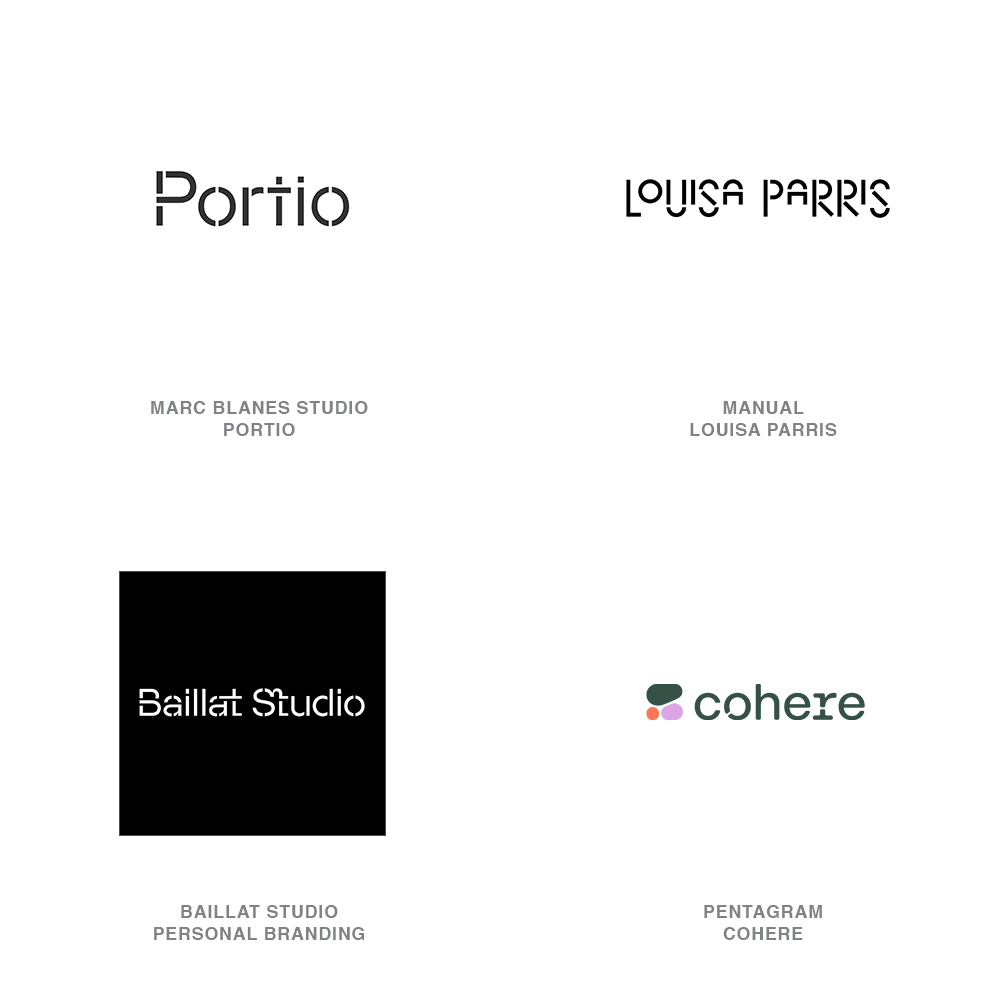
NeoStencil
Aside from the kid down the block with the stencil kit painting addresses on curbs for her side hustle, I’d never given them much thought.
They were a seventeenth century invention used primarily to paint liturgical passages inside houses of worship. With a little care the artist would come back and fill in the gaps left in the letterforms that had those floaters like O and A and P and D, R,Q…that’s a batch of cleanup! Those necessary gaps in the letterforms were kept to a minimum, unobtrusively in the same location on any font. For that matter the first printing fonts that emulated the stencil didn’t occur until the 1930s. Type on a press didn’t need breaks so why would they bother?
This trend is about breaking the rules we’ve taken for granted. As designers, we understand the vernacular and impressions these letters form in the consumer’s mind. Stencils are a visual shorthand for industry, construction, the common individual, and grass root efforts. This is still strong in the public’s associative vernacular. Note in this trend the designs have taken liberty with where and why letter breaks occur. Old precepts have been abandoned and though the symbolism remains the modified breaks are telling a new story and building visual traction. The visual branding of Cohere by Pentagram Partners is especially effective. A variable responsive font was built that adds or subtracts letter breaks reflecting the divisions of biological cells to reflect Cohere’s efforts. Just as well those early stencilers left their letter breaks, or we may never have gotten here.
13 | Logo Trend
HalfAster
Asterisks are still in contention for one of the most relied upon symbols in our design arsenal.
We brazenly incorporate or feature them in our logos in every imaginable iteration. There’s no set color or number of points, some meet in the middle and others don’t. They are thick and thin and friendly and sharp and transparent and frankly, there is an asterisk out there in every mood imaginable. It’s a ubiquitous actor because it has such a broad range. It indicates something deserves special attention or that it’s missing. It serves as a placeholder, as a burst of brilliance or as that button you get to use when a hashtag won’t cut it. And speaking of cutting it, designers have correctly observed that cutting an asterisk in half, doesn’t diminish its magical intensity in the least.
It’s fair to read this trend as both a special sparkle or burst of light as well as brandishing that captivating “look here and take note” that the asterisk was intended for. Its economical construction permits designers to modify stroke weights broadly in a design, making it an even more popular companion. Admittedly a few of the candidates falling into this trend could be half a twinkling star or half a sun but generally these are certified asterisks lopped in half to neatly snuggle up with another player critical to the brand story. It’s the sparkle that may be missing from a mundane product or the promise of radiance associated with its use. The word asterisk literally translates to “little star”--an apt description of this trend.
14 | Logo Trend
Double Os
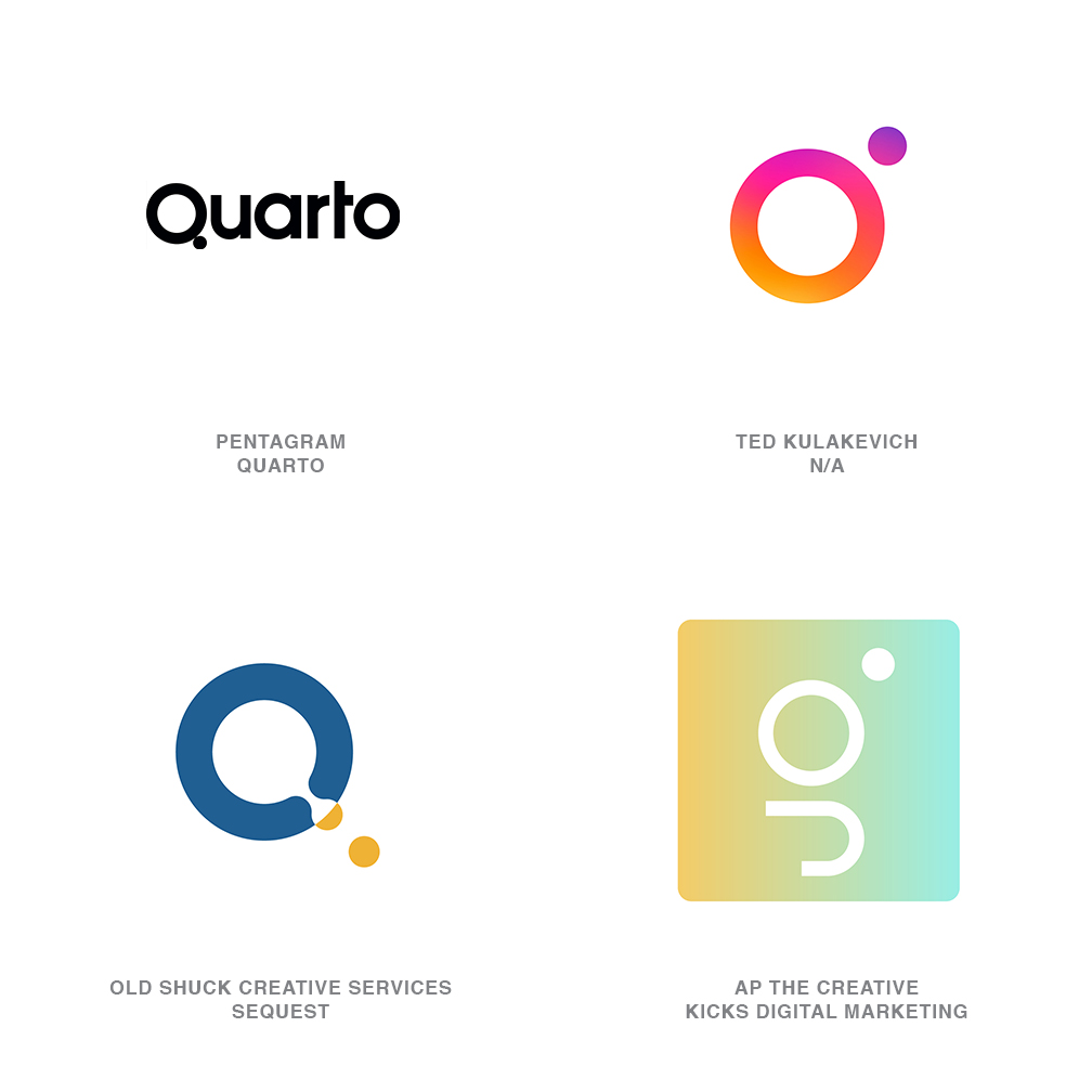
Orbs, balls, globes, planets, moons, and any other object of a spherical nature have a special gravitational attraction to designers.
And exactly who’s orbiting who may still be up for consideration. Double Os is really about relationships and not just terrestrial and lunar. It’s about relationships–good, bad, symbiotic, magnetic, emotional, amorous, subordinate and superior–that’s just enough to start this conversation. Each and every logo in this trend is challenging you to consider the correlation between a larger and a smaller circle. But that’s as simple as that relationship will ever be phrased. Designers resort to circles not just because they have so many symbolic meanings, which they do, but because they are a terrific conceptual place holder. They are that universal representative that will never make the consumer wince.
Circles just touching may represent a relationship of closer dependence, maybe a symbiotic benefit from their proximity. Quarto, a publishing group, focuses on the Q letterform with the tail of the letter represented by the smaller dot placed tangentially next to the larger circle like there is a magnetic connection that won’t release. Others in this category give the appearance of an orbiting sphere kept in check by the gravity of the dominant partner. Still others are merging or splitting away from the larger component in a cytokinetic action. Pairs of solid circles also populate this trend but that doesn’t seem to alter the symbolism. Surprising is the lack of examples rendered with dimension, but now that genie is out of the bottle, we’ll possibly visit that galaxy next year.
15 | Logo Trend
Ritz
Never underestimate the impact of popular culture or the snap of a good cracker.
There was seldom a time that a box of Ritz couldn’t be found at a family gathering or just hanging out in the back of a cupboard. The heritage of that little round guy with seven trademark holes dates back better than a century. There’s a comfort to the feel, the size, and the profile of the cracker that makes the consumer smile. That scalloped edge might remind us of the seal on that certificate we won or imply a warranty or an action of some official nature. Regardless, the eased, ruffled edge isn’t a harsh saw tooth and beckons us to touch.
Where this shape really comes into its own beyond a badge is as the inviting container to hold an iconic reference to your client. Or it could be the shape that emulates nature or fruit or a flower or the cross section of rigatoni or a churro. So much happiness to go around. This shape is so ingrained in our memory that just seeing a partial arc of the familiar ruffle still feels right. It can be technical, but approachability is the charm to this trend. Surprise, there’s no set number of scallops to an edge to join the club but you’ll know it when you see it. You my friend are allowed to incorporate as many or as few as you like, as long as it strikes the right chord in the consumer’s mind.
Follow the trends.
Logo design in your inbox. Subscribe to our monthly newsletter for the latest from LogoLounge.