In a time when so many social media consumers are feeling lukewarm about Facebook, it’s not surprising that most are also underwhelmed with the rebrand of the company as Meta. Manifesting through the rebrand announcement, CEO Mark Zuckerman indicated that in the metaverse, we will be immersed in rather than just observers of experiences, and that it be a change as significant as the creation of the internet.
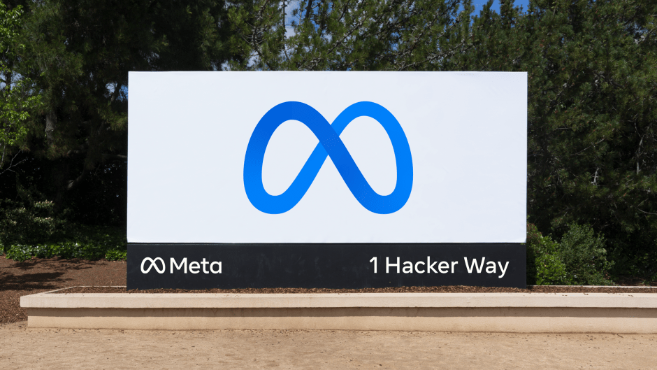
It’s heady stuff, which makes the new branding all the more tepid by comparison. The company’s blog notes that the infinity symbol visually represents the continuous loop between 2-D and 3-D worlds, it resembles an M for “Meta”, and also suggests “infinite horizons in the metaverse.”
Trouble is, it’s also a somewhat common symbol that does not communicate the excitement of the revolution. In an article on the website Quartz, LogoLounge founder Bill Gardner points out that in the current LogoLounge database, there are already nearly 1,200 logos that use the symbol, including one for a start-up called Metta. Use of the mobius was noted as a popular direction in the 2008 LogoLounge Trends report.
https://www.logolounge.com/articles/2008-logo-trends
From the Quartz article, “Because of its ubiquity, Gardner predicts that Meta’s version will likely be the one to stick in people’s minds in the near future, saying, ‘Facebook’s [Meta] team will consume all the oxygen in the room when they implement this, and few folks will remember that anyone else was there first.’”
https://qz.com/2081392/meta-the-reaction-to-facebooks-new-logo-and-brand-identity/