Trend-watching, until recently, has largely been an exercise in watching connections form between direct associations. Photoshop releases a new filter, and voila - entire raft of logos take on that effect. A particular illustration style is featured in a successful advertising campaign or movie, and in what seems like minutes, the flavor of that art starts to enhance corporate identities.
Periodically, something truly surprising and unexpected pops up. Finding those little treasures are one of the great perks of categorizing 27,000 logos, as LogoLounge and a talented panel of judges just did in preparation for our fourth book. But there’s always that natural undercurrent of influence that touches this design and that, a drift of scent, a faint change in air temperature. It’s there, but almost not.
This year, however, it seems as though there has been a change in the nature of trends themselves. Instead of a hub-to-spoke relationship in which trends fan out from a central source, prevailing tendencies in logo design now seem to send out long underground runners that poke through the dirt in unrelated, unexpected places, anywhere in the world. It’s harder and harder to trace the rhizomatous spread of ideas anymore - which truly is a good thing.
What follows are 15 trends that have indeed popped up all over the world. Overcasting them all are prevailing winds that are worth noting first:
- We saw less emphasis on sustainability or general "greenness" in logo design. There’s plenty of natural imagery, but being "green" doesn’t seem all that unique anymore.
- Colors are becoming more vivid. Desaturation has drained away, and the chroma factor pumped up.
- There’s an overall move toward cleanliness - in type, in line, in color - as if ideas are getting more and more succinct. It may be an indication of the degree of seriousness with which branding is now regarded.
- Less is more common: less calligraphy, less Photoshop tricks, less artificial highlights.
- Found pattern and illustration hang on and on and on. With a bottomless treasure chest of visual history constantly at the ready through retail collections and over the internet, it’s a direction that’s not likely to run its course soon, if ever.
And now, the trends. Please remember that they are gathered here to chart long-term movement or change, not to offer design suggestions. It’s a living history. The key is to study the trends, then evolve forward - as far forward as you can leap - from them.
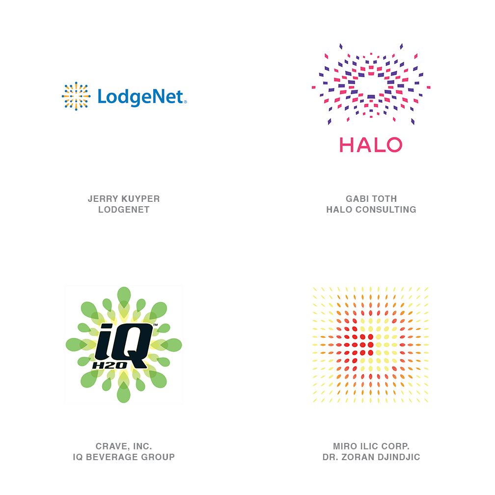
01 | Logo Trend
Supernova
These examples drive a field of elements toward or away from the viewer using a variety of methods. The LodgeNet logo (by Jerry Kuyper) advertises the company’s in-room movie service by flying a picture at you with a smart explosive technique. This blast is simple in construction and void of halftone - particularly interesting considering the product is an online commodity that could easily have justified overboard solutions replete with RGB trickery.
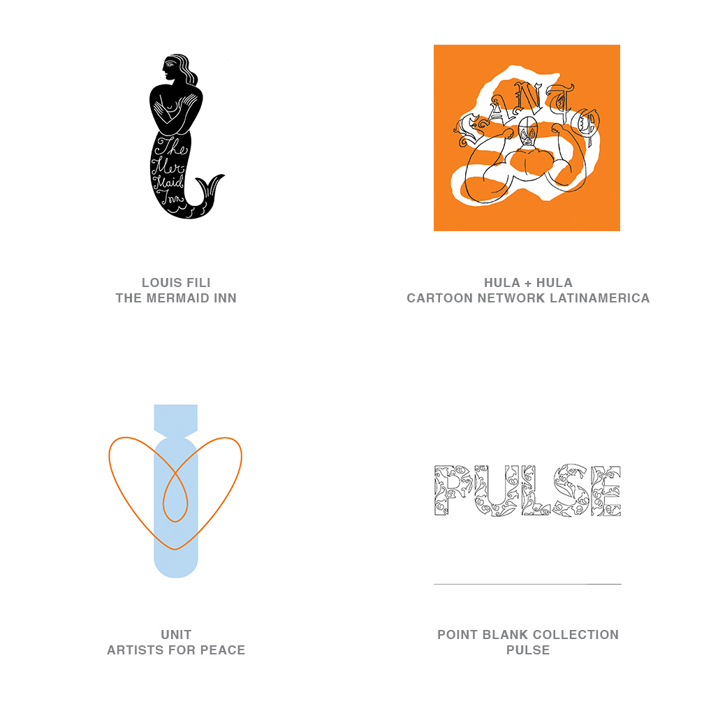
02 | Logo Trend
Fine Line
Consistency of line weight is one of the tenets of good logo design. It builds rhythm and ensures legibility at first glance. Forget this rule for this category. Turn your line weight down to hairline and start drawing. Most of these logos live on two levels: first glance, and then second glance, with reader glasses. Typically, a heavier image with message one serves as a background field. The more profound message two is generally encrypted over the top of or knocked out of the heavier image.
Fine strokes weights may read as no more than pattern initially, but they can also carry the dichotomy of a counter message. A variation on this is the use of linear art en masse to create enough weight to define a message as in the PULSE logo. This yin yang process tends to captivate the viewer and lends a sense of intelligence to a mark that doesn’t require a hammer to impart a subtle message.
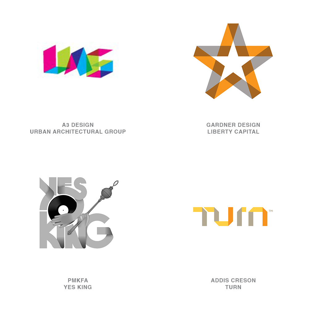
03 | Logo Trend
Foldover
Sometimes the simplicity of the folds takes on additional meaning when the substrates demonstrate unique properties. Note how the opposite side of the material changes to a different color at every fold in the TURN logo. Or see how transparency enforces the visual overlap of material. In some ways, this technique creates a bit of a puzzle effect. It engages the viewer as it tempts them into tracing out the path of the mark or trying to determine if the folds could really occur as offered.
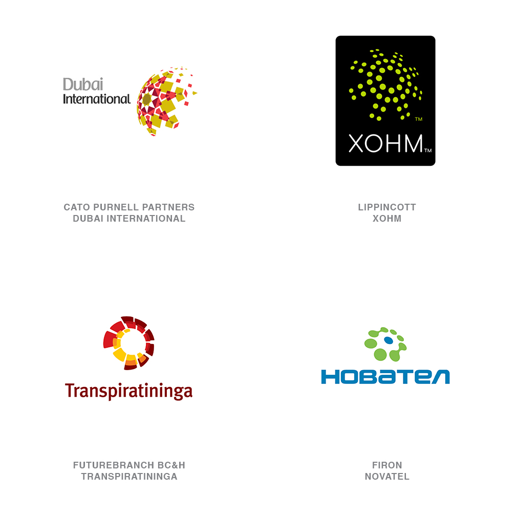
04 | Logo Trend
Global Expansions
What a refreshing outlook this trend presents. Time was that any company involved in international commerce gave some passing consideration to a globe as their logo. It’s a solution that has become terribly challenging to address with an original perspective. These logos at least have the honesty to step back and say, "Hey, we may not be fully global yet, but give us time." All of these marks rely on a centric pattern that diminishes at the edge and then warps out to wrap the sphere in symbolic expansion.
Cato Purnell Partner’s diverse group of solutions for Dubai Airport succinctly communicates a key message. Commerce, travel, and tourism have made Dubai a true crossroad for international travelers, and this world-class logo has found a unique way to express the point. Using the Islamic sacred symbol of an octagram, or eight-pointed star, the logo starts to envelope the global sphere with its spreading tile mosaic. The dissemination of a culture is no accidental message in this mark.
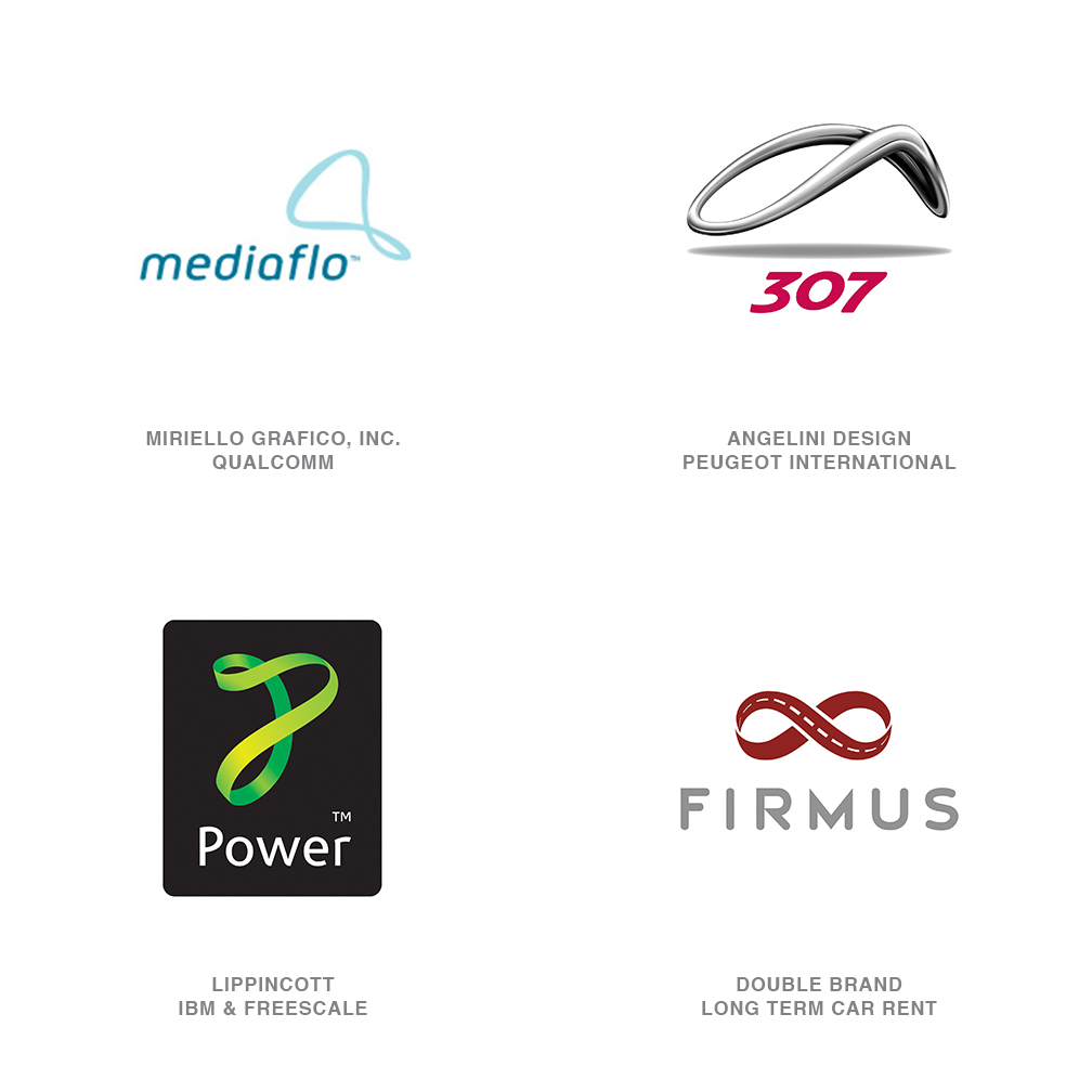
05 | Logo Trend
Loops
Continuous bands, yes, but not all of these marks have that certain mojo of the Mobius strip. Moving away from the universal sign of infinity, this group of logos seems to celebrate the flow of a closed cycle. No doubt more than a few rubber bands were called into action for their modeling services, but a ribbon-like figure was not mandatory.
There is something personal about the lack of perfect symmetry displayed here. The flexible nature of these logos signifies the ability to transform to meet the needs of the moment. Some appear to be snapshots of motion captured in a millisecond, of an object tense with energy.
The Peugeot 307 loop reflects the profile of that specific car but also seems to hover weightlessly above the ground. The chromed appearance of the mark takes on a surrealistic quality while conveying a certain technical prowess as well.
06 | Logo Trend
Jawbreakers
Anyone who’s ever torn up his or her mouth grazing on a jawbreaker or Gobstopper can attest to the concentric rainbow displayed on a perfect cross-section of the confection. There is a certain childhood joy associated with the perfect cleaving of these orbs that is akin to discovering hidden treasure. The 70’s op-art quality of these marks is accomplished with little regard for a reserved palette. Generally, brilliant color is a must and often cross-sections are as unique as Technicolor snowflakes.
There is a youthfulness to these logos that addresses a certain vitality in the market. You can’t help but smile at the visual joy they seem to capture. Influences could include Target’s inventive use of its own logo in marketing efforts, although the red and white of their mark seems sedate in comparison to examples shown here.
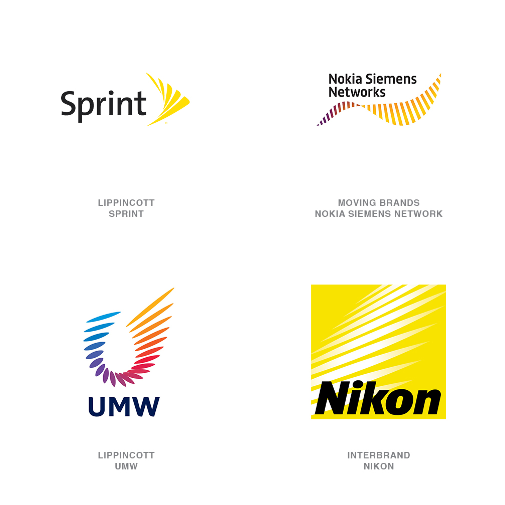
07 | Logo Trend
Strobe
The Nikon logo crafted by Interbrand some years ago may have signaled the introduction of this process with a major brand. Sprint’s adoption of Lippincott’s logo, a representation of the stop-motion animation of pin dropping, opened the gates for deeper exploration and solutions in a similar vein. Nokia Siemens’ new animated logo, created by Moving Brands, successfully plays out the strobe concept when adapted to print.
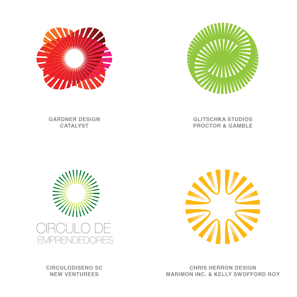
08 | Logo Trend
Nimbus
Dissemination of light or energy by the use of rays is far more than an astral aura. This indicates a central subject or capability and the prospect that it holds the key or the solution to whatever the question is. Light also connotes knowledge and guidance. Even distribution of these spokes ensures a fairness of distribution and equality of access. As a moth will attest, there is an attracting radiance to these logos, regardless of color.
09 | Logo Trend
Stitch
Houndstooth and herringbone aside, designers on more boutique projects are dipping into their grandmothers’ baskets of sundries and notions. This is often not as much about textile patterns as it is about the elements that hold a garment together. Zig zag, whip, and cross-stitch are a few of the strokes in the sewing arsenal. Bric-a-brac, fishnet, fringe, and tassels are also working their way into these solutions. This common language of mundane elements takes on a refreshing, often feminine beauty when layered together with great taste. Just remember that the difference between a tablecloth and a haute couture gown is not the material, but knowing what to do with it.
10 | Logo Trend
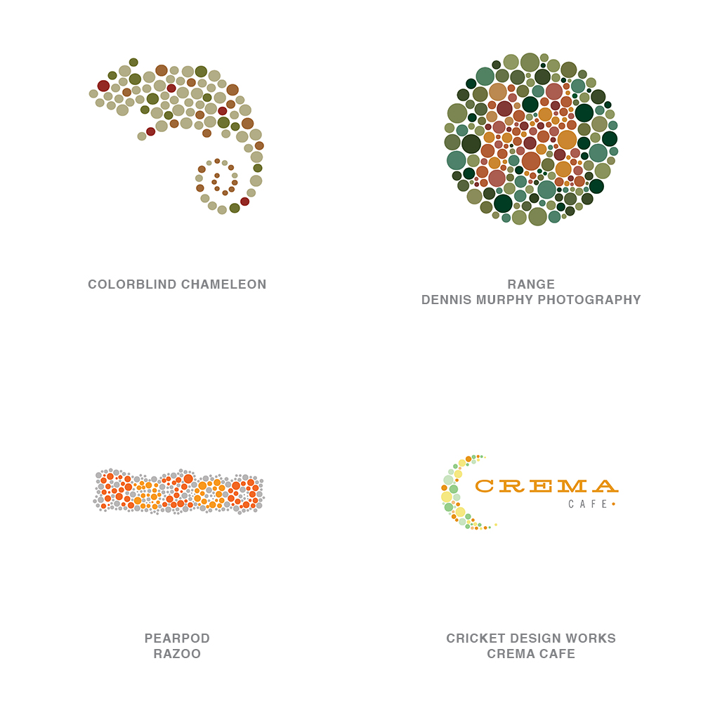
Colorblind
Sometimes clusters of a logo technique surface with little if any rationale. For this bracket, it’s as if National Geographic just reported the recent unearthing of a series of Ishihara color plates for color blind testing. The influence is obvious but the timing is unexplained. You have to admire the chutzpah of a client willing to adopt a logo that 7% of the male population and 0.4% of women won’t be able to understand.
Maybe this is exactly the point. These marks represent a quirkiness associated with entities that only a certain percent of the population will be able to really appreciate. Even for individuals without color blindness, these visuals can be a bit challenging to decipher. But that adds to their mystique and helps to build affinity for the logos when the viewer realizes he has passed the test. Either way, there is a joyful, reminiscent charm at work here - either that or this report is entirely wrong and these companies all sell Dippin’ Dots ice cream.
11 | Logo Trend
Amoeba
This process of morphing and motion give us a clue about the structure and processes of the businesses represented here. Flexibility and an agile nature allow businesses to adapt in mercurial industries. These are entities that embrace the value of evolution. If you’re evolving, chances are you’re a living organism, and there aren’t too many of those with corners.
12 | Logo Trend
Facets
To create the greatest value in a material as base as a stone, one has to first recognize potential worth. With exacting efforts, a trained eye can cut away the precise amount that will best maximize value. All of this is done with the looming specter of complete failure if the action is not correct. With great risk comes great reward.
These logos can also address the multifaceted nature of a business. By arranging these facets in their optimal positions you create the greatest clarity and light. Or maybe it’s not that deep and we just like bright and shiny things.
13 | Logo Trend
Doodles
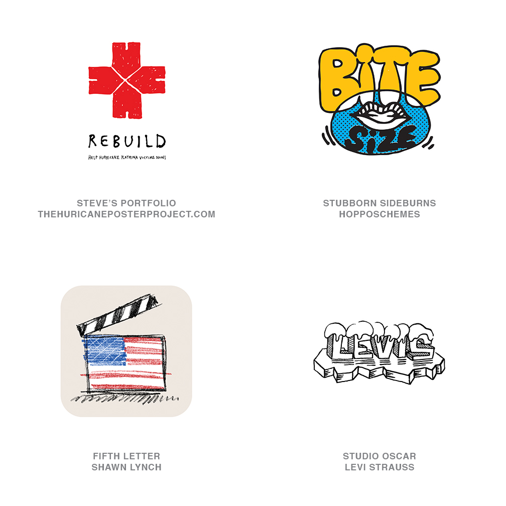
Immediacy is an important justifier for these marks as well. The Rebuild logo, developed after Hurricane Katrina sends the message, these people need your help now. There is no time to finesse a corporate solution to the problem here: We need the help and response of everyone, and we need it now.
Personal messages and a sense of humanity are associated with these marks. It is the assurance the middleman has been cut out, and that this message is between me and you and no one else.
14 | Logo Trend
Flourish
Credit the stunning work of Si Scott and the unbridled design of Marian Bantjes as primary influences on this work. Scott specifically has developed a signature look that is being emulated a bit too close for comfort, in some instances.
Decorative flourishes gone wild identify these entities: They give more than you anticipate and are conscious of the frills and excesses necessary to carry you to satisfaction. These designs are exoticand unexpected but with enough whimsy to avoid being overtly feminine.
15 | Logo Trend
Fibrous
A collective acting in unison to maximize action and create strength in numbers is at the heart of these logos. These are not lines in perfect step with one and other. Unlike the grooves of a record, these elements show a degree of independence and celebrate the diversity of the components as they unite.
Uniting elements for a common good has become a prevalent theme of late. This trend transcends the corporate world and is seen in social efforts as well. Respect of individuality and honor of uniqueness are admirable pursuits.
Minor Trends
Some categories emerged this year that did not qualify for their own lanes, but which are still worthy of mention.
 |
Animotion: What makes these designs unique is that they are designed to be in motion. They are not static designs that were juiced up later. Moving Brands for Swisscom |
 |
Braille Words: Imagine words, numbers, or letters formed out of Braille-like dots. Pearpod for Plus 3 |
 |
Stacks: These logos are like transparent sandwiches that have shape stacked upon shape upon shape. Bukka Design for Neven Vision |
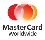 |
Contact Drop: If a contact lens dropped on top of a logo, you’d have the same effect that these logos have. They are generally lens- or circular in shape with a hard outer edge and a soft inner edge. Think of the Barrack Obama logo. FutureBrand for MasterCard Worldwide |
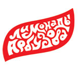 |
Psyche Type: If you want to know what is going to happen in any kind of design, look back to what was happening 30 years ago. It’s a never-ending merry-go-round of style. Witness the groovin’ psychedelic type treatments that are so popular today. It’s Haight-Ashbury all over again. Yaroslav Zheleznyakov for Lemonades from Arbuzov |
 |
Pathways: There are also plenty of motion lines to be seen, going up and down, back and forth, or around and around. These are like tracers — sometimes transparent like light, bouncing around or bending in space. The Tennis Australia logo is an excellent example. Where the ball goes, the logo goes. FutureBrand (UK) for Lakshmi N. Mittal |
 |
Warped: If you take a gridded piece of paper and start to fold or twist it, the printed grid will begin to conform to whatever motion you’re applying. But in this category of logos, the substrate is more pliable, more flexible than paper. There’s more give and stretch, so that lines on the x and y axis become contorted. thackway+mccord for FINRA |
Finally, it’s worth noting that there’s a reasonably reliable place to look every day for the very latest in logo design (in addition, to LogoLounge.com, that is): television promo graphics for any of the major "style" channels — Food Network, Discovery, HGTV, the Travel Channel, and more. Because they have the money and the ability to get work out there quickly, the channels tend to be progressive forecasters and trendsetters. And designers, just like the rest of the unwashed masses, are home on the couch, watching.
Follow the trends.
Logo design in your inbox. Subscribe to our monthly newsletter for the latest from LogoLounge.