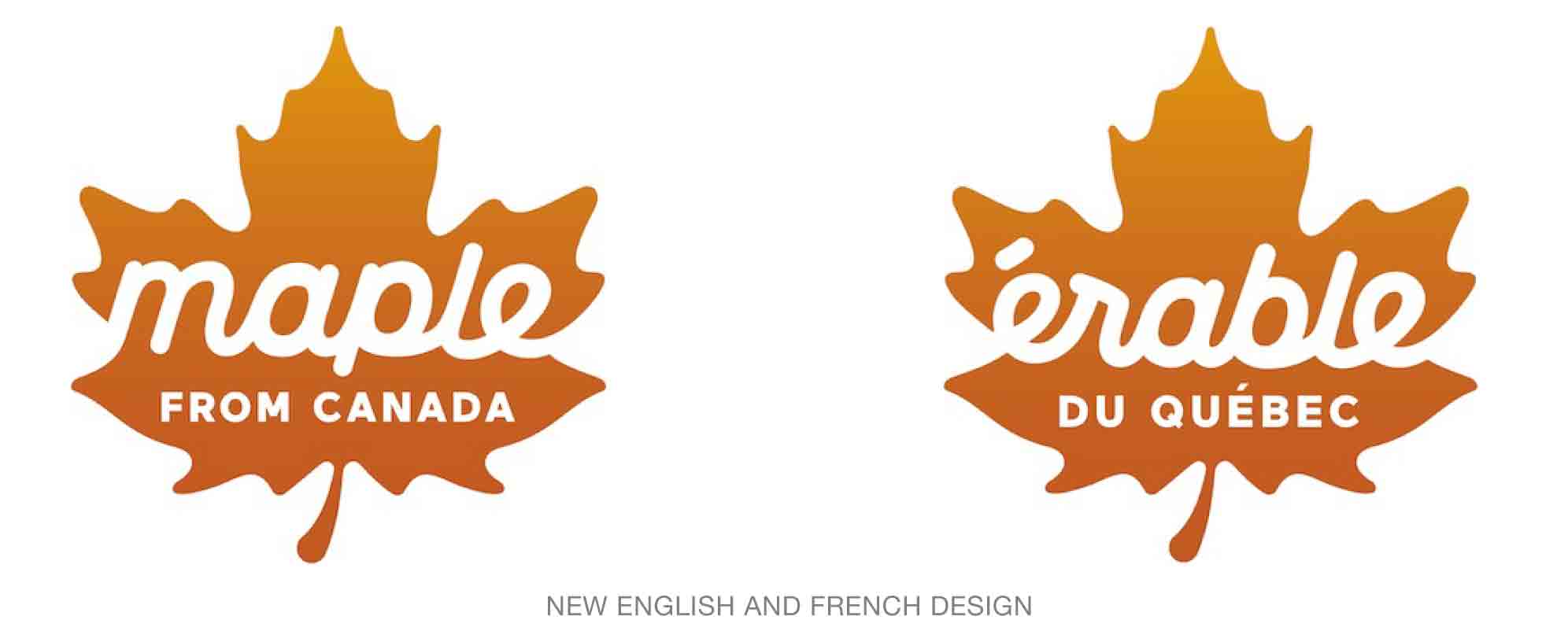
The simplicity of the Federation of Quebec Maple Syrup Producers’ new logo, created by KBS Montreal, is at one time charming and extremely professional.
First, although the use of a maple leaf can sometimes feels tired for Canadian identities, in this case and in a rich, gradated maple color—representing the different grades available, golden, amber, dark, and very dark—feels just right. Second, the design works well in French and in English. And finally, the cursive font and rounded leaf shape suggest the thick, fluid nature of the product.


The new mark is a significant improvement over the old logo’s lock-up and logo, both of which looked extremely dated and in no way well-represented the 7,300 maple businesses in Quebec that produce 72 percent of the world’s maple syrup.
Read more behind the new look here.