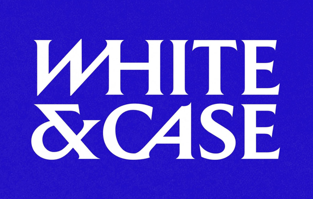
• White & Case is a 125-year-old global law firm known for helping clients with international arbitration, cross-border mergers and acquisitions, capital markets, and project finance. Uncommon Creative Studio worked with White & Case to create a new identity that was inspired by the complexity of the client’s work.
The new logo looks as though it might have been carved in stone, but it is decidedly modern—especially for a law firm. Its energy and forward motion of the design projects boldness, strength, and solidity. Uncommon also created an “activated ampersand” that serves as standalone icon that has this same old/new dichotomy.

https://www.creativereview.co.uk/white-and-case-rebrand-uncommon-creative-studio
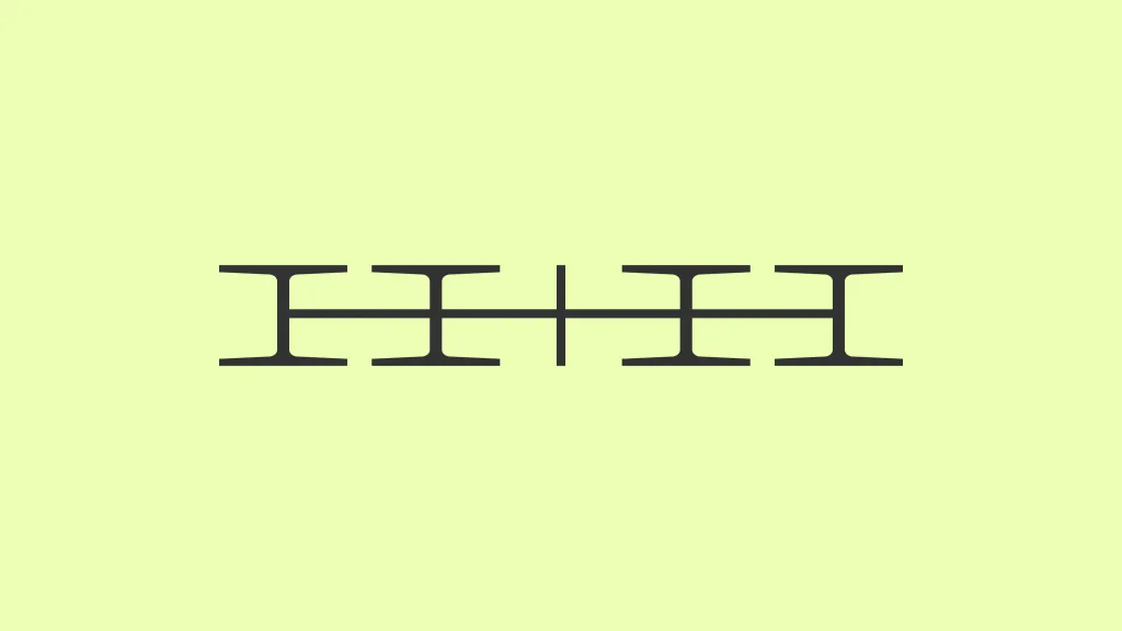
• Design firm How&How is now how+how. Founder Cat How explains the update: “For six years we’ve told clients that turning up your truth is the only way to be original. This was our chance to take our own advice, and to build a brand as ambitious as the teams and clients we work with.”
The new mark has a mid-century modern feel: Its elongated, abstract, dazzley shape demonstrates the intentional choice to be different. But further study reveals solid legibility—just two letters and a plus sign, crossbar-connected into an elegant monogram.