P.A.C. began as a small bakery in São Paulo, Brazil, but it has grown into a much larger operation and space since. Design firm Polar—which is a neighbor to the bakery—has created an identity system for the client that allows it to grow and flex as needed as it evolves.
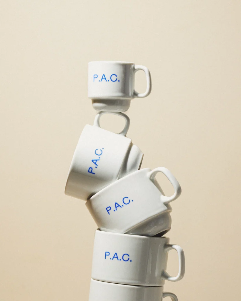
At the center of the system is an extremely spare wordmark—simply P.A.C. The designers felt that this already-distinctive name, just in its typed-out form, created its own ownable shape and design. It has an unfinished feel, wholly appropriate for a craft bakery whose business it is to be creative in the products it offers. The food itself, placed in or on bags and dishes adorned with the logo, provide an every-changing gallery of “art” for customers to enjoy.
https://www.itsnicethat.com/articles/polar-pac-graphic-design-project-041126