Americares, a 40-year-old organization that helps those suffering from poverty and disasters in the United States and abroad, has a new identity created by New York City-based Harley & Company and Americares’ in-house marketing department.
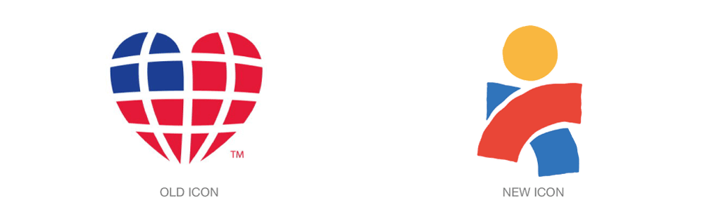
The new design is greatly simplified from the original design, whose wordmark was easily confounded by its ability to be reproduced—and thereby diluted—by any Times Roman-like typeface a person might have handy. Gone, too, is the clumsy capital C at the center of the name: an all-lowercase approach is both more legible and friendly. The handmade feel of its bespoke typeface and icon communicate the human touch that is at the center of everything the organization does.

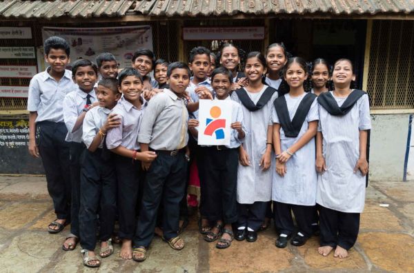
Red and blue carry over from the old design, but gone is the flag-like heart that clearly spoke of the United States. In its place is an open-armed figure, stepping forward, signaling a shift toward a more global presence. Americares now works in more than 90 countries each year, providing medical supplies, rebuilding health centers, and supporting rural health care.
To learn more about Americares, simply click here.