The name of the Swedish hotel Ett Hem translates to “a home.” Studio Firth has managed all aspects of the hotel’s visual identity since 2010, all the while keeping “home” at the center of its concept.
Ett Hem is an unusual hotel in that guests are encouraged to make the space their home away from home: stretch out on the sofa, relax in the dining room with friends and pets, hang out in the kitchen, or enjoy a nap in the garden.
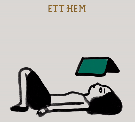
Studio Firth focused on the authenticity of the place—its warm and welcoming attitude as well as the Swedish arts and crafts architecture of its building. They created a new typeface based on traditional Swedish letterforms. The identity is complemented by charming pen-and-ink illustrations created by Iris de Moüy and thought-provoking photos and short films by Polly Brown. Together, these elements exude the sense of warmth and sophistication that is Ett Hem.
https://www.itsnicethat.com/articles/studio-frith-ett-hem-illustration-graphic-design-project-180124