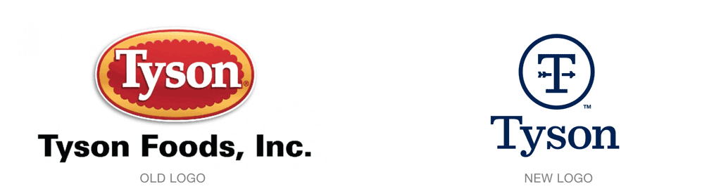
Tyson Foods has updated its corporate logo with the help of Brand Union. The new design marks a distinct break from the company’s predominately yellow consumer identity, which appears (at this writing) to remain unchanged.
The new identity is crisp and simple, with the suggestion of a weather vane, a long-time symbol of American farming, at its center.
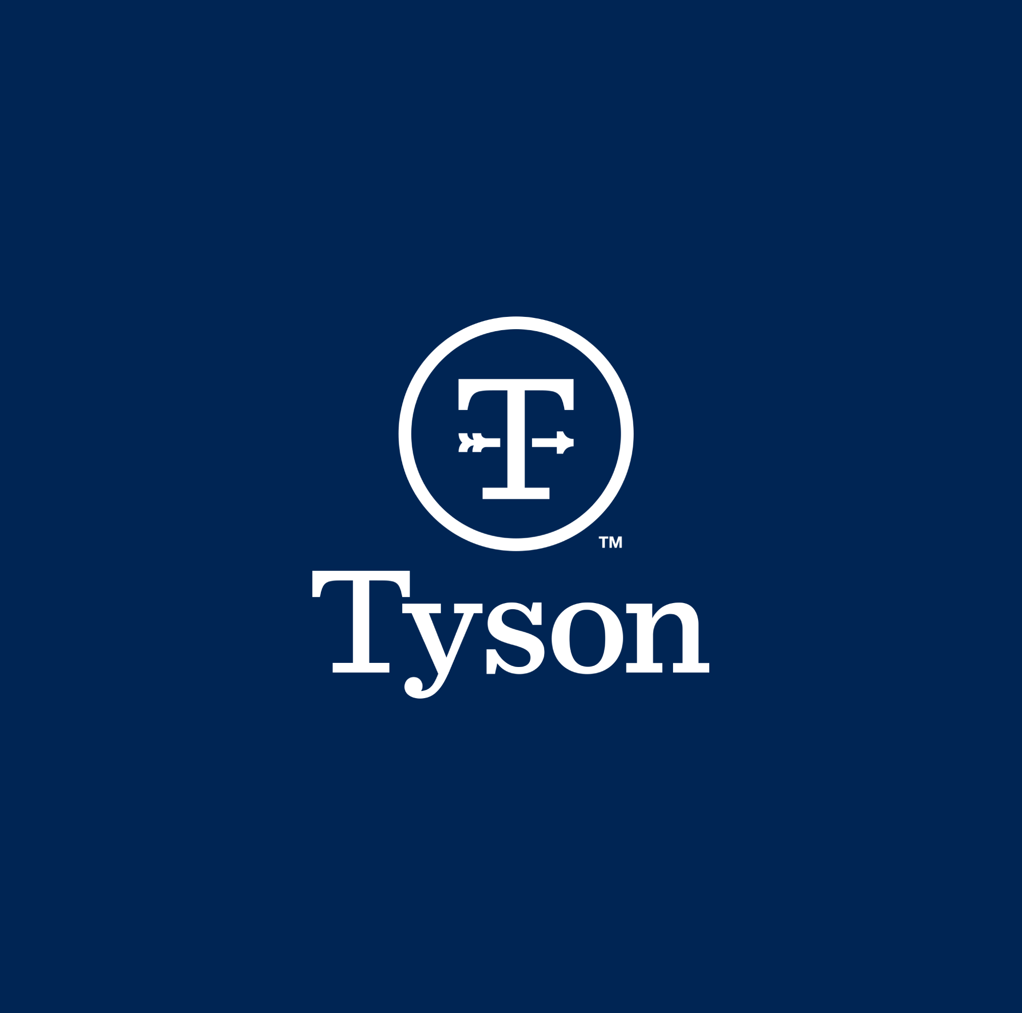
“The weathervane is a farmer’s compass, but it’s also the compass for our innovation,” Tyson president and CEO Tom Hayes said at a recent presentation.
View a complete history of Tyson’s corporate identity here.