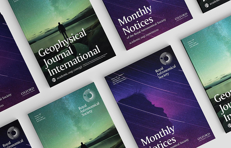
“Let whatever shines be observed”: the Royal Astronomical Society’s motto for the past 200 years still feels aspirational and inspirational. However, the organization’s original logo, designed two centuries ago, was neither: it was too complicated and did not reproduce well on screens or in smaller applications. Johnson Banks has created a new identity system that better reflects the society’s status as a leader in astronomical education and study.
![]()
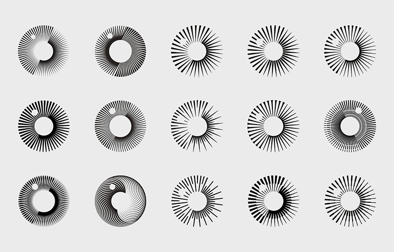
From the Johnson Banks website: “Their new symbol takes its inspiration from several sources: the Society’s motto ‘Let whatever shines be observed’; the vision and discovery that characterizes two centuries of study; and its work with both astronomers and geophysicists.
“Stepped spokes are repeated and rotated to form a symbol that can be interpreted in multiple ways—a stylized eye or planet with an orbiting moon—reflecting the many different sides of the Society’s work. It is also turned 23.5 degrees to reflect the Earth’s angle of tilt from the plane of its orbit around the sun.”
Colors used in the new system suggest the colors of Earth and sky. In a nod to the society’s significant history, the J-B designers also created a highly simplified version of the original logo to be used on certificates and medals.
https://www.johnsonbanks.co.uk/work/royal-astronomical-society
![]()