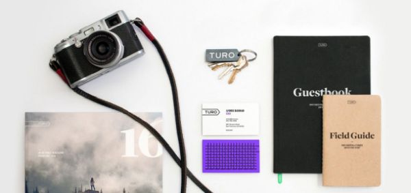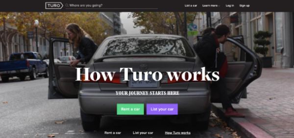
DesignStudio has reintroduced the car-sharing service RelayRides as Turo, complete with a brand story of life on the road that is hard to resist. The company enables car owners to rent out vehicles that otherwise would just be sitting to travellers who are looking for a way to get to their next adventure.

DesignStudio's new identity brings that sense of adventure forward, injecting a new angle into the normally staid car rental industry. Its basic arrow- or street sign-shaped logo is an easy icon to recognize and understand: the shape is already so much a part of the travel environment. Color use is minimal, as the designers wanted the rented vehicles and adventure destinations to supply that.

The designers say their type selections have a more refined, editorial tone, a sensibility that is carried forward in a brand film and even what could be a growing library of on-line travel journals, submitted by happy customers.
See more here.