Tia presents a new model of health care for women, offering a one-stop shop that includes reproductive health, primary care, mental health, and wellness services. The organization has grown from a chat app to a group that offers in-person plus virtual services. It needed an updated visual identity that reflected its growth.
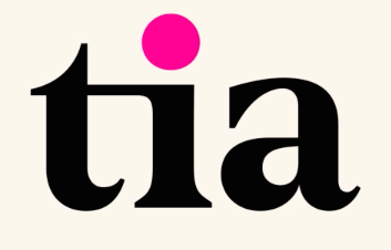
Athletics created a new identity for Tia that not only reflected that expansion but also appealed to a proliferating and more diverse clientele. The new logo uses friendlier and more cohesive lowercase letters and preserves the “Tia pink” dot, an element that is used throughout the system. That bright pink is complemented with a warm palette that includes cream, terra cotta, poppy, and raspberry. A tertiary palette of pistachio, gold, white, and black provides contrast and accents.
A curving, undulating line, representing the changing nature of health, is constant element of the new identity. Photos of real women’s bodies populate the system, truly personalizing the identity experience.