Latroupe’s identity was created to attract a new sort of backpacker: an older traveler with more money but who still craves the community of the hostel experience. It was also meant to appeal to the scores of working nomads unleashed from offices by the pandemic as well as to young families looking for an affordable but quality lodging experience.
Saffron created Latroupe’s name and its visual spirit. The hostel chain wanted to communicate a sense of community while at the same time celebrating individualism. In fact, the new brand is built on the coda “unity in diversity.” From the Saffron website, “The concept was eclectic enough to ensure everyone at Latroupe feels a trouper, from travelers to local visitors, from front-desk staff to business partners.”
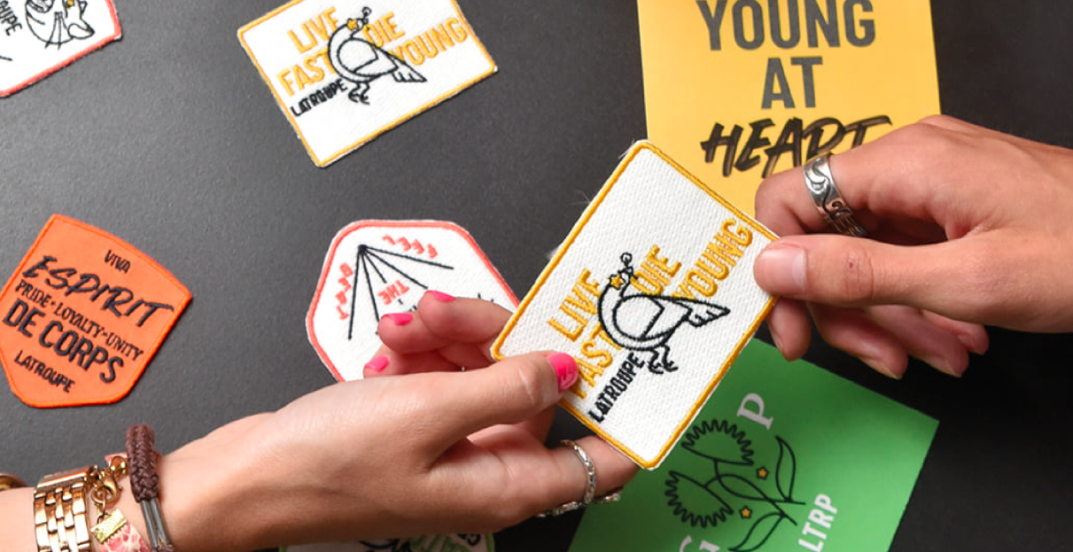
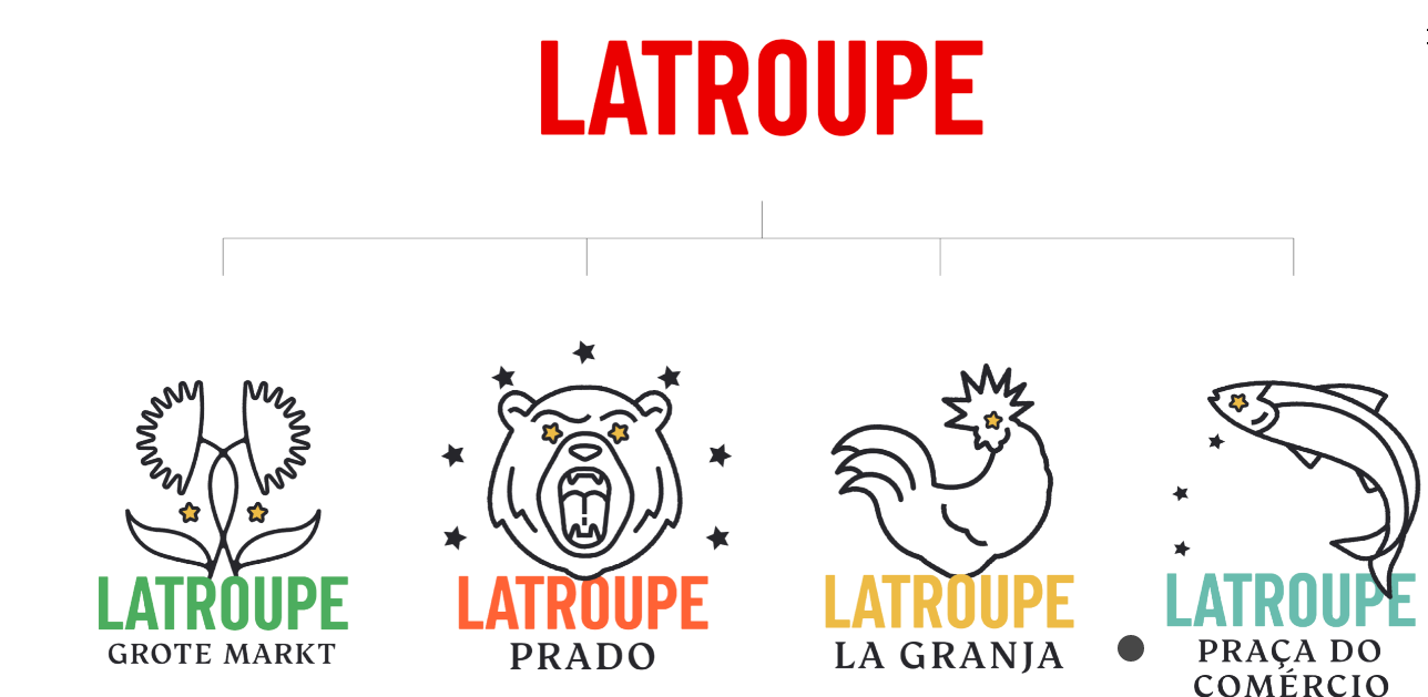
Latroupe’s core wordmark is reused in location-specific sub-identities. Other aspects such as a passport and collectible embroidered patches all promote a sense of affiliation for staff and guests alike.