BrandOpus has given the 150-year-old Swedish coffee brand Gevalia a brand update that focuses on a consumer’s senses, not on the company’s product. “Awaken your sense” is at the center of the new identity.
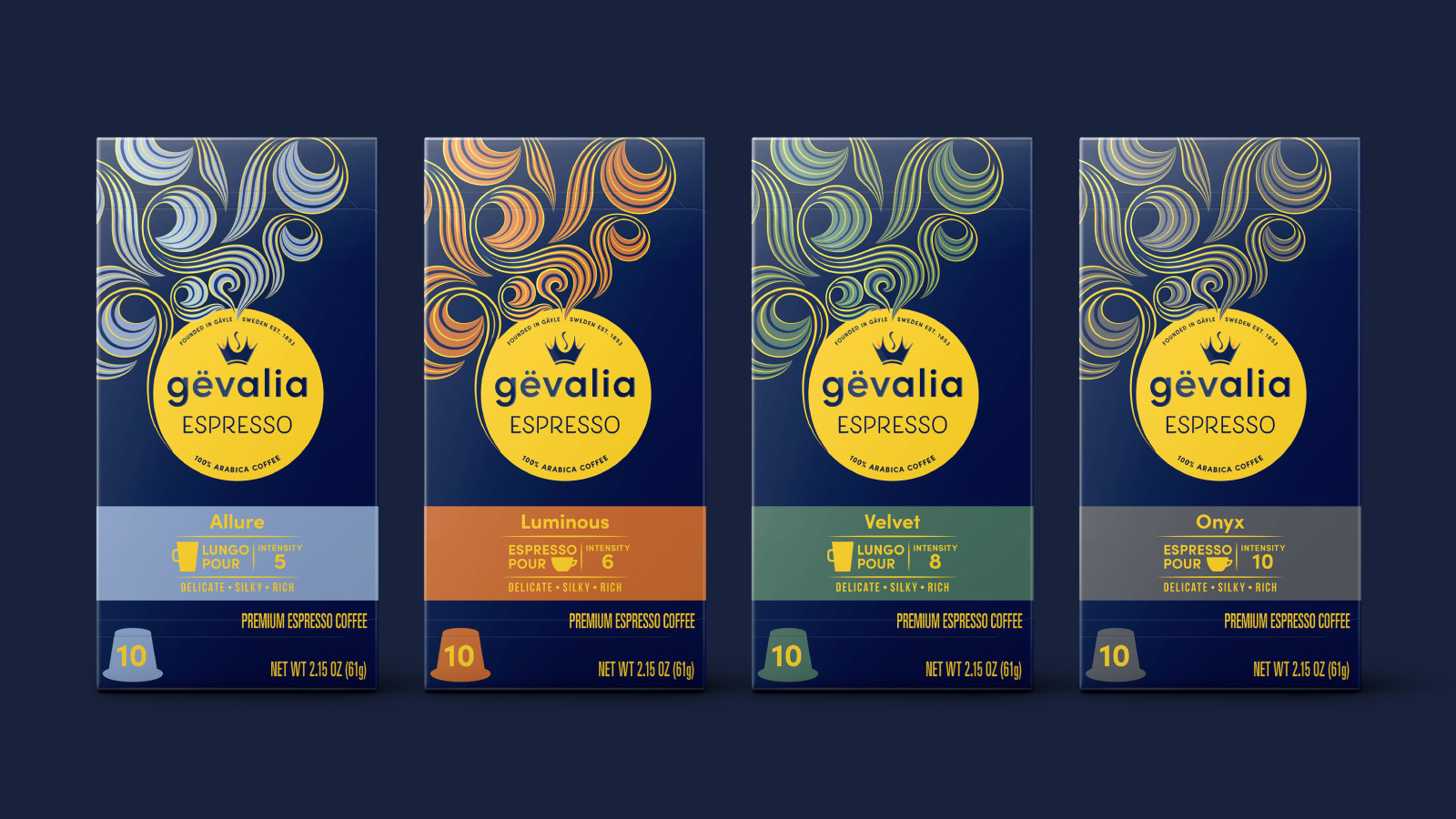
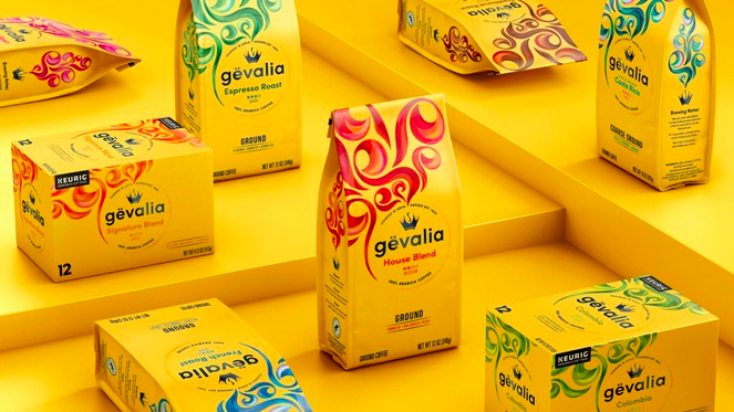
Intricately colored swirls on the packaging suggest the product’s aromatic experience. Product categories are color-coded for easy ID on store shelves, but the brand’s original yellow packaging has been kept.
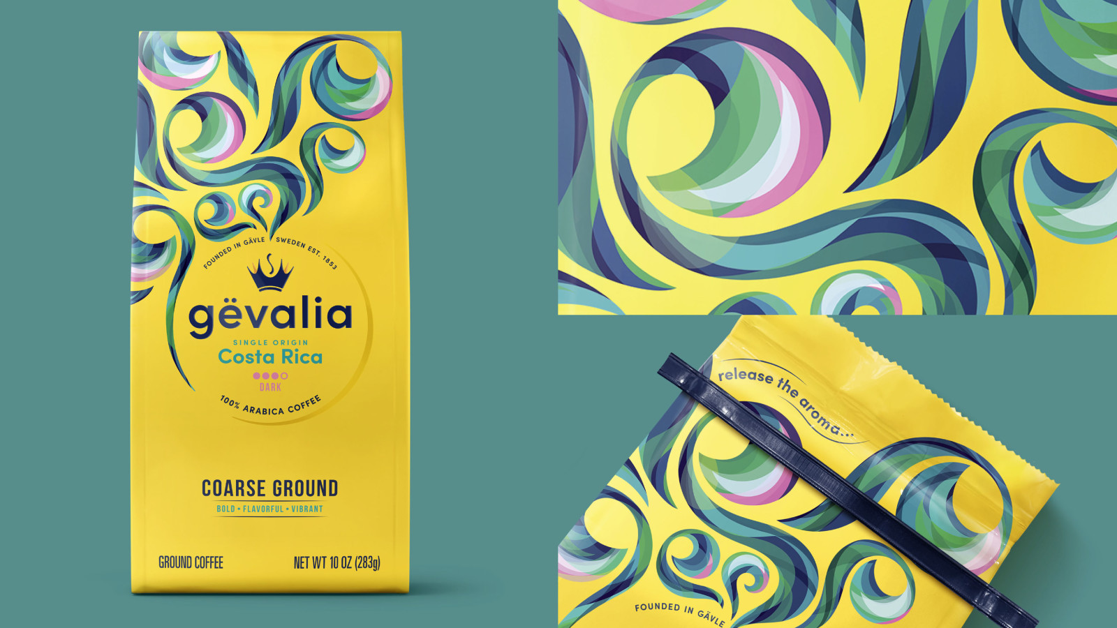
The brand name is now written as “gëvalia,” to aid in the pronunciation of the soft “g.” A new crown logo is, like the colorful swirls, more expressive and relaxed. The new crown is almost like a cup of coffee, with its own aromatic swirl.