The UK business watchdog organization Raid used to have an identity that was little more than its name spelled out in all caps. Its old logo said very little about the group’s tenacious work or its strapline, “Holding business to account. Standing up for human rights.”
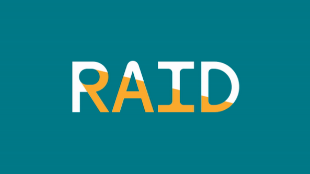
Design firm Templo has created a new identity for the group that does much more. Templo selected the face Dinamo Maxi for the project and installed a spotlight into the counter of the capital letter R. That spotlight shines out of the counter and across the other letters, symbolizing Raid’s focus on wrongdoing and finding justice. Any word that contains an R, such as “corruption,” “rights,” or other terms Raid uses frequently, can include the spotlighted-R.

The spotlight can also be used as part of illustrations; it shape also serves as a container/frame for illustrations, photos, and text in website and print designs. Finally, a saturated teal blue—which speaks both of darkness and of truth—serves as an excellent backdrop for accent colors orange and white.
https://www.itsnicethat.com/news/templo-raid-graphic-design-050224