Kirkland Urban, a mixed-use development northeast of Seattle, has a new identity created by design agency People People. The site has been under construction since 2019, so the identity needed to communicate progress and excitement to local citizens.
A survey of nearby residents informed the designers that local priorities included a welcoming environment with shopping, dining, and gathering spaces. Because the development was taking so long, a sense of completion was also important. The designers created a set of colorful, building block-like shapes that suggested different sorts of spaces being assembled into a whole.
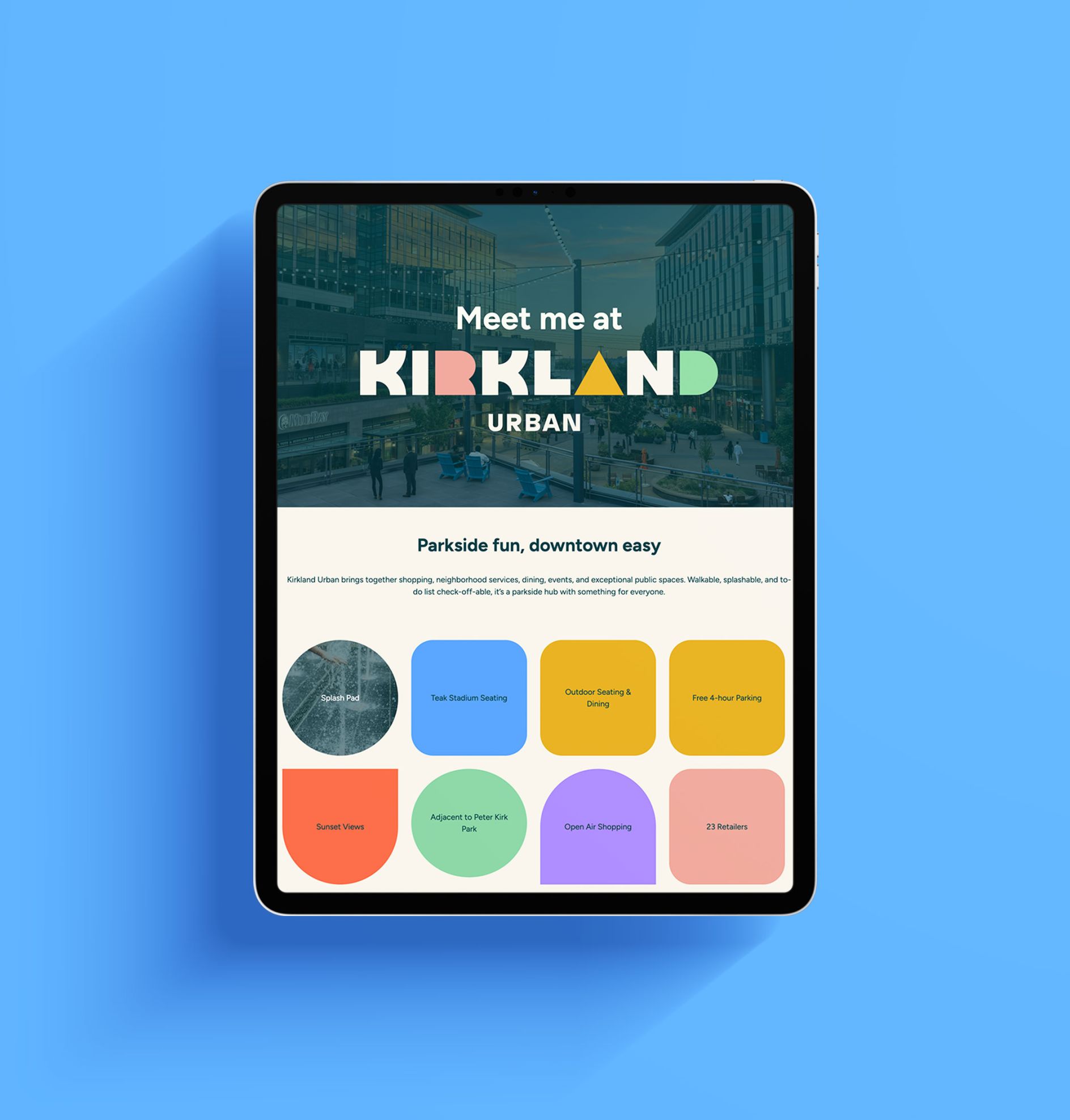
A recent Creative Boom article explains more. “Modular, block-like supporting graphics can be used on their own or paired together to form eye-catching patterns. The colour palette features an inviting combination of warm and cool hues, including grounding teal, mint green, electric blue, violet, vermillion, bright ochre, and salmon. Over 100 window graphics in these forms and hues are installed around the project site.”
https://www.creativeboom.com/inspiration/kirkland-urban-rebrand/