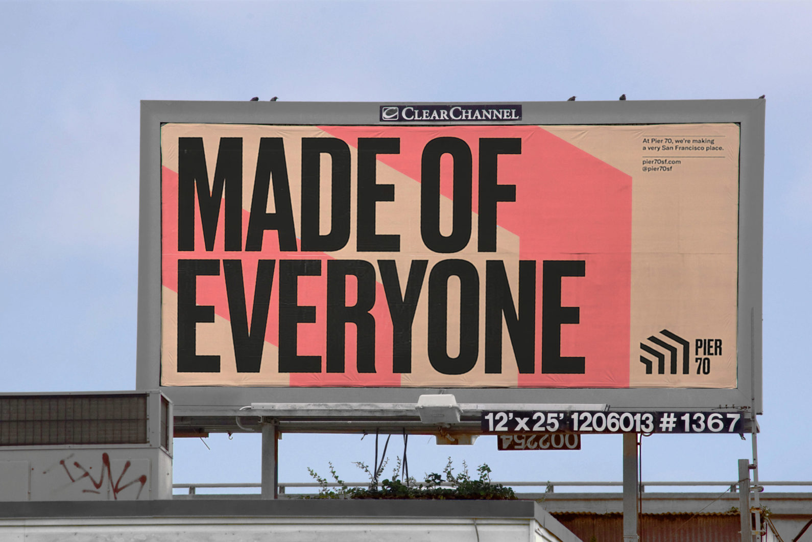
The design firm dn&co has created a new identity for San Francisco’s historic Pier 70, a property that is part of a 15-year regeneration project meant to transform what used to be an industrial and ship-building area into a cultural and creative center.
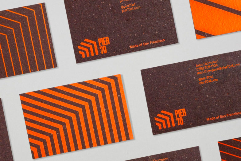
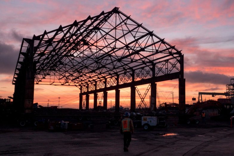
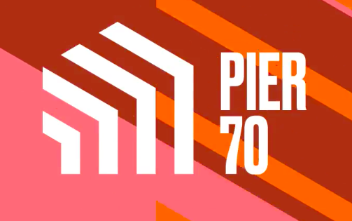
The designers built their design concept on the geometry of the 50-foot steel frame that now serves as a gateway to the redevelopment. They combined industrial brown and gray with bright orange, blue, and pink, representing the property’s industrial history and projected energetic future. The angularity and boldness of the identity’s graphics and typefaces also speak strongly of the site’s origins.
From the dn&co website: “In a city going through fierce debates about the loss of its identity, we created a brand that looked at the key ingredients that have always made San Francisco great: creativity, openness and its relationship to the Bay. The identity for Pier 70—a former shipyard set to become a vibrant living and working neighborhood—signals a powerful renaissance of the city’s industrial roots with a bold and distinctive visual language that’s a love letter to San Francisco.”