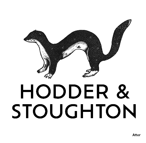
Despite a founding date in 1868, British publishing house Hodder & Stoughton has apparently long suffered from an identity problem: the public doesn’t know how to pronounce its name. Hodder art director Alasdair Oliver and freelance illustrator Jonathan Ashworth have created a new “stoat on” logo that helps customers to visually read the name properly.
Katie Espiner, CEO of Hodder & Stoughton, explains why the new design works for the company. “Above all, our stoat stands for clarity. Clarity in who, how and what we publish, clarity in how we bring expertise, specialist knowledge and first-class market awareness to our publications, and clarity in who we are,” she says.
https://www.thebookseller.com/news/hodder--stoughton-unveils-fresh-branding-and-logo