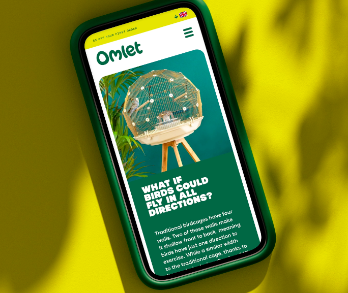
Pet product company Omlet takes a different direction than its competitors: instead of projecting human preferences onto its products, it prioritizes what pets prefer, be it in design, flavor, or use. The company has long been known for a sense of whimsy in its offerings, and now Ragged Edge has created an identity that matches that level of fun.
With its colorful 3D sculpted and sometimes animated characters, the new branding brings to life a whole new world to consider: how animals interact with everything in their lives. Accompanying typefaces match the energy and healthy solidness of the animal characters.
The wordmark itself contains a few nods to the animals that Omlet serves. The O in the design is distinctly egg-shaped—Omlet does sell many chicken, duck, and quail products—while the “m” is shaped like a set of perked-up ears or perhaps a turned-up beak.