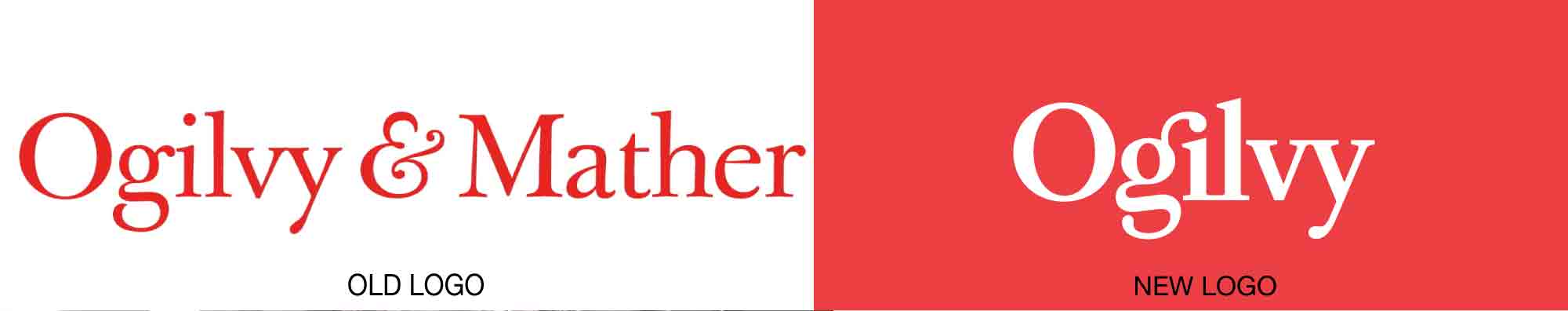
Ogilvy has done away with the Mather, as well as with OgilvyOne, Ogilvy Public Relations, and other family agencies, in a rebrand that will unite 450 offices in 120 countries under one cozy umbrella. The 70-year-old WPP-owned company did not stray far from its traditions, sticking with red and a rendition of Baskerville—founder David Ogilvy’s favorite typeface—for its new wordmark.
From a company release: “To underline the new direction, Ogilvy’s red logo has been modified with a brighter Pantone and a secondary palette of gray, pink, blue and yellow has been added to emphasize the company’s desire to modernize, while maintaining, its strong heritage. The Ogilvy fonts have also been recut and customized as Ogilvy Serif and Ogilvy Sans.”
Read more details here.