Mention the brand name “Nokia,” and most people think of a budget cell phone, or even worse, they wonder if the company is still in business at all. Nokia, in addition to still making phones, is very involved in many different arenas of technology and is pushing forward to partner with even more. Lippincott, which has worked with the 157-year-old company for over 15 years, stepped in to help revamp the its identity and help it become better known as a gutsy B2B resource.
From the Lippincott website: “[Nokia is] pioneering the future where networks meet cloud to accelerate the impact of digital in every industry. We further articulated Nokia as a strategic collaborator and a distinctly human brand with a new purpose: ‘At Nokia, we create technology that helps the world act together.’ This purpose comes alive in a fresh new logo and visual identity, designed to signal change and help existing and prospective customers see Nokia in a new light.”
The old Nokia wordmark, last updated in 1978, came to have very dated look, sort of a “Back to the Future” or “Star Wars” flavor. In the new design, Lippincott abandons the square sans serif lettering, including the screen-shaped O, a definitely dated reference to desktop- and phone screen-based technology. The new O is wide-open, a window or conduit to the cloud and whatever else is next.
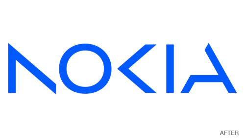
In the previous design, the letter K has a play button embedded in its shape. In the new wordmark, the designers preserve that arrow shape to represent the K and apply the same minimalist treatment to the N and A as well. The new lettering is so abstracted that the name actually only “reads” when all of the letters are used together. When used alone, the letters function well as graphics in the identity system.
The system’s new color palette is bright and broad, representing what the brand video calls the “kaleidoscopic colors of innovation.” Gradations between strong hues add a sense of motion and positive change. The wordmark itself is now a lighter, more electric blue.