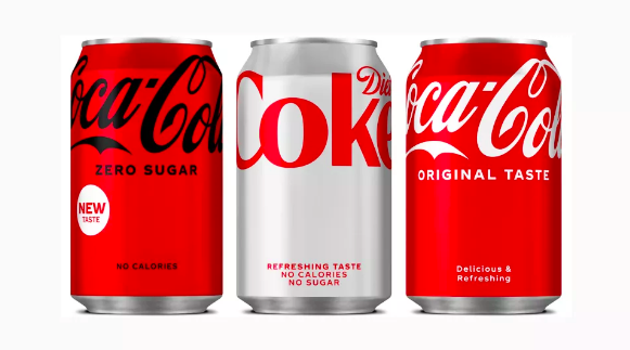
Coke has simplified its identity system across its Coca-Cola, Coca-Cola Zero Sugar, and Diet Coke brands. The brand’s signature red ties the designs together, as does a nearly open field on the lower portion of the cans. All but the most essential elements have been removed from the design, and the product names have been moved up. The resulting empty space is now part of what the in-house design team calls a visual metaphor: together with the raised wordmark, it suggests an “uplifting experience.”

Mother Design has created an identity for Nuud, a start-up chewing gum company whose product is made from the tree sap chicle. Chicle is biodegradeable; regular chewing gum, on the other hand, is made of single-use plastic.
As Nuud’s intent was to disrupt the standard chewing gum category, Mother Design developed an in-your-face strapline: “Chew plants, not plastic!” The wordmark’s bright white grin suggests freshness, happiness, and cleanliness.

White Castle asked its employees, one-quarter of whom had been with the fast-food chain for over a decade, what they wanted as part of their work uniforms. Some requests were simple: a durag, for example. However, their ideas inspired a more fundamental and important shift in the company: a system that treated workers with respect and did not treat them like human billboards. (Photo credit: Elliott Jerome Brown Jr., courtesy Telfar.)