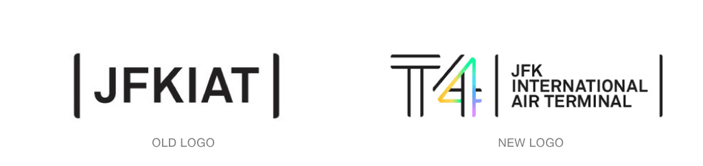
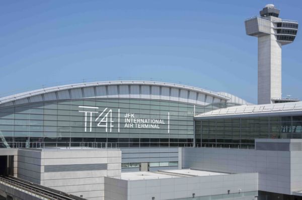
Terminal 4 at JFK International Air Terminal in New York, New York is one of the busiest terminals across the nation, with an annual passenger volume of 19.5 million. With its long lines, crazy delays and all of the general frustrations that come with flying internationally, Terminal 4 decided to brand itself with a fresh identity created by Base Design.
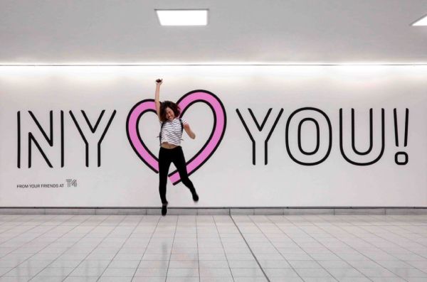
The new identity hopes to create better customer experience, while exuding “good vibes” to those fighting the general flight stressors.
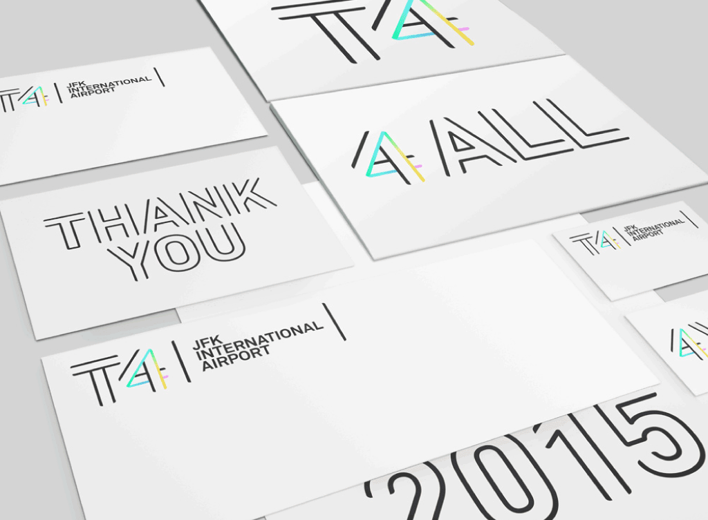
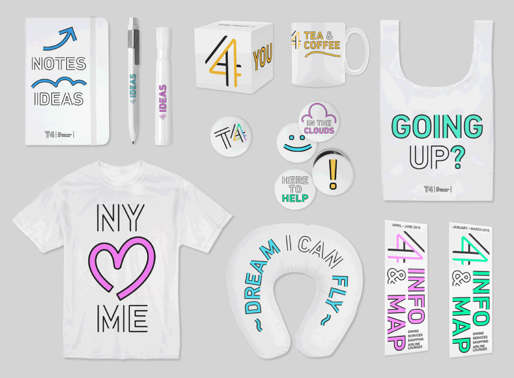
The new design is reminiscent of the terminal’s exterior grid, with multiple lines and spaces that make up the “T 4” monograph. The pastel-colored gradient hue, which runs trhough most of its advertising typeface, helps to establish a vibrant and welcoming environment, which should be received well, by those leaving or coming home.
To read more behind T4’s new identity, click here.