Honda has modified its main logo to create a new logo for its new EV models. The new deisign is simplified—just an outline—in anything release so far.
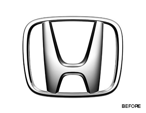
The H is wider, and its top stems are angled out more as well. Honda literature says this design is meant to represent two outstretched hands.

https://www.caranddriver.com/news/a46339613/honda-new-logo-evs/