Now 66 years old, the NBC peacock has enjoyed a storied upbringing. Created by the Sudler & Hennessey team of John Graham and Herb Lubalin in 1956, the bird disappeared and reappeared as part of the NBC identity until its permanent return in 1979, when it was redesigned by Lippincott & Margulies.
In 1986, NBC brought in Steff Geissbuhler of Chermayeff & Geismar to further modernize and simplify the bird. The network added a stained glass effect to the mark in 2011, and in 2013, the design turned opaque and glossy, and a bespoke typeface—Tinker, named for one-time NBC chair Grant Tinker—was added.
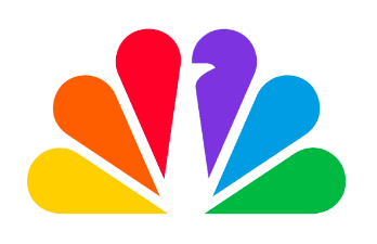
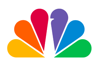
In late 2022, a newly modified logo began appearing without much fanfare. Most of the changes, such as more space between feathers and a more pronounced bird beak, may have been introduced for better scaleability. But the mark’s colors have also been brightened, and the NBC wordmark was also reworked so that its weight and rhythm better matches that of the peacock.
The most recent adjustments will be spread through the company and its partners, including streaming service Peacock, throughout 2023. No outside firm was named as the agency of record, although loyalkaspar is currently the brand partner for Peacock.
https://www.newscaststudio.com/2022/12/07/nbc-new-peacock-logo/