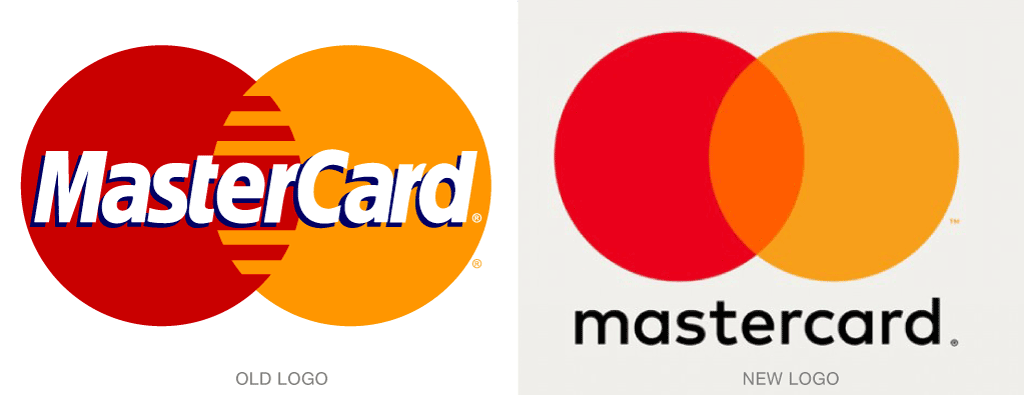
MasterCard’s new logo, by Pentagram, has not fallen far from its parent’s tree. Master Charge first used the now familiar dual overlapping circle convention in 1968, and the refreshed design brings that visual into even more focus.

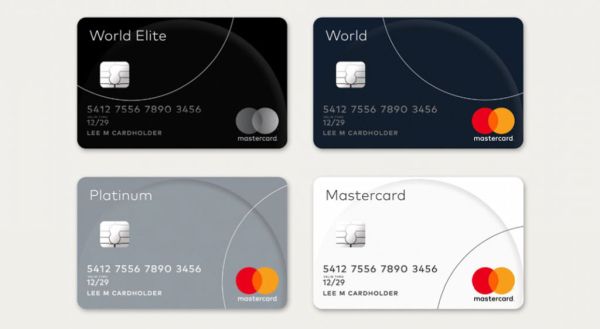
Pentagram’s design is brighter, simpler, and so much less dated. The typography is also all lowercase, which paves the way toward new “master” applications, such as masterpass, MasterCard’s new digital payment system.

Michael Bierut on the design, from a Creative Review article: “‘They’ve invested for more than 50 years in some of the most basic visual attributes you can have—the circle repeated twice and overlapping, two of the three primary colors. To actually stake your claim and say you want to own something that simple is something you just can’t do if you’re a startup trying to make a name for yourself with a brand new product that no-one’s ever heard of,’ he says. ‘If you see MasterCard’s history as a foundation for the work, then it starts to feel liberating, not inhibiting… we really just tried to distill what the essence of the brand was and see how concise we could be with communications.’”

To see the full story behind the new design, simply click here.