![]()
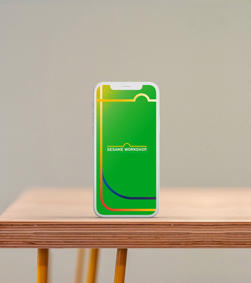
Sesame Workshop, the philanthropic organization behind the show Sesame Street and many other efforts that support children, received a new logo in 2022. It borrowed from the very familiar shape and lettering of the Sesame Street sign, forming a definite connection between the two entities.
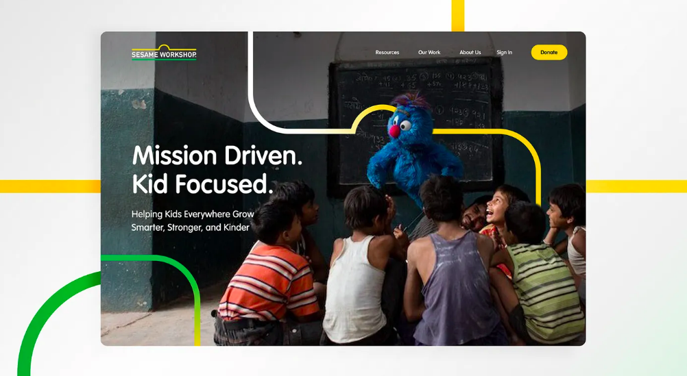
Trollbäck+Company has now extended the new identity into a graphics and motion graphics system that creates an expansive network of many streets—not just one—routes that connect the Workshop with all of its collaborators. The plan is playful, but not childlike. Its built from primary colors plus green, but is sophisticated in its execution. The new design efficiently differentiates the parent organization from its most famous offspring, the Sesame Street show, but maintains unity with it.
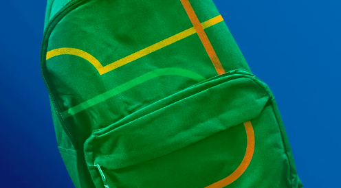
From the Trollbäck website: “Through repetition of the Sesame Workshop logo, we create a unique ecosystem of streets and intersections that expand the brand’s visual vernacular... In all animation, the lines extend from opposite sides of the screen and overlap to signal cross-collaboration. Vibrant colorways represent the non-profit’s bold, visionary approach to education and philanthropy.”