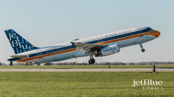
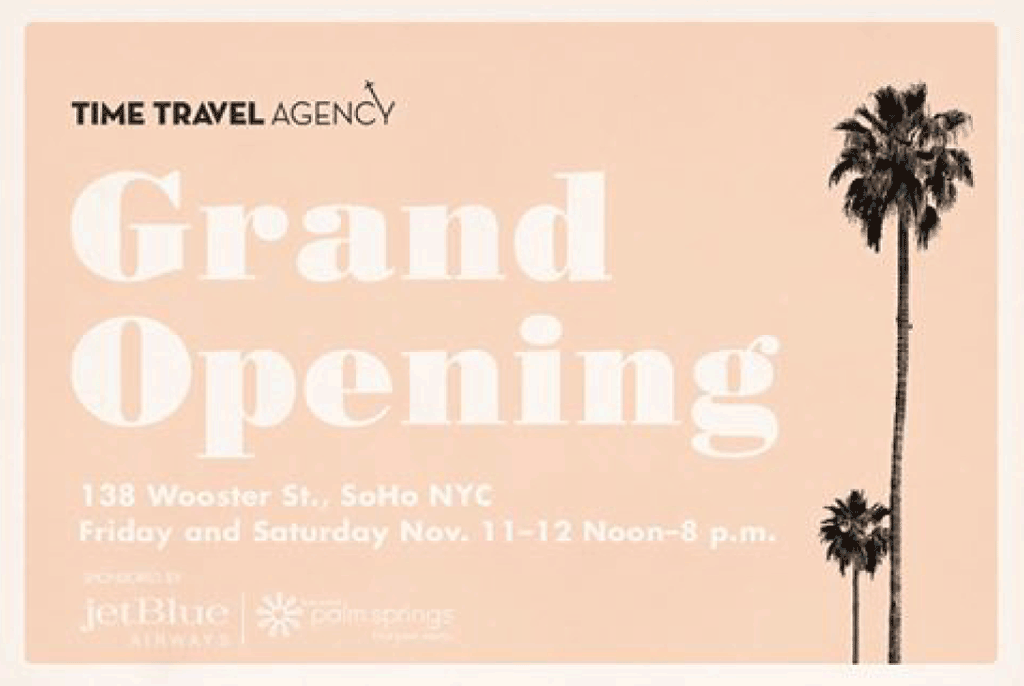
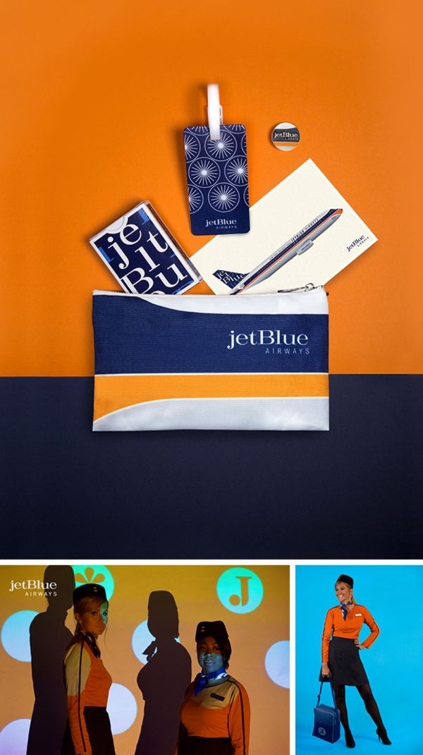
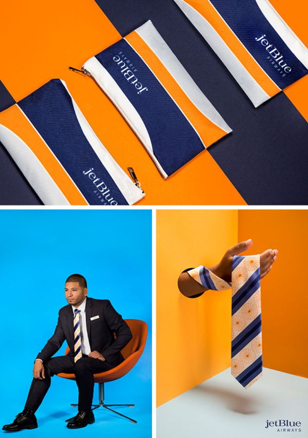
JetBlue had a lot of fun with its brand recently when it celebrated its new NYC-to-Palm Springs route by creating a 1960s-style identity, complete with ads, a pop-up “Time Travel Agency,” fare deals and uniforming of the period, and even a retro-painted plane.
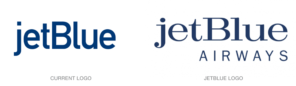
The project gave JetBlue designers, working with the agency Mullen Lowe, a chance to explore their brand from another direction. What would a 16-year-old company have looked like 50 years ago? They spent many hours at New York’s Lubalin Archive at Cooper Union, researching the design of the 1960s and considering how their identity would have translated.
From a JetBlue news release: “The 1960s were rich with sleek but bold graphics and stylecharacteristics of today’s JetBlue brand,” says Jamie Perry, VP of marketing [for] JetBlue. “With that in mind our team broke from our tradition of timeless designs and instead imagined a look to celebrate this iconic era of aviation and what JetBlue may have looked when it would have been introducing humanity to air travel.”
Read more details here.