• Bugatti, the British luxury car-maker, has a new identity that it hopes will help transition the company from an exclusive automobile brand to a wider-reaching luxury brand. Bugatti partnered with Interbrand to help with the evolution.
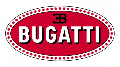
The original Bugatti emblem looked something like a brooch. This made sense, as the mark was created by the jeweler-father of Ettore Bugatti, the company founder. The redesign appears to have dispersed (so far) with the bejeweled oval, leaving two elements: the pumped-up EB logotype and the now-one-dimensional wordmark. A royal, rich blue reigns in the new plan.

https://carbuzz.com/news/bugatti-has-a-bold-new-logo
• Luxury car brand Aston Martin has rebranded with a new identity that is simpler, bolder and more intense. It pairs well with the company’s new catch-phrase, “Intensity. Driven.”
Art director and designer Peter Saville created the new brand. He made both the wings and the type bolder, and also dropped the single vertical line at the bottom of the wings as well as the inverted arch.