The 160-year-old wealth management firm Hilliard Lyons has a completely new brand identity and demeanor.
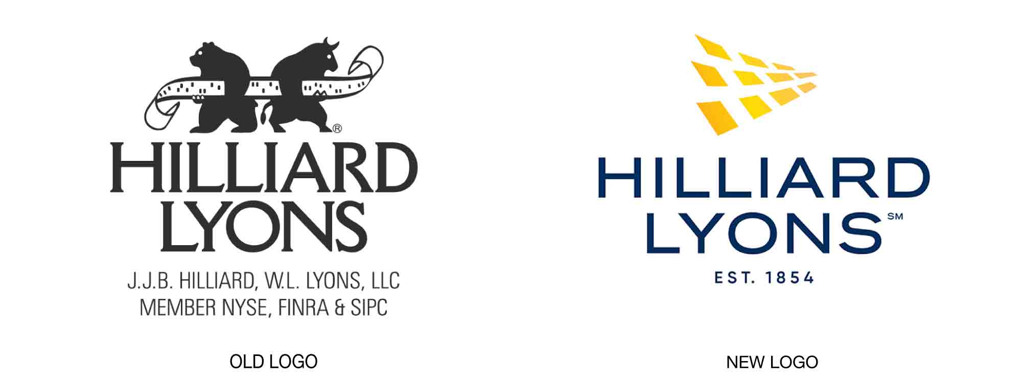
The company’s previous identity was extremely literal and centered around a very cluttered logo that contained a bull, a bear, some tickertape, and a lot of words (including “Lyons,” which inadvertently makes one think of yet another animal).
Not much has been released concerning the redesign at this writing except for the logo, created by Denver-based brand agency Monigle. It contains what is called a “golden pathway” and feels much more optimistic and forward-moving overall, and it certainly demotes the concept of ongoing struggle that the old design contained. It is possible to discern the letters H and L in the design’s negative space, but this could be reaching. The new wordmark is modern and contains a reference to the firm’s history in the words, “Est. 1854.”
Visit the Hilliard Lyons website here.