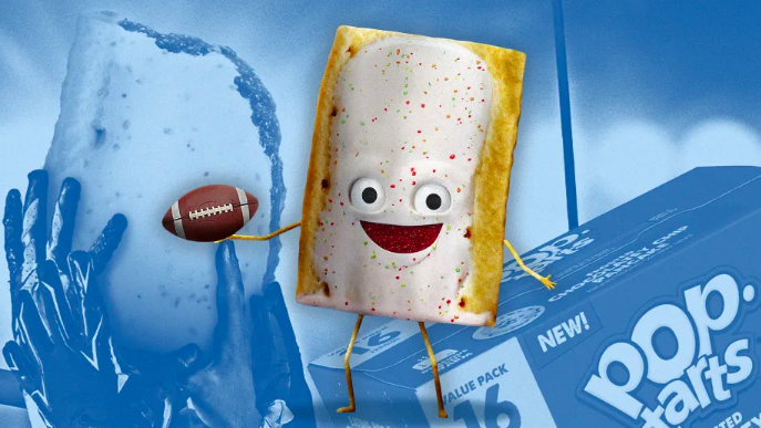
• Pop-tarts’ new mascot—literally a toaster pastry with skinny arms and legs and a smiling face—is the new member of the anthropomorphic brand mascot club. It’s meant to be fun and friendly, but also look yummy—a great guy to watch the big game with and then eat.
https://www.fastcompany.com/90999615/pop-tarts-edible-mascot-branding-trends
• The goal of OMSE’s new branding for Black Bee Honey is to “free the bee” and stress the benefits of wild, unadulterated, and completely natural honey. A bespoke typeface was inspired by the flight of bees and includes three versions that mimics the nature of various honeys: drippy, waggle, and runny.
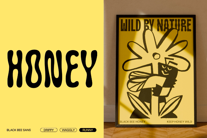
The brand’s color palette reflects the yellows, greens, purples, and blues found in British meadows. Finally, a team of chaotic, personality-filled bee characters populate the system.
https://www.creativeboom.com/inspiration/omse-black-bee-honey/