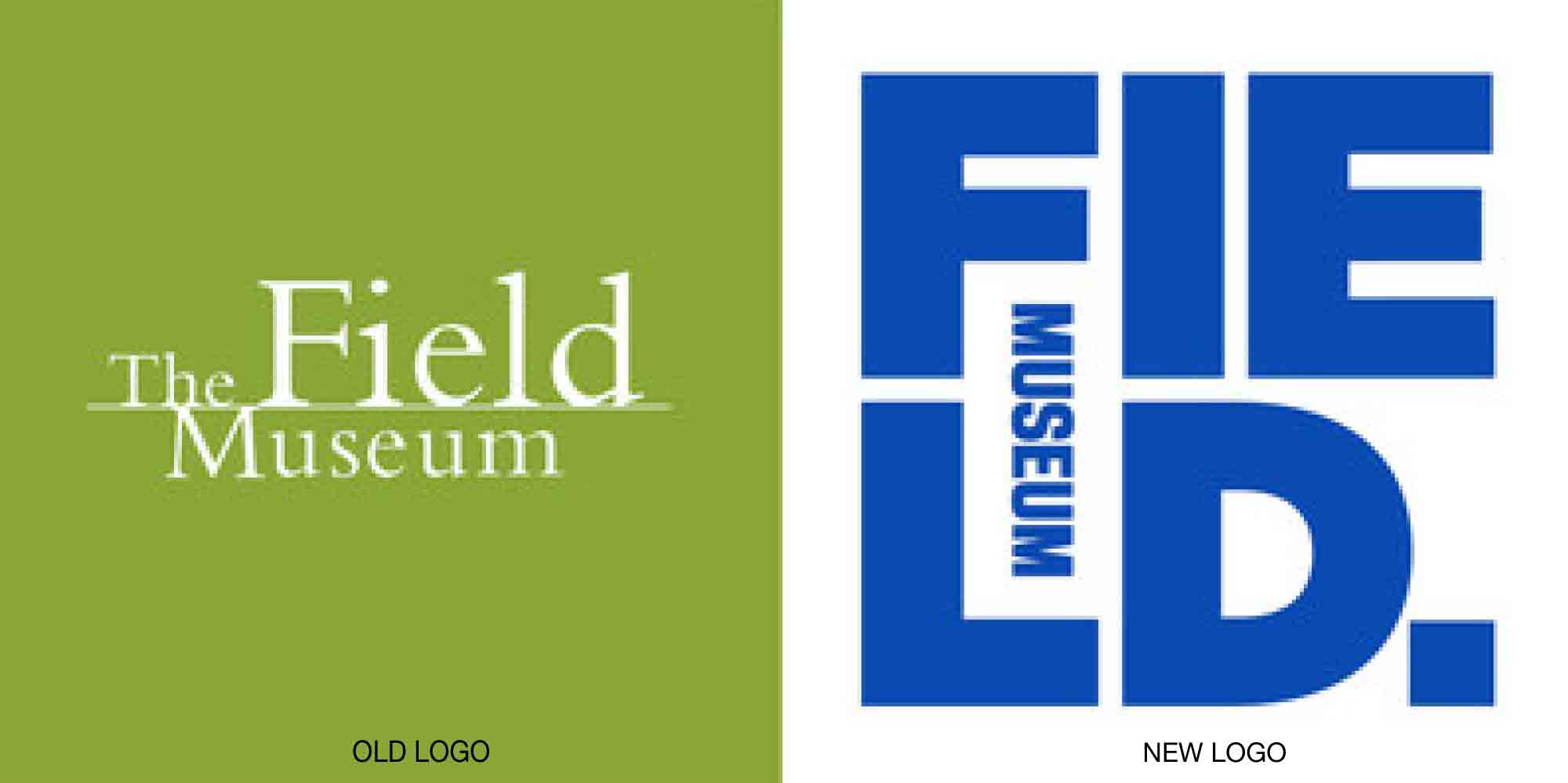
Chicago’s famous Field Museum is rebranding to better explain to the visiting public that it is not a fusty institution or an entertainment venue but rather a living scientific organization that is helping to answer the tough questions the world is facing today.

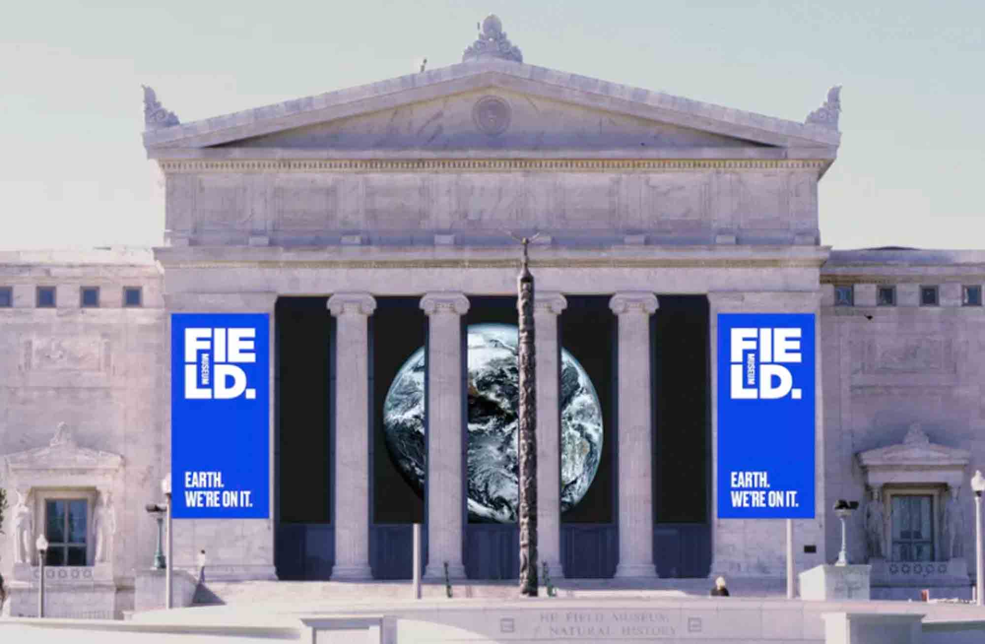
Fronted by the new slogan, “Earth: We’re On It,” the new identity is grounded in a bold royal blue, symbolizing the Earth, sky, and water. The Field’s previous logo could have represented just about any museum—just plug in another name—but the new design is decidedly big, bold, and personal to the city. Embedding the word “museum” into the name suggests how exhibits are housed or displayed at the institution. The block period at the end of the name is said to represent how only a small portion of the museum’s enormous collections are ever on display at any one time.
Read more details here.