Fast-food hamburger restaurants around the world tend to be visually tied to American chains. Identities are filled with red and yellow in various combinations with hero photos of food flashing by shots of people having fun. A Swedish restaurant chain, Tugg, needed something very different in order to stand out.

Design agency Kurppa Hosk created an amazing new world that—most significantly—includes absolutely no food photography. The designers gave the previous Tugg wordmark a feisty update and added a chomping Pac-man-like hamburger character as the main icon.
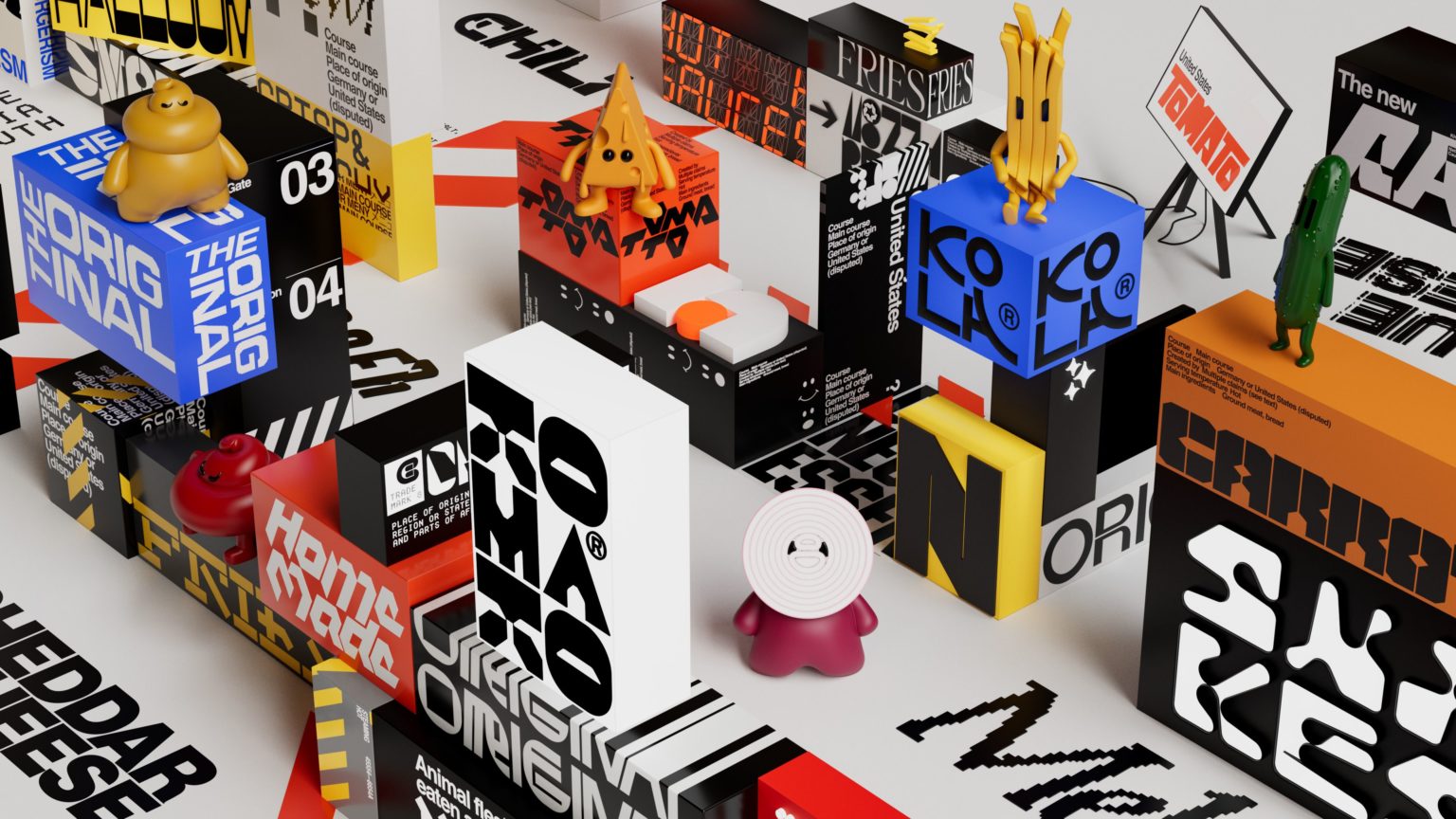
From the Kurppa Hosk website: “[W]e proposed an alternate take on a visual identity for Tugg that brought in inspiration from around the world, beyond the US. At its core, the new Tugg identity is about the universality of the humble hamburger, and how it can be brought to life in new ways to welcome anyone and everyone through design.
“With this ambition, we created a visual world that moves far from the hamburger’s (debated) American origins. Accompanied by colorful graphics and wild typography, we introduce the Tugg family consisting of Cheesela (cheese), Fritte (fries), Gurra (cucumber), Mustafa (mustard), Shalotte (red onion) and Ketty (tomato). Together they invite us to Tugg City, where anything is possible and everyone is invited.”