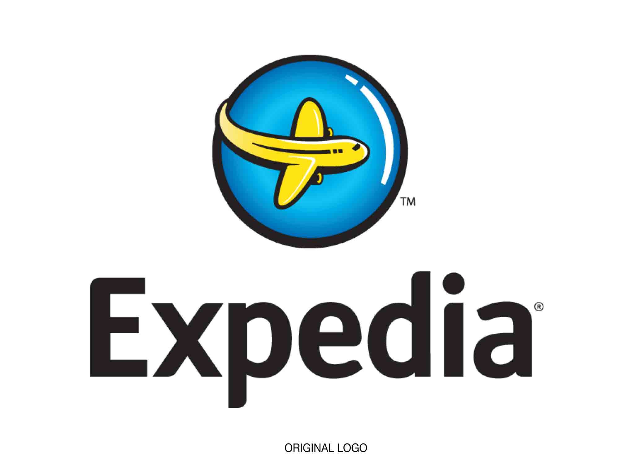
Expedia Group has grown from being one of many small and squabbling travel booking sites with a cartoon-like logo to one of the world’s largest travel platforms. Having gobbled up competitors and allied companies such as Hotels.com, Hotwire, Orbitz, Travelocity, and Trivago, it needed a new brand that marked it as a leader not only in travel, but in technology.
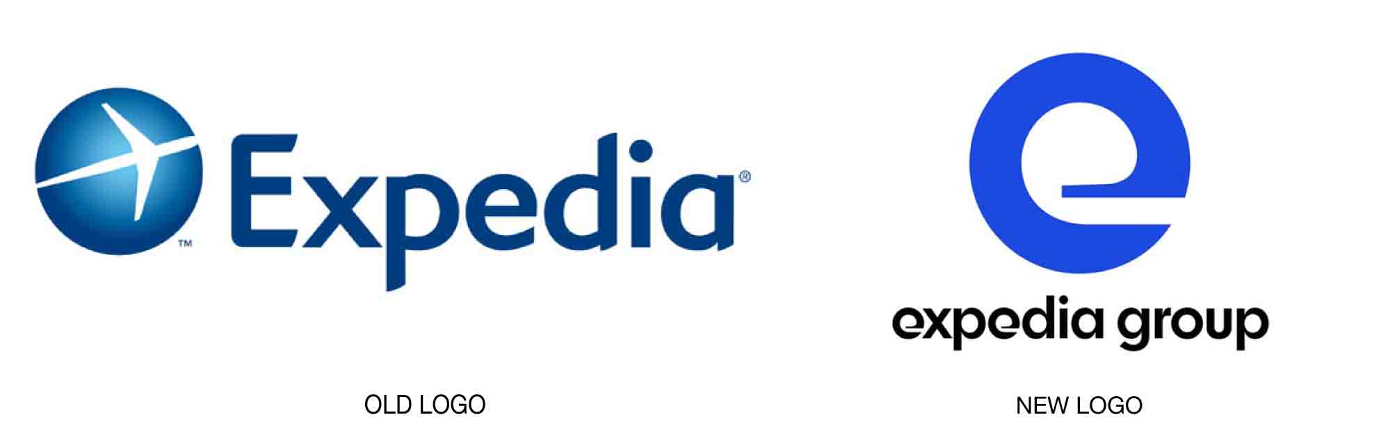
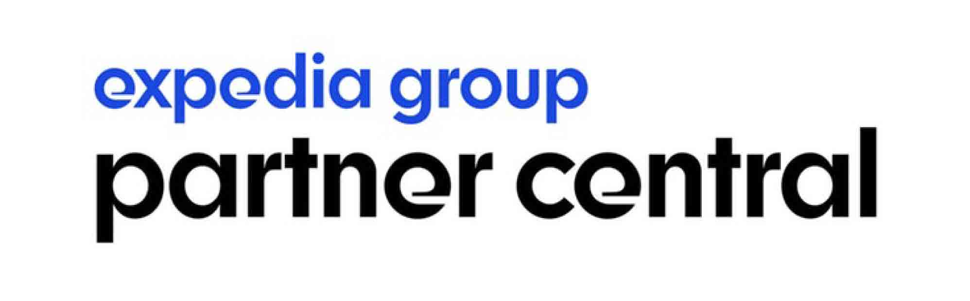
Pentagram created a new identity for the group that is centered on a uniquely shaped lowercase letter “e” logo, two of which appear in the client’s name. The letter’s circular shape and powerful counter suggest ongoing motion. The fact that the counter is open creates a secondary, interior e-shape, while allowing the outside shape to appear as if it could be growing. The bold blue color of the identity easily suggests water or sky, both indicative of travel and freedom. The highly recognizable design will allow Expedia Group to “own the e,” says the Pentagram team.
Read more details here.