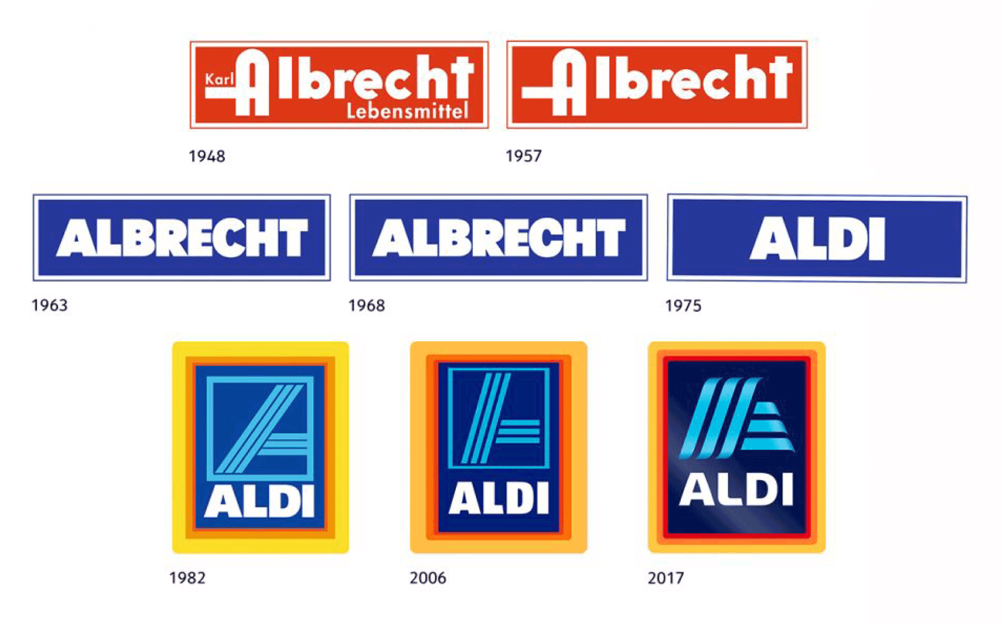
Discount grocer Aldi is headed back to the ‘90s with its new plumped-up identity. The inhouse Aldi communications group says the entire company is being modernized, and the refreshed design is in step with that process.
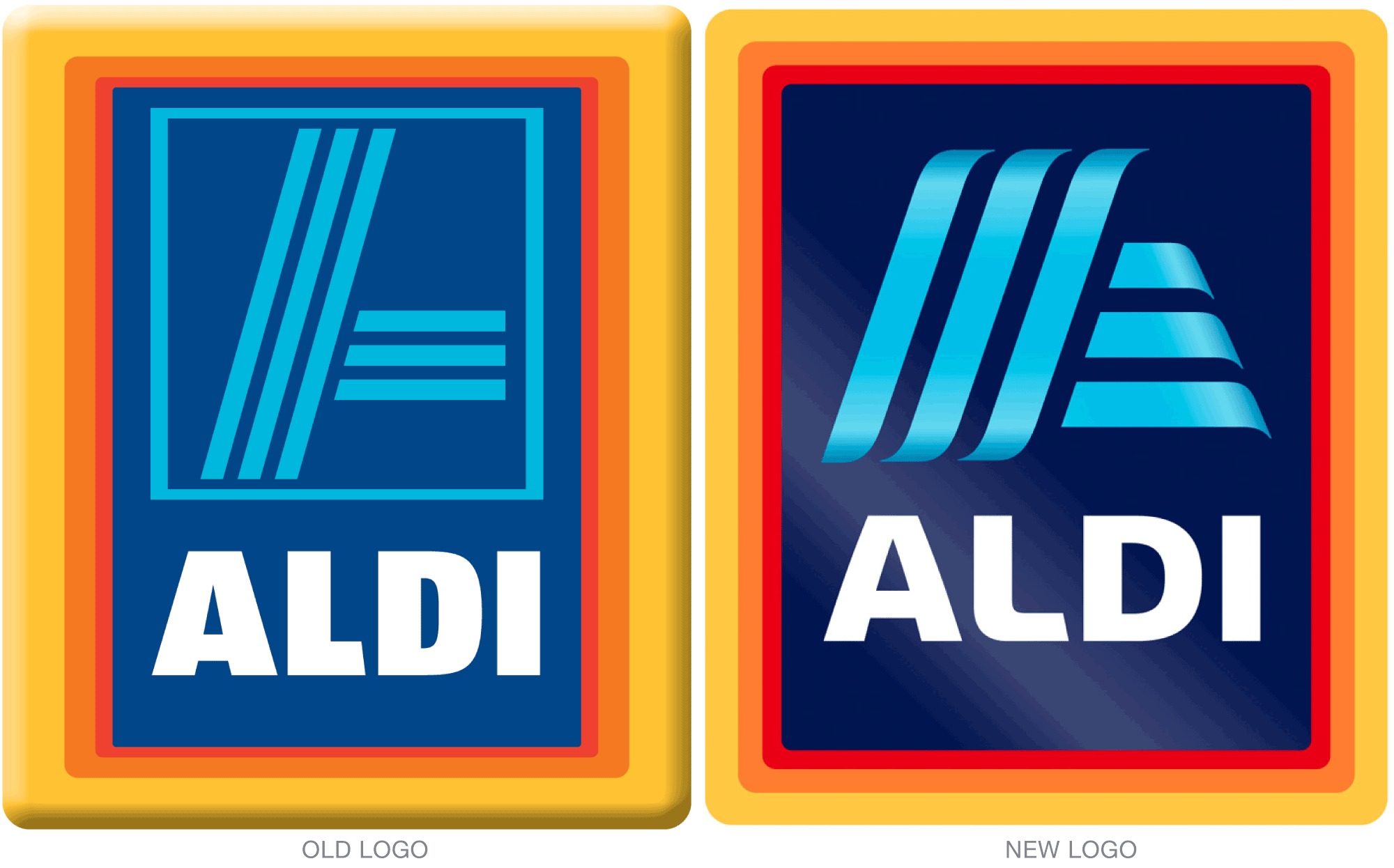
In addition to the use of gradients, the bounding box around the striped A has also been removed which will make it easier to use the letter on its own as an icon.
Find more details here.