The yellow-and-black color scheme of The Playbill is familiar to theater fans, but since the publication’s founding in the 1930s—its way paved by many years of predecessors—it has enjoyed a readily adaptable identity.
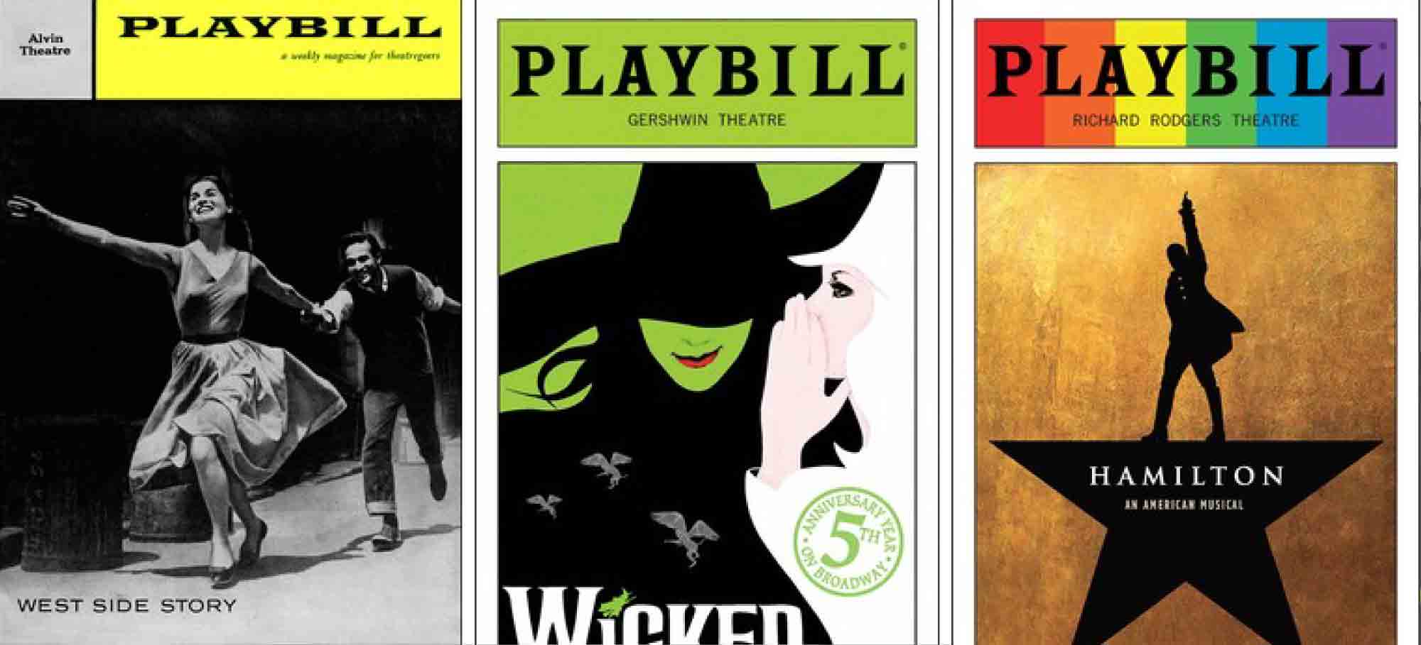
The yellow header banner came into play in the late 1950s, creating a flexible format in which a black-and-white photo and theater name associated with a headlining production made a bold monthly statement. Over time, the design has begun to accommodate additional information, including especially iconic shows and important events, mostly through color alterations, without seriously altering the magazine’s identity.
Read more details here.