It has only been in the last few years that Russian designers are making themselves known in the field of identity design. As the Soviet government has allowed more and more of the outside world in, the incoming elixir of information has coursed into the veins of creatives such as Denis Ulyanov, a young Russian designer and LogoLounge member living and working in Tula City.
Ulyanov's upbringing placed him in a nearly perfect spot to benefit from the cultural influx. Instead of attending a standard school as a child, he was enrolled in a lyceum of arts. He graduated only recently - in 2006 - from Tula State University - with a degree in engineering and design. As a student, he had opportunities to work with design firms and decided that the office setting curtailed his creative freedoms more than he could stand. So upon graduation, he went directly into freelancing and has not looked back.
"To say it has been hard would say nothing. It was sheer survival, both professionally and domestically," says the 25-year-old designer, whose clients now include National Shoe Company, EKF, and Svam Group. Ulyanov also teaches design classes at his alma mater. "But it was precisely that period that gave me a chance to believe in myself, assess my strengths and my possibilities. At the bottom line, there is a financial and artist's independence and an unwaning love for the chosen business."
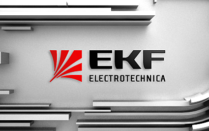
Ulyanov created this logo for Flavir Electronics, which produces low-voltage devices in Russia and abroad under the trademark of EKF. The designer's inspiration came from the electric manta ray, a sea creature which is large and powerful but which has no competitors.
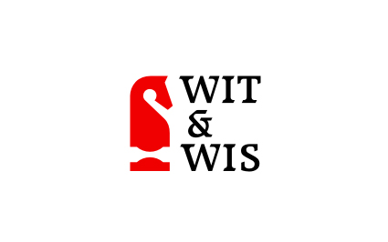
Wit & Wis is a company that offers integrated services to foreign and Russian corporate clients and individuals in legal, business and audit consulting. It wanted a new logo that reflected its professionalism and reliability. The shape of the chess knight brings in the elements of analytical thinking and planning.
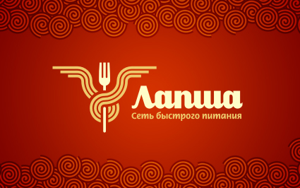
The name for this fast-food company, "Lapsha," means "noodle" in Russian. While retaining its plasticity and even grace, Ulyanov has here tied the noodle shape on a fork representing the client to form a trident or crest.
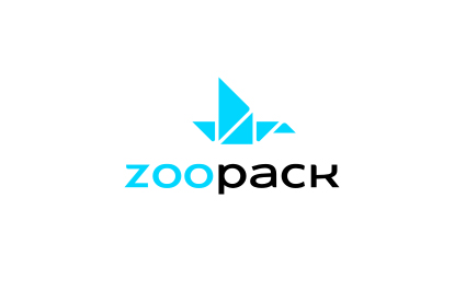
ZooPack, a company that designs and develops packaging, needed a logo that spoke of its creativity and serious intent as a company. The Japanese art of origami inspired Ulyanov's design: The new logo suggests artistic engineering in which both mathematical reasoning and the mind of an artist are represented. On a practical level, the design also represents a folded box, in abstract terms, exactly what the client produces.
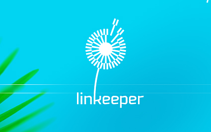
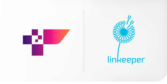
Linkeeper provides its customers with systems of links exchanges. Ulyanov believed that the dandelion in the logotype is an ideal symbol, representing a compound set of indivisible units, together now, but easily separated and sent on their way. The mechanical component of the business is represented with simple and solid logotype.
Although he would like to expand his office someday-perhaps with the help of the students he now trains-but for now, he either handles complete projects on his own or involves other freelance colleagues.
"I derive enormous pleasure from the analytical process involved, from thinking of and finally finding a laconic solution that has vigor, visual obviousness and provability, as the theorem of Pythagoras. For me, a good logo is a flashing chain of mental associations, or of creative logic. Creating a good logo does not require tricked-out software or fancy gadgets. It is your head which is key," he explains. "I want to find a path forward whereby I come upon a symbol that is laconic in shape and at the same time endlessly deep in the associations it can bring about-a logo that would be easy to remember and hard to forget."
His design work has a Western tinge: It is definitely part of the larger, modern world. But it is also of Russia: Even when using Roman letterforms, for example, he can choose fonts which have characteristics of the Cyrillic alphabet - a "K" whose top arm sweeps out farther than its bottom leg, almost an upside-down letter to Western eyes.
Ulyanov says that as a profession, the field of graphic design began its revolution in Russia only recently. Whereas Western design has already established a history, his country is undergoing a "revolutionary renovation."
"The plummeting rain of information and the possibilities that computer technologies offer are like a brainstorm," he notes. "Such words as 'branding' or 'corporate identity' are now understood. Companies pay more and more attention to their visual image and consider the money spent on the development of a corporate style or rebranding done by a talented designer as a profitable investment. It has become a sign of decency, a savoir-vivre, to have a quality logo."
The long technology and information isolation of Russian design diverted it from the path taken by Western design, but now, while preserving its own flavor, it has plunged into the sea of knowledge. It is a very exciting time to be a designer in Russia, Ulyanov says. The impressive demand of clients for good work sends the spiral of creativity higher and higher. That creativity will reveal itself in smarter design work as well as in benefits to the artist, such as the development of better Cyrillic fonts, not all of which are nowadays up to current standards.
"We do not need to wait for an inspiration to visit us because inspiration is now our permanent condition. which is the source of the sap that makes us capable of working 18 hours a day," he says. "The result: Logos produced by Russian designers have made their way into the shortlists of international competitions."
Copyright 2008 Logolounge Inc.