![]()
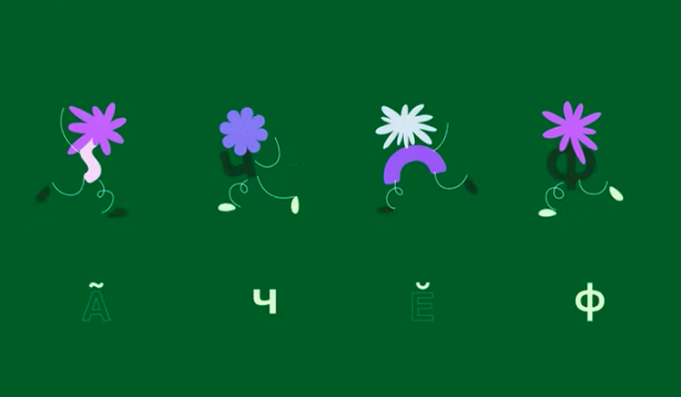
• Language Supp Ukraina is a free online platform created to help children and young people who have fled Ukraine to learn a new language, Polish. Warsaw-based Podpunkt created a friendly, warm, “slightly abstract” space where refugees can be comfortable while they learn. The design team not only created the identity for the site, but also delightful teaching tools called “wordcreatures.” These combine hand-drawn letters and art to visually indicate what a word means.
https://www.itsnicethat.com/news/podpunkt-language-supp-ukraina-graphic-design-020822
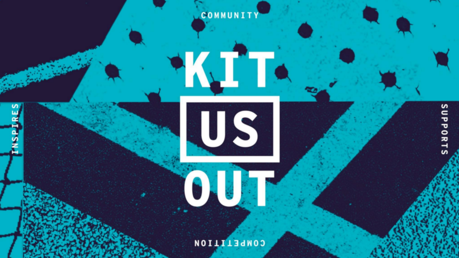
• Kit Us Out is an organization that aims to level the playing field for all world-class athletes—not just the wealthy ones—by providing proper gear and apparel for those who are less fortunate. Design Bridge used the theme of commonality in the organization’s new identity. What do all athletes actually experience while competing? Energy, boldness, and motion, of course, but the brand also builds on patterning commonly seen at sporting events such as lines painted on courts and fields, netting, treads on shoes, and trimmed grass, for example.
The muscular logo boxes in the word US to symbolize unity and belonging, but it also suggests the shape of a field, court, table, pool, rink or anyplace athletes gather to compete and excel.
bbonline.com/news/kit-us-out-marks-10th-year-with-new-visual-identity