Pentagram has updated an evening university’s visual identity while leaving the school’s brand identity relatively untouched.
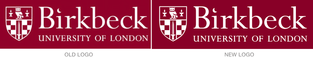
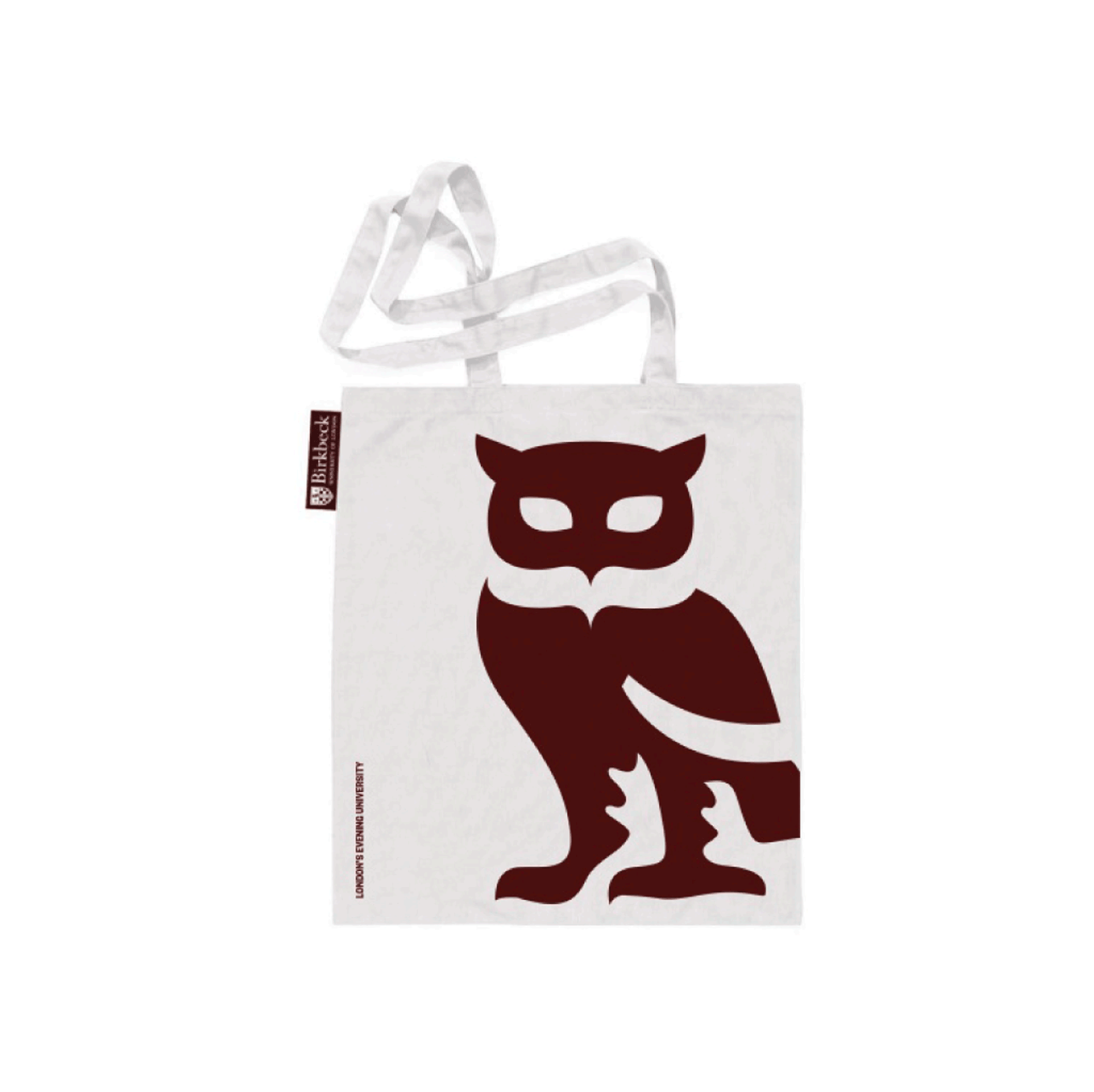
Founded in 1823, Birkbeck, University of London’s has a crest logo that was first used in 1997. Instead of changing that crestother than minor tune-upsthe designers instead used the crest’s elementssuch as the owlin new ways on shirts, bags, Facebook, and other more social venues. They also worked with the client’s in-house team to keep the new visual identity more consistent over all use.
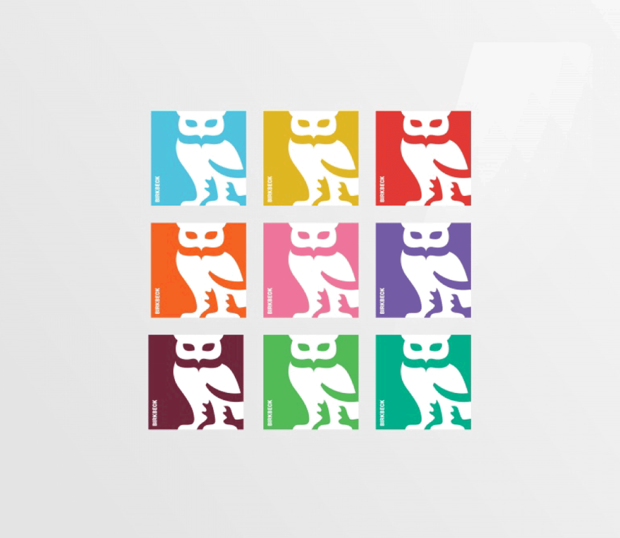

Changes include darkening the original burgundy color, reversing the use of burgundy and white within the crest, and adding a white outline to the crest. The identity’s color palette also expanded from two to ten colors. (Photos from Design Week.)
To see more, simply click here.