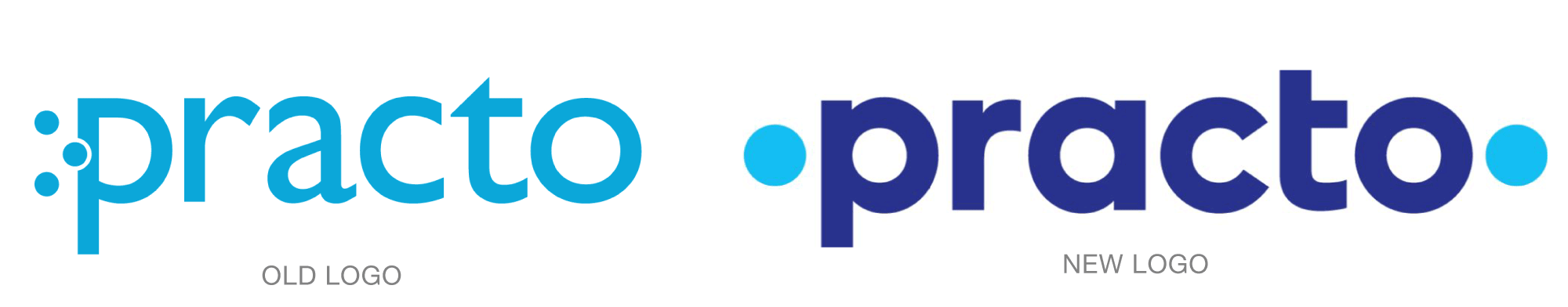
Practo is a health care management company that helps make connections between patient and physician and between physicians and their practices. For the first time since its founding nine years ago, Practo has a new identity, created by Chermayeff & Geismar & Haviv.
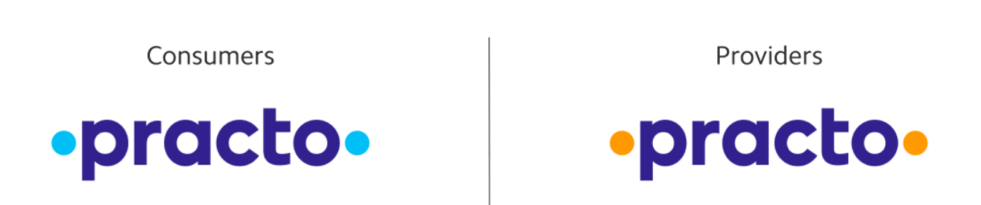
The designers retained the dot concept from Practo's original brand, but turned it into an entirely new concept: connecting the dots. With a dot on either end of the brand name and a string of dot-shaped counters inside the letters p, a, c, and o inbetween, the bookend dots visually tie the message together. Practo's consumer sub-brand will have blue dots, while the provider sub-brand will have saffron dots.
Read more behind the new identity here.